duorocks17 Posted January 17, 2004 Share Posted January 17, 2004 [COLOR=blue]Hello fellow artists! After entering into my internet and web design class the beginning of this semester, i found out how to make banners just using a simple program we all have called Paint. Now i'm sure most of you already knew about this, or use a more advance version, like PhotoDraw, (which is what we will be getting into). So i would like to ask your opinions, and comments on what are my first banners. If you would be so kind as to point out, some things, such as: what is wrong with the banner. what could make it look better, and whether you like it or not, that would be great. Thanks for all your help! Now to get things started. This first banner is one from Pilot Candadite. I made this one for my friend, who knows absultly nothing about the show.[/COLOR] Link to comment Share on other sites More sharing options...
Baron Samedi Posted January 17, 2004 Share Posted January 17, 2004 Ok. For one- it has no border on it. Banners always need borders. Even with the most backward, anti-productive Paint program, borders can be created. It is a basic 'requirement' and can enhance the look of a banner no end. Simple black ones most often accentuate your basic banner. Two- the banner images. Did you attempt to resize them? If so, don't. >.> Always leave images in Paint alone. When resized, they quite literally go to hell. Pixelly, warped and generally bad looking, they can ruin an otherwise decent banner. Three- the text. Never make text in Paint. It always comes up with some intrusive horrible looking background around the text, which is the worst thing since BO :rolleyes:. lol. In all seriousness, text in Paint is demented. That program should be shelved. I can't find too much good about the banner, excepting the quote. Paint is a devil to use though- have fun with Photodraw. it is a helluva lot better, thats for sure ^_^. You'll improve with time... and a decent program. I'm eagerly waiting for more! Link to comment Share on other sites More sharing options...
duorocks17 Posted January 17, 2004 Author Share Posted January 17, 2004 [COLOR=blue]Ok, I did some of the things that you sugested. But when I put the words in that was before i read. Now i can't get them out.>-< This one is also from Pilot Candidate.[/COLOR] Link to comment Share on other sites More sharing options...
Baron Samedi Posted January 18, 2004 Share Posted January 18, 2004 Already, that looks a lot better than before. The border just gives it definition and boldness. The images aren't the highest quality- but they'll pass. All this serves to make you aware of how much better any other program is than Paint. Good work and keep them coming. When are you progressing to Photodraw? Link to comment Share on other sites More sharing options...
~Mystical Pan~ Posted January 18, 2004 Share Posted January 18, 2004 My thoughts for both banners mirror almost exactly like Baron's, however, something about the font background in both banner bugs me. Probably cause they stand out nastily. Does Paint do that automatically or something? Once you moved away from Paint to other programs, try limiting yourself to 2 images only and trying to blend them together. ^^ Link to comment Share on other sites More sharing options...
DDG Posted January 18, 2004 Share Posted January 18, 2004 [color=navy][size=1]Ok, well, I used to use paint, but now I don't. Well, I still use it to put borders on my banners, but that's all. I agree with Baron_Samedi. When using Paint, do not resize your images. They come out pixellated. Advice on the words, you don't have to have a background! When you click on the font button, two little pictures come up under all of the other buttons. One has a square with a white box behind it (or something like that) and the other has a square with a clear box behind it (or something like that). If you click the one with the clear box and then type in your words, you won't get a background behind your text. I would also suggest saving atleast two copies of each banner. One with text and one without, just in case you mess up on the text because once the text is on there, you can't edit it. All in all: For these being your first banners they are pretty good. I hope that one day your banners will be great and that the PhotoDraw program will help make them great because Paint is just killing your potential. ^_^;[/color][/size] Link to comment Share on other sites More sharing options...
Haze Posted January 18, 2004 Share Posted January 18, 2004 I think they are pretty good considering you are using Paint. My first comment will be to let you in on a little secret....*whispers* there is a way to get that ugly backgorund box off of your text. Yup! All you have to do is click on the little box that has no fill (this little box I am talking about is under where all of the tools are. It pops up once you click on text. It is the option on the bottom with the shapes and no white behind them.) Also I think you might be able to get some better pictures. It may just be Paint messing with your pictures, though. I cannot wait until you move on to Photodraw. Paint is evilness in the extreme. But you are doing good with what you have. I hope to see more soon! -haze Link to comment Share on other sites More sharing options...
duorocks17 Posted January 19, 2004 Author Share Posted January 19, 2004 [COLOR=blue]ok, thanks to your tips everyone, i have recreated my first banner and i have to say, it looks a lot better! I didn't resize the images, I added a border, and made the text blend into the background! :) Well, what do you think? I think i'm starting to get the hang of this! We don't start PhotoDraw for a couple of weeks, but i cant wait![/COLOR] Link to comment Share on other sites More sharing options...
Baron Samedi Posted January 19, 2004 Share Posted January 19, 2004 That is a lot better, I must admit. I think the border should be black though- and the font colour could be a more bolder and contrast more with it's surrounds. Also, image blending will become better with Photodraw. A few weeks? Hell, an eternal torment, for sure. Anyway, keep making them! You have improved drastically since your first. Link to comment Share on other sites More sharing options...
duorocks17 Posted January 20, 2004 Author Share Posted January 20, 2004 [COLOR=blue] Thanks for all your help everyone! Yeah, i can't wait till we get into it. But while we're both waiting, here's yet another one I have made. Also, i figured out that if i put the pics in Publisher first, it will let me resize them decently. Well, at least i think so. What do you think?? This one is from Cowboy Bebop. I just love this quote.[/COLOR] Link to comment Share on other sites More sharing options...
Fyxe Posted January 23, 2004 Share Posted January 23, 2004 [size=1][color=darkblue]These are pretty good for some of your first and using Paint. I personally think the 3rd Pilot Cantidate banner I saw was the best. The Cowboy Bebop one is good too, just a little on the pixely side and some of the pictures are rather dark. Pretty good work on these, can't wait to see your upcoming banners. I'm sure you'll make alot of progress. Keep it up! ^^[/color][/size] Link to comment Share on other sites More sharing options...
duorocks17 Posted January 23, 2004 Author Share Posted January 23, 2004 [COLOR=blue]Thanks for all your comments everyone! I think that the Cowboy Bebop is one of the better ones I've made so far. Heh..i sort of got into the PhotoDraw program earlier today..it looked very interesting. The bell rang before i could play with it though. Well I thought i would show off some skills of a friend of mine, while i'm in the process of creating another banner. Here's one created by my good friend Conna_da_fox. It's of a cute little guy named Billy, and is taken from one of the little movies that is hilarious! Well, here it is![/COLOR] Link to comment Share on other sites More sharing options...
Artemis Posted February 1, 2004 Share Posted February 1, 2004 They're going great, duo! Let me know when you move up to PhotoDraw like you said. Then you can make me a bishie banner...lol :love2: lol I have to say, your billy banner cracks me up, but then, you have to have seen that little video. "I have a question. Is Dr. Pepper a real doctor? I don't think he's qualified to be a soft drink." lol Link to comment Share on other sites More sharing options...
duorocks17 Posted February 19, 2004 Author Share Posted February 19, 2004 [color=blue]Thanks for all your comments guys. The work is coming along, and we're about to move on. Hopefully I can find some free time in class to make you guys a good one. But here's one to keep you satisfied. I really don't like it myself, i think i could have done something else with it. I didn't know what to put for the quote either, so if you haven't watched the series, you probably won't get it. [font=Century Gothic][font=Verdana][color=teal]EDIT:[/color][/font] Here I am to answer such a gratious request! *giggles* Well, I finally got a computer with PSP8 and i have to admit this animation thing is pretty neat. Tell me what you think of my newest creation!!!! [/font][/color][color=black]Does anyone know how to reduce the size of animation files so you can get them to upload? I tried mine, and it was just to big![/color] [color=teal]EDIT AGAIN:[/color] Here's another banner I made today, and yeap that's right! It's just for Tony!!! Here's your suprise and I hope you like it! Please comment on this banner too. It one of the first one's I've made with my new programs. The second one is the one I currently have in my sig. I think it's funny. If you have another idea for a quote, I would greatly appriate it. [color=teal]Posts combined after deleting spam. -Syk3[/color] Link to comment Share on other sites More sharing options...
Syk3 Posted March 10, 2004 Share Posted March 10, 2004 [quote name='Hells Fire']Since Duorocks told me to post I shall post my opinion on former Presidents. Why are we still guarding former President? I can see guarding ones that no one likes, but who wants to hurt a great guy like Jimmy Carter or Bill Clinton*snickers*. I say the only ones who need guarding are the ones that know one likes *cough George cough*. We are spending tax dollars defending these guys but why? None of them have done anything worth them needing defending. Oh wait George Bush did raise taxes and Bill did boink Anna Nichole, I mean Monica whateva her name is.[/quote][color=#30415d]And how exactly does that have anything to do with the banner? O_o[/color] [quote name='callmegoddess04']::gapes:: Your good. Reall good. I like the Elektra one. Who's it for? Your real good, duorocks17![/quote][color=#30415d]I reccommend reading our rules, specifically on constructive criticism, before posting in the Art section again. ~_^[/color] Link to comment Share on other sites More sharing options...
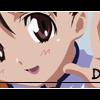
platinum Posted March 10, 2004 Share Posted March 10, 2004 What is the name of the show where you got this picture. [img]http://www.otakuboards.com/attachment.php?attachmentid=16814[/img] Link to comment Share on other sites More sharing options...
duorocks17 Posted March 11, 2004 Author Share Posted March 11, 2004 [COLOR=Blue][FONT=Century Gothic]I got those pictures from one of my favorite shows "Pilot Candidate" otherwise known as "Candidate for Goddess." Please post comments on my work, i don't want this to turn into a spam thread and get closed. The new one I'm working on now is going to be from Full Metal Alchemist, but I'm having some difficulties with these new programs, so it might be a bit before i get it on here. I'll be sure to post it when I'm done. In the mean time, please feel free to comment on the ones i have done already.[/FONT][/COLOR] Link to comment Share on other sites More sharing options...
Recommended Posts
Create an account or sign in to comment
You need to be a member in order to leave a comment
Create an account
Sign up for a new account in our community. It's easy!
Register a new accountSign in
Already have an account? Sign in here.
Sign In Now