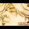
Epitome Posted July 3, 2003 Posted July 3, 2003 I made this for XxJoltxX. I want to know what my fellow Otakus think. Is it better than my previous one or worse. Comments, ratings, give me all of it...
Guest Zeh Posted July 3, 2003 Posted July 3, 2003 Since most of it is a monotone color, the faded colors in the image go badly. If you greyscaled it, it would be alot nicer. Pretty neat, though. Who are the people?
Epitome Posted July 3, 2003 Author Posted July 3, 2003 I grayscaled it, it looks a little bit better like that. And the peopl are form a manga called Naruto...
eleanor Posted July 3, 2003 Posted July 3, 2003 [size=1] Yeah, I think the second one is much better. I like how you designed the banner, but for some reason I think it would be better without the guy on the left. But maybe you put there to keep it in balance...::shrugs:: but it's a good banner nonetheless.[/size]
Guest Zeh Posted July 3, 2003 Posted July 3, 2003 Hmmm, maybe you should fill the border in white... It looks real cool now, though.
Guest Zeh Posted July 3, 2003 Posted July 3, 2003 It looks much better now, compared to the first version. I like it ^_^
Guest night wulfe Posted July 3, 2003 Posted July 3, 2003 I like the second much better. However, I agree with maladjusted. It would be a much better banner without the guy on the left. It also looks better grayscaled. All-around it is a good banner. By the way thanks for my avatar Hataki.
Dragon Tamer 89 Posted July 6, 2003 Posted July 6, 2003 that last banner was one of my favorite banners
Recommended Posts
Create an account or sign in to comment
You need to be a member in order to leave a comment
Create an account
Sign up for a new account in our community. It's easy!
Register a new accountSign in
Already have an account? Sign in here.
Sign In Now