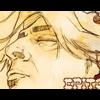
Epitome Posted September 7, 2003 Posted September 7, 2003 Here is one that I made from a wallpaper, its a Vampire Hunter D one. Tell me what you think...
quietstranger16 Posted September 8, 2003 Posted September 8, 2003 [color=green]that looks pretty interesting. did you draw all those squigly white lines yourself, or use some type of filter? also, i like the pic u used of D. he's got a cool gaze there. nice work[/color]
~Mystical Pan~ Posted September 8, 2003 Posted September 8, 2003 Personally, it seems too cluttered. The text could be placed better...probably on the lower left corner or something, but not in the middle. The effect to the left doesn't quite help the banner. I'm not sure what it is. OO; Though, the image of D is kick ***. I don't think you should have made it transparent. The border is ok...but it doesn't quite fit. However, that's what I see. You may love your banner the way it is...and if you do, don;t listen to me. ^_^
Recommended Posts
Create an account or sign in to comment
You need to be a member in order to leave a comment
Create an account
Sign up for a new account in our community. It's easy!
Register a new accountSign in
Already have an account? Sign in here.
Sign In Now