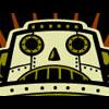
Baron Samedi Posted November 2, 2003 Posted November 2, 2003 Here is what may be my new banner and avi... opinions? I'll post banner, and then avi when someone replies. [img]http://www.otakuboards.com/attachment.php?postid=510321[/img]
AzureWolf Posted November 2, 2003 Posted November 2, 2003 I absolutely abhor the artwork in the banner, so I can't make an unbiased comment on the banner work here. I think others might feel the same. Nonetheless, here goes... I think you did the best you could with what you had to work with. I mean, a background would really suck with this stuff, IMO. However, I like the text setup (along with the font used). It fits really well with the "picture."
Haze Posted November 2, 2003 Posted November 2, 2003 what are you talking about? i think that it is hilarious! not to mention good, as always. true the artwork is not gorgeous but all together the banner looks great. for my info, what are pink-eye banditos? they are quite funny looking. ^__^ but kind of cute! ^__^ very nice baron. very nice. keep it up ~haze
Baron Samedi Posted November 3, 2003 Author Posted November 3, 2003 Well, Azurewolf, thats your choice. WHat is so bad about it anyway? My main banners are jst getting bits of pictures I like, and making them into a banner. Thats all. I don't do much with them. Anyways, here is the avatar. [img]http://www.otakuboards.com/attachment.php?postid=511152[/img]
Aries_t3h_ph34r Posted November 3, 2003 Posted November 3, 2003 Heh, I know what abhor means from choir camp..Anyhow, I like it!It's nice and random kinda like 'The one eyes one horned flying purple people eaters want to huuuuug you.' heh.I love the art very my friend Andrew.
Recommended Posts
Create an account or sign in to comment
You need to be a member in order to leave a comment
Create an account
Sign up for a new account in our community. It's easy!
Register a new accountSign in
Already have an account? Sign in here.
Sign In Now