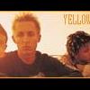
ARTommy Posted November 11, 2003 Posted November 11, 2003 heres a banner i mad its of Hrlembeat characters. comments and criticism welcome!
Baron Samedi Posted November 11, 2003 Posted November 11, 2003 Hhhmmmm. Never heard of Harlembeat However, I like your banner. The border is good, the text looks very effective, and the picture of the guy with the hat fits in well. What doesn't seem to fit in with the banner is the guy in the singlet... for some reason he doesn't fit. He just... seems a bit mis-matched, perhaps find anothe rpicture of him. Overall, I like it. 7.5/10
ARTommy Posted November 11, 2003 Author Posted November 11, 2003 thanks Baron I'll kep that in mind when i'm redoing it heres another one of Zelda that i did for a reguest i tried to use a Zelda through out the ages type of theme
CharmedImmortal Posted November 11, 2003 Posted November 11, 2003 Wow, the first banner looks cool. But...can you make something for the background? I don't want to make you feel bad, but to tell the truth having only a red background with the name is...boring. The second one is awesome! Nicely done. I also like the litle link. It looks cute! ^_^ Really, really, REALLY nice! Make more pls!
ARTommy Posted November 11, 2003 Author Posted November 11, 2003 Thanks Charmed! i know the red backround is pretty durn boring but I cant think of any thing else to put there..oh well heres a third one for the heck of it. i think i laso did this for a request
CharmedImmortal Posted November 13, 2003 Posted November 13, 2003 Aha! Cute Vash! I like the third one better. The vash picture is so purrty and CUUUTE!!! ^_^ 9/10 Do more please?
Recommended Posts
Create an account or sign in to comment
You need to be a member in order to leave a comment
Create an account
Sign up for a new account in our community. It's easy!
Register a new accountSign in
Already have an account? Sign in here.
Sign In Now