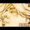
Epitome Posted February 5, 2004 Posted February 5, 2004 [size=1]This is going to me entry to the banner making competition so I was just seeing what you thought. I dont think that it turned out as well as I had liked it to. It looked alot better in the program while I was editing it. So comments please.[/size]
Darkest Moment Posted February 5, 2004 Posted February 5, 2004 [size=1]The first thing that stood out was the text and im sorry but the font is to plain for my taste and the boarder that goes along the line in the middle appears a bit big, but other than that it looks ok. Overall the banner has a bit blur. Nice job though.[/size]
Recommended Posts
Create an account or sign in to comment
You need to be a member in order to leave a comment
Create an account
Sign up for a new account in our community. It's easy!
Register a new accountSign in
Already have an account? Sign in here.
Sign In Now