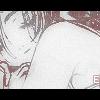
Epsilon Posted April 4, 2004 Share Posted April 4, 2004 [COLOR=SlateGray][SIZE=1] After recently seeing the anime, Wordsworth. I decided to make some sort of thing of one of some of the images I had. Originally a wallpaper, I took the wallpaper and turned it to a banner and avatar. Originally though, the origanl bg I had made for the wallpaper/banner is lost because I didn't save it. It had been shades of of pink, red, and white with flowers. Just as well I suppose, I think the current bg of the banner suits the character much better. Really happy with the results, C&C please. Enjoy! [/SIZE][/COLOR] [IMG]http://www.otakuboards.com/attachment.php?attachmentid=18468&stc=1[/IMG] [IMG]http://www.otakuboards.com/attachment.php?attachmentid=18469&stc=1[/IMG] Link to comment Share on other sites More sharing options...
AzureWolf Posted April 9, 2004 Share Posted April 9, 2004 [font=Georgia][color=blue]Whoa... Are you [i]the[/i] Ruby of the old OB? Haha, I remember you! Nice to see that you are still around![/color][/font] [font=Georgia][color=#0000ff]Getting to the artwork... the banner's really nice. The purples complements the red-hued girl really well, but it's a little faded. You should increase the contrast of the BG to correct that problem.[/color][/font] [font=Georgia][color=#0000ff]The same thing goes for the avi. It has this "magazine scan" look to it. It was a cool effect idea, but the picture seems too faded now. If you could somehow keep that effect [i]AND[/i] the picture's color, that'd be perfect.[/color][/font] [font=Georgia][color=#0000ff]If it doesn't make sense, the quality of the girl in the banner is what I'm talking about. Notice how everything else, compared to that stock picture, appears faded.[/color][/font] [font=Georgia][color=#0000ff]Hope that helps.[/color][/font] Link to comment Share on other sites More sharing options...
Epsilon Posted April 9, 2004 Author Share Posted April 9, 2004 [SIZE=1][COLOR=SlateGray]^_^ Thanks for the advice AzureWolf. Yeah it got a little too faded on the avi. And I think a little soft on the banner, but I'm going to go back and try to fix that. Instead of making another thread for banners I'm just going to use this one. So here's my next one, it's from an video game called; Shoujo Yoshitsune Den. The bg took awhile to get in there because of the cropping with the girl on the right's hair. But being able o re-color parts of the image was fun.[/COLOR][/SIZE] [IMG]http://www.otakuboards.com/attachment.php?attachmentid=18585&stc=1[/IMG] [IMG]http://www.otakuboards.com/attachment.php?attachmentid=18584&stc=1[/IMG] Link to comment Share on other sites More sharing options...
AzureWolf Posted April 11, 2004 Share Posted April 11, 2004 [font=Georgia][color=blue]That's a very well-executed theme right there. The only thing I could say that seems... strange(?) would be that the avatar is larger than the banner in terms of height. That just seems a little weird.[/color][/font] [font=Georgia][color=#0000ff]Aside from that, the BG is a very nice touch, and the stock pictures appear very natural on it. The positioning of the hand and the light in the banner was a nice touch.[/color][/font] [font=Georgia][color=#0000ff][/color][/font] [font=Georgia][color=#0000ff]No complaints here. ^_^[/color][/font] Link to comment Share on other sites More sharing options...
Recommended Posts
Create an account or sign in to comment
You need to be a member in order to leave a comment
Create an account
Sign up for a new account in our community. It's easy!
Register a new accountSign in
Already have an account? Sign in here.
Sign In Now