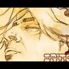
Epitome Posted April 22, 2004 Share Posted April 22, 2004 [size=1]This combination comes from the Animatrix. I think they both turned out fairly well. I didnt add any text because I tried to add some but it made it look alot worse. So please comments, and suggestions.[/size] Link to comment Share on other sites More sharing options...
Epsilon Posted April 22, 2004 Share Posted April 22, 2004 [SIZE=1][COLOR=SlateGray]Nice work, Hataki Vash. Both the avatar and banner are, pretty much perfect and high quality. I see what you mean by not adding text because of how you'd get it in, but I think it looks just fine with out any text [b]Avatar[/b] I like the fact that you went with the double, one white line, border rather then a plain border. It adds to the feel of the light in the image, also accents for the door frame and the other items within the image that aren't totally seen. [b]Banner[/b] Dido above, but I don't like the way there, seems as though to me, that over on the opposite side of the character/person right by the first inner border the green seems to curve a bit. (Although, it may just be my eyes. Don't know...) It'd try to straighten that out, but it all depends on eye sight and comprehension of that dark of green were it fades.[/SIZE][/COLOR] Link to comment Share on other sites More sharing options...
Recommended Posts
Create an account or sign in to comment
You need to be a member in order to leave a comment
Create an account
Sign up for a new account in our community. It's easy!
Register a new accountSign in
Already have an account? Sign in here.
Sign In Now