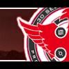
Bullet Theory Posted August 23, 2004 Posted August 23, 2004 Here's a banner I made featuring one of my favorite local bands, Bury Your Dead: [IMG]http://tinypic.com/3563d[/IMG] Ratings, please! EDIT: There is a white boarder but you can't see it. I swear it's there.
Haze Posted August 23, 2004 Posted August 23, 2004 Bweeeeee!! I <3 BYD! I saw them when they came to [my] town a few months ago. It is really simple. I don't suppose with non-anime stocks you could crop and all that and still have them look right. I might suggest taking the original image, and downsizing it, then re-cropping. It would look better if you could see more of his face... I suppose I mean like...zooming-ot? I can't quite think right now. I would also suggest a font that is more complex. That one is far too simple, in my opinion. Something that would fit in with tht BYD style perhaps? I don't know. Good job.
Guest Mana Posted August 24, 2004 Posted August 24, 2004 Alright, I'll be honest with you. I give this banner a 1 out of 10, becuase it seems too plain. Way too plain. It's very simple, but not artistic, you know? It needs a better background, I think. Nice try though. But I wouldn't use it if u payed me money. But you did want ratings so don't complain about my rating. But it is good enough I suppose. It's not bad, it's just not great, ya know? -MILZ
Recommended Posts
Create an account or sign in to comment
You need to be a member in order to leave a comment
Create an account
Sign up for a new account in our community. It's easy!
Register a new accountSign in
Already have an account? Sign in here.
Sign In Now