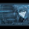
Salvation Posted August 12, 2005 Posted August 12, 2005 Here is my avatar and banner :) All comments and criticism welcomed!
Retribution Posted August 13, 2005 Posted August 13, 2005 [SIZE=1]Ooh... Ghost in the Shell. Cool stuff. [b]Banner:[/b] Pretty good on the whole -- I can tell you know what you're doing from the various effects you used. You used appropriate font, and placed it well. The faded stock works very well to boot. My only problems with this is 1) the white space in the center, and 2) the right edge of darkness and light. It looks a little too obvious the distort filters you used, and perhaps a small blur would fix that. [b]Avatar:[/b] Assuming you didn't crop this from another wallpaper/banner/avatar, it's a job done extremely well. There's really nothing to critique, except I wish the stock was larger, and the border more noticable.[/SIZE]
Recommended Posts
Create an account or sign in to comment
You need to be a member in order to leave a comment
Create an account
Sign up for a new account in our community. It's easy!
Register a new accountSign in
Already have an account? Sign in here.
Sign In Now