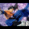
Malkav Posted June 1, 2007 Share Posted June 1, 2007 Stuff I've been working on. [img]http://img.photobucket.com/albums/v103/myndara/Nero03.jpg[/img] [img]http://img.photobucket.com/albums/v103/myndara/malkav2.jpg[/img] [img]http://img.photobucket.com/albums/v103/myndara/Untitled.jpg[/img] The third one's been worrying me, I've reserved it for a friend (her name's not on there yet) I may have went overboard with the brushes. I made the last two today. I decided to go with 300x100 cause the 500 is just too linear. Link to comment Share on other sites More sharing options...
jigglyness Posted June 2, 2007 Share Posted June 2, 2007 For the first one, I think that there is a little too much bg space and maybe make the text stand out just a little more but not too much to distract it from the stock. For the second one, It's pretty good but I think you could do a little better with the text. Other than that, its fine. :] As for the third one, Try to make the face pop out more so it's not lost in the brushing. And one more thing. In my opinion, try not to have the stock in the straight center of the sig. I find it to not be as stylish. *shrug* You seem to be in the right track. Keep up the good work. :] Link to comment Share on other sites More sharing options...
Malkav Posted June 2, 2007 Author Share Posted June 2, 2007 [IMG]http://img.photobucket.com/albums/v103/myndara/Anjisig.png[/IMG] My best one so far. Script fu in the GIMP helped me alot A far as text and drop shadows went. Also took advantage of feathering. When I fix the cheshire cat one I'll re upload it on this post as an edit. Link to comment Share on other sites More sharing options...
Recommended Posts
Create an account or sign in to comment
You need to be a member in order to leave a comment
Create an account
Sign up for a new account in our community. It's easy!
Register a new accountSign in
Already have an account? Sign in here.
Sign In Now