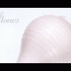
treton_noir Posted February 23, 2003 Posted February 23, 2003 here's something i just made. as the title suggests, its a bit of the abstractedness. ime not exactly sure what "C+C" means, but it seems to get replies. lol so here it is. c+c. ^_~
PiroMunkie Posted February 23, 2003 Posted February 23, 2003 [color=indigo][size=1]It is okay, I suppose. Those dots are annoying. You did that in another work of yours. Just not my flavor, I guess. The rest of the banner looks nice, though. Those dots are just too strong and outstanding against the rest of it.[/color][/size]
Chaos Posted February 23, 2003 Posted February 23, 2003 Radial blur with plastic wrap and adding numbers and dots are not cool. Hellbird is cool. ^-^;; *points to the harsh change between red, white, and blue* Well, I suppose you're patriotic at least...O_o
PiroMunkie Posted February 24, 2003 Posted February 24, 2003 [QUOTE][i]Originally posted by Medra[/i] [B]Radial blur with plastic wrap and adding numbers and dots are not cool. Hellbird is cool. ^-^;;[/B][/QUOTE][color=indigo][size=1]I am not seeing a Radial Blur in there, comrade. o-O Perhaps your down time from Photoshop has taken its toll?[/color][/size]
GinnyLyn Posted February 24, 2003 Posted February 24, 2003 I tried to look at this again in b/w, and I like it better like that. There's something that's just not right about the colors. Plus, the numbers seem to disappear from the viewer's eye. Other than that, the effects and texture are fun to look at. ^^;
Recommended Posts
Create an account or sign in to comment
You need to be a member in order to leave a comment
Create an account
Sign up for a new account in our community. It's easy!
Register a new accountSign in
Already have an account? Sign in here.
Sign In Now