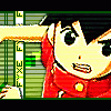
Fyxe Posted October 19, 2003 Share Posted October 19, 2003 [SIZE=1][COLOR=darkblue]Well, just as the title says... this is my first banner. We just got Adobe Photoshop 7.0 so I messed aroung with it a little and this is what I came up with. This is a simple Mia banner. I just played around with the little stuff, so it's pretty plain. I didn't have any good quotes either, so the phrase isn't that good. Please tell me your comments and what I can improve on, etc. Enjoy. ^_^[/COLOR][/SIZE] Link to comment Share on other sites More sharing options...
Guest PhoenixFlame Posted October 19, 2003 Share Posted October 19, 2003 looks great,btw where could i get adobe? Link to comment Share on other sites More sharing options...
Dagger Posted October 19, 2003 Share Posted October 19, 2003 It's a nice first banner. I like how the font matches her hair color. However, the red kind of clashes with the calm turquoise of the text... try putting a silvery-white color (as in the background) behind it instead. The images are a little fuzzy, too. Is that because of the source material, or because you saved it at a low quality setting? In general, a good effort. ~Dagger~ Link to comment Share on other sites More sharing options...
Fyxe Posted October 19, 2003 Author Share Posted October 19, 2003 [QUOTE][i]Originally posted by PhoenixFlame [/i] [B]looks great,btw where could i get adobe? [/B][/QUOTE] [SIZE=1][COLOR=darkblue]I don't know where we got adobe. But you just need to look in a programing store, that's all I know. And Dagger, I know that the red doesn't go with the pic, but I was just playin aroung with things. The images just happened to turn out fuzzy, I had to make that one with her folding her arms bigger than it was, so that's how it turned out. Anyway, thanks for the comments, I'll be making more in the future... so keep watch![/COLOR][/SIZE] Link to comment Share on other sites More sharing options...
Ayokano Posted October 19, 2003 Share Posted October 19, 2003 [COLOR=darkred][size=1]...... There is a thread with the same title right below this one..... o_o The picture on the right dosen't really look good, but the one on the left looks great. I agree with Dagger that the color of the font is nice how is the same color of her hair, but that red needs to be change. I like the background, and the picture on the left. The banner itself is quit good for a first ^_^[/COLOR][/size] Link to comment Share on other sites More sharing options...
Assassin Posted October 19, 2003 Share Posted October 19, 2003 [size=1][color="666666"] The banner looks awesome. I just don't like the text and the red surrounding the text lol. Have you tried different types of fonts. Also, the left stock[image] looks great with the banner but the right stock[image] looks sorta blurry to me. Great job though and keep up the awesome work. Overall Rating : 8/10 [/size][/color] Link to comment Share on other sites More sharing options...
Fyxe Posted October 20, 2003 Author Share Posted October 20, 2003 [SIZE=1][COLOR=darkblue]Ok, I made another today. Yet again, I was just experimenting. This one is another simple, plain banner. I'll get into the more detailed things once I figure everything out. This one has some better picture quality than my other banner did. Also I know the blue outlines on the letters don't go well with the banner, but I couldn't find anything better. Anyway, instead of making a whole new thread, I will just post my banners here. I hope you enjoy this one as well and I love to hear comments/ what I can inprove, etc. So keep 'em coing. ^_^[/COLOR][/SIZE] Link to comment Share on other sites More sharing options...
Haze Posted October 20, 2003 Share Posted October 20, 2003 it looks good, except the blue letters. . . and even hey are not incredibly icky. its pretty good! i dont like teh red for the first one either. it doesnt flow. who is this mei chick anyway? Link to comment Share on other sites More sharing options...
Fyxe Posted October 20, 2003 Author Share Posted October 20, 2003 [QUOTE][i]Originally posted by Haze_Gundam006 [/i] [B]it looks good, except the blue letters. . . and even hey are not incredibly icky. its pretty good! i dont like teh red for the first one either. it doesnt flow. who is this mei chick anyway? [/B][/QUOTE] [SIZE=1][COLOR=darkblue] Mia is a character from the Golden Sun series, it is one of my favorite GBA series. She is a water adept, so yeah. I know about the outlines of the letters, maybe I should try more colors or just stop using it when I don't know what to put for the color. Lol, that is probably the best solution. Anyway, thanks for the coments, I'll try to use different things in the future. I hope I will get better. ^_^[/COLOR][/SIZE] Link to comment Share on other sites More sharing options...
Recommended Posts
Create an account or sign in to comment
You need to be a member in order to leave a comment
Create an account
Sign up for a new account in our community. It's easy!
Register a new accountSign in
Already have an account? Sign in here.
Sign In Now