Ozymandius Jones Posted February 12, 2004 Share Posted February 12, 2004 Well, I've figured out how to make banners...if anyone wants this one, feel free to take it...just give me credit. Also, constructive criticism is good, just be nice! [IMG]http://www.otakuboards.com/attachment.php?attachmentid=17436&stc=1[/IMG] Link to comment Share on other sites More sharing options...
Kanariya Posted February 12, 2004 Share Posted February 12, 2004 [size=1][color=chocolate]Mm, the quote is good for it, but there are some downs. You've just started on banners, so I'll try not to go too hard. One, the whole image is blurry, and that doesn't help. I do like the font you did use, but you also needed a border, a dark blue one I suggest for the dark blue theme. ^_^ For a first, it's not that bad really.[/size][/color] Link to comment Share on other sites More sharing options...
Syk3 Posted February 22, 2004 Share Posted February 22, 2004 [quote name='Ozy Jones']Ok, working on a second banner.[/quote][color=#30415d]We don't need an update; simply post the banners whenever you're done. ~_^[/color] Link to comment Share on other sites More sharing options...
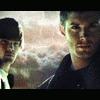
Ozymandius Jones Posted February 22, 2004 Author Share Posted February 22, 2004 Hey, I was just gonna edit that post! Oops. Well, now I know. Here it is, anyway... [img]http://www.otakuboards.com/attachment.php?attachmentid=17563[/img] Link to comment Share on other sites More sharing options...
Nomad Posted February 25, 2004 Share Posted February 25, 2004 [FONT=Book Antiqua][B][COLOR=DarkGreen]The First One: Alright, it seems alright for a first banner and whatnot. But, I don't like the fact that all that was done was an image put on a OB sized banner and text added. It's alright though. The text doesn't really fit well where it is. If it had a shadow or something it'd stand out more and look better. And a border wouldn't hurt, in fact it would help it out alot. Otherwise, it's a nice little banner. The Second One: This one I don't like at all, sorry. You can see where something was at the top of the banner, and the little box in the upper right hand corner isn't helping either. And the font is horribly placed. It's hard to read, and doesn't stand out. And yet again, there's no border so it takes away from everything. So that's what [I]I [/I] think. Sorry if I was a little harsh or whatever.[/COLOR][/B][/FONT] Link to comment Share on other sites More sharing options...
Pyrophobic Posted February 26, 2004 Share Posted February 26, 2004 Hrm, it occurs to me that you should look for better resolution images so that your banners are nice and sharp. The font choice for the first banner fits well with the tone of the image, but watch out where white overlaps onto white-blue. I wouldn't make the text any darker, but ... I don't know. Perhaps playing with its positioning without diminishing it too much in size As for the second one - this time the font seems a bit thin and it doesn't have enough of a punch - plus it's sort of stunted in its impact by being placed partly over the details of the image. Yup, borders'd be a good idea. I think the first banner's better and I'd certainly urge you to develop that one. Not bad for an early attempt, though. Hope you post another one soon. ^_^ Link to comment Share on other sites More sharing options...
Ozymandius Jones Posted February 28, 2004 Author Share Posted February 28, 2004 Hey, thank you all for answering...even those of you who could be described as 'critical'. I have been working on borders while I try to find a better version of the Sesshy pic. Here's the latest banner. [img]http://www.otakuboards.com/attachment.php?attachmentid=17725[/img] Link to comment Share on other sites More sharing options...
Kyokokeiji Posted February 28, 2004 Share Posted February 28, 2004 ok well the frist one: actully the image isnt blurry its just really rough and of bad quality but i find it hard to find one really good inuyasha anime image that int of bad quality. the quotes is very good though. ok the second one: much better image quality but still a little rough, a little bluring in the right areas will fix that right up. now i think the bad part fo this one is that the text isnt very noticable. if you ahve adobe photoshop you cane go to layer and click on layer style to make the text more noticible, and dimensional in some cases. the third one: the image itself is a good pic and its a very good quality. the quote goes great and the letters r more noticible. good job! had a hard time with banners at first also Link to comment Share on other sites More sharing options...
Ozymandius Jones Posted March 2, 2004 Author Share Posted March 2, 2004 Hey, a good review! How nice...I'm working on more elaborate banners now...I use the 'colored pencil' filter for the background, and you guys are right....borders do help. [img]http://www.otakuboards.com/attachment.php?attachmentid=17762&stc=1[/img] Link to comment Share on other sites More sharing options...
Recommended Posts
Create an account or sign in to comment
You need to be a member in order to leave a comment
Create an account
Sign up for a new account in our community. It's easy!
Register a new accountSign in
Already have an account? Sign in here.
Sign In Now