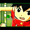
Fyxe Posted March 21, 2004 Share Posted March 21, 2004 [size=1][color=navy]Yay, I finally have the internet back! Anyway, in the time that I have been unable to use the internet, I made some more banners. It suprised me at how many banners I have made of this period of time. Normally it takes me forever to start on a banner... but I've made quite a few because of my boredom. I will be showing you three banners today. 1st banner: This is just a cute little .hack//SIGN banner I made. I loved the picture I had of Tsucasa and Kite together, so I kinda just played around a bit. It went rather well, or so I think, but I like this banner and I hope you people do too. It isn't that complicated, but it took me awhile to figure out what I was going to do. 2nd banner: This is a Angelic Layer banner, although I have never read/seen this series, I stumbled arcoss a picture I thought I could use. It may look plain, but I spent forever on the background. But it turned out well for my labor. 3rd banner: This banner is called Destination Destruction. I just took a picture I had found and played around with some different stuff and added a few things to my liking. It all jumbled up into a very interesting thing. Not my favorite banner ever, but interesting enough. I would really like some feedback on these banners so I can show you some more of my creations. ^^ Thank you and enjoy![/color][/size] Link to comment Share on other sites More sharing options...
AzureWolf Posted March 22, 2004 Share Posted March 22, 2004 [font=Georgia][color=blue][u]1st Banner[/u][/color][/font] [font=Georgia][color=blue]While I do like the art on the picture, and how you put the .hack logo in, the BG just doesn't fit. You should have something more .hack-ish, if that meaks sense. Come to think of it, I did this neat trick for an MGS banner once, where I made all hexagons in the BG: that would actually be perfect for this banner. Try something less "silly" for the BG.[/color][/font] [font=Georgia][color=#0000ff][/color][/font] [u][font=Georgia][color=#0000ff]2nd Banner[/color][/font][/u] [font=Georgia][color=#0000ff]The best of the bunch, I'd say. This banner has a really professional feel to it. There are a few cropping problems with the stock picture, but if you can take care of that, I'd have no qualms with this piece.[/color][/font] [font=Georgia][color=#0000ff][/color][/font] [u][font=Georgia][color=#0000ff]3rd Banner[/color][/font][/u] [font=Georgia][color=#0000ff]Seems lazy, and I'm not even talking from a Photoshop perspective. It has a cool idea, but I think you could do without the color inversion and try something more "risky."[/color][/font] [font=Georgia][color=#0000ff][/color][/font] [font=Georgia][color=#0000ff]I hope that helps. ^_^[/color][/font] Link to comment Share on other sites More sharing options...
Recommended Posts
Create an account or sign in to comment
You need to be a member in order to leave a comment
Create an account
Sign up for a new account in our community. It's easy!
Register a new accountSign in
Already have an account? Sign in here.
Sign In Now