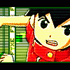
Fyxe Posted June 11, 2004 Share Posted June 11, 2004 [size=1][color=darkblue]Hey, I haven't had a banner thread for awhile... so here we go. A lot of this stuff is from awhile ago, probably from around Spring Break to now. Most of these look fairly simple, but depending on the banner I probably did more than you may expect. I hope you enjoy them, I have quite a few to show. So, C&C would be much appreciated. ^^ 1. [IMG]http://img58.photobucket.com/albums/v177/ShadowFox71/Conna_Banner.jpg[/IMG] This is my current banner, I had fun making this one. 2. [IMG]http://img58.photobucket.com/albums/v177/ShadowFox71/Tifa_Banner.jpg[/IMG] 3. [IMG]http://img58.photobucket.com/albums/v177/ShadowFox71/Wolfs_Rain_banner.jpg[/IMG] I just had to do a wolf's Rain banner, I probably made this the day after I saw the first episode. 4. [IMG]http://img58.photobucket.com/albums/v177/ShadowFox71/Nights_Embrace.jpg[/IMG] 5. [IMG]http://img58.photobucket.com/albums/v177/ShadowFox71/breath_of_heart_banner.jpg[/IMG] 6. [IMG]http://img58.photobucket.com/albums/v177/ShadowFox71/Cowboy_Bebop.jpg[/IMG] I just loved that picture with Ed and Ein, plus I had never actually made a Cowboy Bebop banner, so here it is. 7. [IMG]http://img58.photobucket.com/albums/v177/ShadowFox71/Melody_of_Nothing.jpg[/IMG] 8. [IMG]http://img58.photobucket.com/albums/v177/ShadowFox71/Now_until_the_break_of_day.jpg[/IMG] This one was pretty simple, I just did a lot of fading and tinting.[/color][/size] Link to comment Share on other sites More sharing options...
Epsilon Posted June 12, 2004 Share Posted June 12, 2004 [COLOR=SlateGray][SIZE=1]As always, very nice work Conna. The ones I like most are banners; 1, 3, 5, and 8. But I'll get to the reasons why soon. But simply about all of them, I like their borders. Even the no-bordered number 6. All high quality and good. Err...Oo Happy reading. --------------------------- [b]Banner:[/b] 01 You've done a good job with the grid effect, and having it coincide with the type of "shadow button" border. Something that isn't really easy to pull off as along the lines of "will it go well with the color scheme, and the over all feeling." The shades of blue go well with the character's expression, and the way the girl is angled inwards/downwards. You've also done a good job with text placing. The shade of black for the lettering helps bring out the pigments of gray in the shadowing border. [b]Banner:[/b] 02 The imaging goes well with the border. (I have no comment on the border since it was used in the above banner) The positioning is done well because of the fact that you've done a good job with the merged colored letting. I like the color of the bg, it kind of reminds me of a blinding light that she's trying to get away from. The font is good. But I dislike how the "A" is farther from the rest. It might just be the fonts it's self...I don't know which font that is... [b]Banner:[/b] 03 Personally, I think this banner has a wonderfully done border. Since it seems to me that the black and yellow seems to overlap and switch at some point. The font is absolutely perfect. It goes along with the eyes of the wolf and the howling image. Heh, I really love the fact of the howling wolf is in there. ^.~ [b]Banner:[/b] 04 A nice job on using the area round area. I like the blind effect and that it's not too strong or weak to contrast with image of the banner. Since the blind effect/fliter is there, it helps the banner to look more organized with the three line border. The area around the text is just fine, since it helps to define the text. I think it was a neat effect. But the area around the "G," "H," and "T" seems to be a little more pixelated then the rest of the lettering. [b]Banner:[/b] 05 First of all, I love the fact that this banner is "short" in terms of length. Having it go "longer" wouldn't have allowed it to give off the same feel. That being said, I like the angle of the character/image. It's a beautiful CGed one, and the expression just adds on to the banner size. A good judgment for the length. A good one lined border and the vertical lining going down on the right hand side is good. [b]Banner:[/b] 06 Not much to say about this one. I like the image because it goes well with the font. It could use a border line on Ed's and Ein's end. But no where else. [b]Banner:[/b] 07 Very pretty image you found there. The BG is beautiful and makes the banner look more elegant. I like the white lines going in back of the neko. And how the black border is about 2 pixels closer to the inside. Rather then laying it on the edge. But the font is iffy. Since it's the shade of white on a light blue area...It just looks a bit odd to me on where the light hits on some of the curves. [b]Banner:[/b] 08 My favorite out of all of these. The a liniment of the image goes great with the quote. So do the colors. I like how it's in a blue hue and a bit of grayscale at certain points in the banner. I really like the border and how it's like a clear inner line between the two. The font goes great over all. And the text shadow, drop down makes it remind me sort of like glass.[/SIZE][/COLOR] Link to comment Share on other sites More sharing options...
Recommended Posts
Create an account or sign in to comment
You need to be a member in order to leave a comment
Create an account
Sign up for a new account in our community. It's easy!
Register a new accountSign in
Already have an account? Sign in here.
Sign In Now