Raven's wing Posted March 3, 2005 Share Posted March 3, 2005 Please note that I do not take credit for any original artwork. I would love to hear comments. I have used many of these as signatures on different sites. Most don't fit the requirements for this one, however, if you would like a custom banner, just PM me. I'm Raven, by the way :catgirl: . I have many more, but five's the current limit, so comment and I'll put more up in my response. I'm working with Arcsoft Photostudio. This was a personal siggy banner... [img]http://img.photobucket.com/albums/v223/Raven1/angelangel2.jpg[/img] Gabriel from Angel sanctuary... [img]http://img.photobucket.com/albums/v223/Raven1/gabriel01.jpg[/img] Cowboy Bebop ( a personal favorite...spike rocks.) [img]http://img.photobucket.com/albums/v223/Raven1/cowboybanner1.jpg[/img] (Advertisement for another creative arts forum.) [img]http://img.photobucket.com/albums/v223/Raven1/creativearts1.jpg[/img] And yes, this one is a wall paper...lol. [color=teal]I uploaded that last picture for you, since it expanded the screen a bit. Hope you don't mind! ^_^ -Syk3[/color] Link to comment Share on other sites More sharing options...
Retribution Posted March 3, 2005 Share Posted March 3, 2005 [SIZE=1]Hey! I guess I'll evalutate your work. [B]1st picture[/B] was good... but you didn't really do anything to it. All I see is the text, which shouldnt've been to hard. [B]2nd picture[/B] I don't like very much. The blend (if any) was somewhat hard to spot. The rough transition from a black edge, to a picture of a girl, then back to the black is clumsy, and I had trouble spotting your text. That could use some position-tweaking and stuff... make it more noticable. [B]3rd picture[/B] is getting warmer. I like the blend... very nice. But once again, the text is misplaced and would look much better in another area. Play around with it. Only thing wrong is that the image of the raven standing is hard to see... I had to focus on it for a minute for make it out. [B]4th picture[/B] was alright. I liked the idea of tripling the girl's image, but it was done in a blocky-manner, so I can see the picture's outlines. I'd recommend cutting her out completely, so that you don't end up with those blocky lines. The flower is a whole 'nother story, as it is square and pretty much completely unblended. Again, the idea was good, with it looking like it's falling (I guess), but you need to cut out these images, so that it actually looks like a flower is falling. The text was hard to read. And when using elipses (...'s), you might want to only use three. Any more or any less looks awkward. ^_^ [B]The wallpaper[/B] needs improvement as well. The images didn't blend very well into one another, and so I'm left looking at individual cells of images. I'd recommend getting one really big picture of Ed, then maybe putting it over a [I]few[/I] smaller images of him. The text was in the middle and distracting... maybe next time try on an edge. Overall, you could use some work, but [B]Fear not![/B] You'll definetly get better with practice. Good luck in all your future art works.[/SIZE] Link to comment Share on other sites More sharing options...
Raven's wing Posted March 3, 2005 Author Share Posted March 3, 2005 [QUOTE=Retribution][SIZE=1]Hey! I guess I'll evalutate your work. [B]1st picture[/B] was good... but you didn't really do anything to it. All I see is the text, which shouldnt've been to hard. [B]2nd picture[/B] I don't like very much. The blend (if any) was somewhat hard to spot. The rough transition from a black edge, to a picture of a girl, then back to the black is clumsy, and I had trouble spotting your text. That could use some position-tweaking and stuff... make it more noticable. [B]3rd picture[/B] is getting warmer. I like the blend... very nice. But once again, the text is misplaced and would look much better in another area. Play around with it. Only thing wrong is that the image of the raven standing is hard to see... I had to focus on it for a minute for make it out. [B]4th picture[/B] was alright. I liked the idea of tripling the girl's image, but it was done in a blocky-manner, so I can see the picture's outlines. I'd recommend cutting her out completely, so that you don't end up with those blocky lines. The flower is a whole 'nother story, as it is square and pretty much completely unblended. Again, the idea was good, with it looking like it's falling (I guess), but you need to cut out these images, so that it actually looks like a flower is falling. The text was hard to read. And when using elipses (...'s), you might want to only use three. Any more or any less looks awkward. ^_^ [B]The wallpaper[/B] needs improvement as well. The images didn't blend very well into one another, and so I'm left looking at individual cells of images. I'd recommend getting one really big picture of Ed, then maybe putting it over a [I]few[/I] smaller images of him. The text was in the middle and distracting... maybe next time try on an edge. Overall, you could use some work, but [B]Fear not![/B] You'll definetly get better with practice. Good luck in all your future art works.[/SIZE][/QUOTE] Thanks for the comments...but in my defense, The pics you've described as "blocky" were supposed to be that way. Especially in the Wallpaper...those are supposed to be many cells of images. As for not doing anything with the first picture...here are the original two pics. [IMG]http://img.photobucket.com/albums/v223/Raven1/rose_red.jpg[/IMG] [IMG]http://img.photobucket.com/albums/v223/Raven1/21810-259606.jpg[/IMG] The second picture was my first attempt at photoshoping, and i'm not happy with it either. I intend to redo it soon. The third pic...that's not a raven, it's a man. But I see your point either way. Link to comment Share on other sites More sharing options...
Retribution Posted March 4, 2005 Share Posted March 4, 2005 [SIZE=1]Ah! Now I see that you did work. Good stuff on the first one. I like it. However, I think you could go far with abstract effects incorperated into your surreal art. You'd go far, but that's my opinion. And I still say that the wallpaper could use some more blending. The transition from picture to picture isn't exactly graceful. Good stuff though.[/SIZE] Link to comment Share on other sites More sharing options...
-tiGz- Posted March 4, 2005 Share Posted March 4, 2005 Not bad for what you did do. But for most of them, it does look as though u just added text. Good luck with future graphics! Photoshop is great! Link to comment Share on other sites More sharing options...
Black Moon Posted March 5, 2005 Share Posted March 5, 2005 Okay, I'll only comment on your Cowboy Bebop ones because I don't want to make assumptions about anime pictures that I know nothing about. Heh. Anyway, your first CB one. The darkening of the rose is great, I liked it. But as for the second part of the picture, the text hides Vicious, which is the main focal point. So now all you can see is the wings of the bird on his shoulder, which makes people think that it may be a raven. The tect can be moved up a line, so it goes: "Tell me again ... If the choice made is right." Bring "If the choice made is right" down, and you can see him again, and the text won't really bother the rose if you only bring it up for enough room for the next line. And your wallpaper. I agree, it does seem kind of choppy, but it's hectic. Which works very well for Ed, since she (yes, to those unfamiliar with Cowboy Bebop, Ed is a she) is whacky, and the blockyness portrays her. As for the others, all's I can say is I like 'em, andI can read the text fine. ^_~ Link to comment Share on other sites More sharing options...
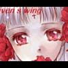
Raven's wing Posted March 5, 2005 Author Share Posted March 5, 2005 [IMG]http://img.photobucket.com/albums/v223/Raven1/Rei.jpg[/IMG] Here another one...I'm not fond of this one...Let me know what you think. Link to comment Share on other sites More sharing options...
Syk3 Posted March 7, 2005 Share Posted March 7, 2005 [quote name='marking time']That is Rei Ayanami it dont matter what it looks like if it's her cause she is my favorate anime character of all time. I LOVE IT[/quote][url="http://www.theotaku.com/~boards/showthread.php?t=32738"][b][size=4]READ ME.[/size][/b][/url] Please try to stick to the topic at hand here, rather than talking about a random character in the image. That doesn't help the artist much, if at all. Thanks. Link to comment Share on other sites More sharing options...
Roxie Faye Posted March 7, 2005 Share Posted March 7, 2005 [color=#9933ff]Oh my gosh. Your stuff is really good. I like the banner with the flower a LOT. I get what you were trying to do with it, and I like it a lot. I know that the first four have already been commented on and all, but I wanted to point out that your text is really bland in some areas. It's like you were using arial or helvetica. It gets really boring. Anything, even Times New Roman would have been better. The Eva picture? I think it's pretty good, considering you drew it all yourself (I could never get that good even if I tried). The background is too busy and takes away from the fantasticness of the picture. If it was more black, it would be better. The only real criticism for the last one is that the shade you used to um.... shade the suit is a little bit too blue. It kinda looks like the sun is setting and that's why the suit is dark, but then in her hair, the same effect doesn't exist, it looks like its daytime. But I do like the last one. I could never get that good. >__>[/color] Link to comment Share on other sites More sharing options...
Raven's wing Posted March 8, 2005 Author Share Posted March 8, 2005 I don't draw the original art...I just wanted to say that. I didn't color it or anything...I wish I was that good. That's actually the reason I turned to Photoshopping, I'm not that good with pen and paper. About the texts...I'm working with an extremely limited range. I have an early system...(5.0) and it's very frustrating. I'm saving up for a better program. I'm experimenting with a few ideas...if I find something that works, you can bet I'll have a broader range. Sorry about the blandness, but there's not much I can do about it right this second. Thanks for the comments, by the way. I'm only sorry that Black Moon is the only one who saw what I was doing with the Wallpaper. Maybe I'll redo it, when I get a little better. Link to comment Share on other sites More sharing options...
You Don't Care Posted March 11, 2005 Share Posted March 11, 2005 [QUOTE=Raven's wing]Thanks for the comments...but in my defense, The pics you've described as "blocky" were supposed to be that way. Especially in the Wallpaper...those are supposed to be many cells of images. As for not doing anything with the first picture...here are the original two pics. [img]http://img.photobucket.com/albums/v223/Raven1/rose_red.jpg[/img] [img]http://img.photobucket.com/albums/v223/Raven1/21810-259606.jpg[/img] The second picture was my first attempt at photoshoping, and i'm not happy with it either. I intend to redo it soon. The third pic...that's not a raven, it's a man. But I see your point either way.[/QUOTE] The second pic in this post is astounding (and I hate using this word). I do NOT know why you don't like it! Staging is placed with precision and the feeling is "m y s t i c a l ?!" Besides that keep up the work. [quote name='Raven's wing']I don't draw the original art...I just wanted to say that.[/quote] Good, because I almost freaked out! Rei is from another pic that I have on my labtop! I hate "IT" when people take credit for other people's work! Now that that is out of the way, were you going for mood in the pic with Rei? Link to comment Share on other sites More sharing options...
Raven's wing Posted March 12, 2005 Author Share Posted March 12, 2005 I'm not sure, to be honest with you ...sudden clarity. I'm not familiar with the series...my friends say it's pretty good. It was sudden inspiration, I liked the original pic. Rei was in a bit of sunshine actually, Mistress roxie...I tried to keep that effect against the chaotic background. I don't think it worked very well...I'd blame the program...but that'd be an excuse...so I blame it on my rookie status. Still new. Link to comment Share on other sites More sharing options...
Recommended Posts
Create an account or sign in to comment
You need to be a member in order to leave a comment
Create an account
Sign up for a new account in our community. It's easy!
Register a new accountSign in
Already have an account? Sign in here.
Sign In Now