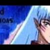
chaoschris89 Posted June 6, 2005 Share Posted June 6, 2005 I got bored last nigth and made this 3 different psp tubes some fading and floodfills and here we go [URL=http://img189.echo.cx/my.php?image=lld7as.jpg][IMG]http://img189.echo.cx/img189/7376/lld7as.th.jpg[/IMG][/URL] tell me what ya think. Be brutal Link to comment Share on other sites More sharing options...
Retribution Posted June 6, 2005 Share Posted June 6, 2005 [SIZE=1][QUOTE]Be brutal[/QUOTE] I don't like it very much, first of all, but it is original. The repeating background of typography original, but it looks pretty bad. The font itself is some standard, default type, and the drop shadow throws the 3-d effects of the foreground all out of whack. As for the foreground, it had the potential to be something really great, but instead, I'm left with three separate, uninvolved characters whose perspectives are off. The woman is standing, the tiger is standing, but from a different point of view, and and the devil guy is standing in a different perspective. It looks rather unorganized, and I have no idea why a devil would have a white glow eminating from it. I'd go with black next time. In summary, it was a failed attempt at being original. The background was the first thing that killed it, and it doesn't look like you've done much except take another person's characters and put them on that cheap, elementary looking background. Better luck next time?[/SIZE] Link to comment Share on other sites More sharing options...
Ezekiel Posted June 6, 2005 Share Posted June 6, 2005 [SIZE=1]The extraction is good, my PSP has been annoying me by leaving behind some white pixels lately, so well done on not having them left behind on the image(s?). Like Retri said, the background is repetitive but I can see where you were going with it. What I think may have look better was having the text faded more and the have the background colour less drab. I also don't think the text colour suits too well with the overall look. But these are all things that get better as you experiment more, so I suggest going over and messing around with aaaaall the settings. May I ask what version of PSP you are using? I can't find how to do that to text with mine and I'm on PSP9 O_o;[/SIZE] Link to comment Share on other sites More sharing options...
Ima Posted June 6, 2005 Share Posted June 6, 2005 I am going to have to go with Retribution on this(Very nice wrap up hard to follow) But the "Devil Guy" Sortof looks like Seperioth(Just my thoughts) the backround well it is horrible I mean any person can throw a pure grey backround together, put some text ect. The renders themself are cool but are not placed correctly and just look as if you threw them on there. It kinda looks like you tried to get the women to pet the wolf? Oh well its decent but its not my style. Link to comment Share on other sites More sharing options...
Delta Posted June 7, 2005 Share Posted June 7, 2005 [COLOR=#7C0201][SIZE=1]Do tell us what you're trying to do with it. If it's: [b]A) A display of your mad skillz in extraction[/b] Those images are tough ones to clean up but were extracted out of their presumably miserable backgrounds as if by the nimble hands of a pro. If the girl and the wolf are from separate images (looks like it) then you deserve even more praise. You preserved the thinnest of outlines and made them look as if they were rendered (sic) directly onto the canvas. Most excellent. [b]B) An experiment in PSP decoupaging[/b] (what a term!) The lower half is detail-heavy. The arrangement should guide the eyes from left to right (so they could see the whole composition) and not downwards. Perhaps you should move the girl's image upwards. The way I see it, the combo can be contained in a triangle (formed by the sword's tip, and the wolf's tail and right paw). And then you could rotate the red guy's image by some 180 degrees and also move him upwards. His image can form another triangle (vertices at the left ear, wing tip and the image's lower right corner) that could balance out the girl/wolf combo. Keh, but that's just me. *winks*[/SIZE][/COLOR] Link to comment Share on other sites More sharing options...
chaoschris89 Posted June 7, 2005 Author Share Posted June 7, 2005 Ok thank you all I'll probly remake that sometime and here are some more I made. again be brutal :animesmil Frozen Pain [url=http://img232.echo.cx/my.php?image=frozenpain3jl.jpg][img=http://img232.echo.cx/img232/5402/frozenpain3jl.th.jpg][/url] Bulldog, made this tag for my mom awhile back. [url=http://img232.echo.cx/my.php?image=kaytbulldog3wu.gif][img=http://img232.echo.cx/img232/1569/kaytbulldog3wu.th.gif][/url] Link to comment Share on other sites More sharing options...
Retribution Posted June 7, 2005 Share Posted June 7, 2005 [SIZE=1][QUOTE]again be brutal[/QUOTE] Well, did you make the picture to the [B]first one[/B]? If not, you really didn't to much of anything. You added some text which looks pretty pixelated, and set it on a repeating background. Good extraction though. Did you draw that? If so, hats off -- you pwn. The second picture looks mediocre. If you drew the bulldog on the computer, good job. The graphic is rather simple, repeating quickly and the pixels 'flinch' on the edge of the picture. Again, something to be fix. The text is very plain, and in general, this isn't much to look at. But I can't diss it too bad, cause you made it for your mom, which was a nice thing of you to do.[/SIZE] Link to comment Share on other sites More sharing options...
PAche Posted June 8, 2005 Share Posted June 8, 2005 i saw all 3 of your pics and here's what i think: first one- its kind of plain and your characters are a bit too "in your face".plus they're all cluttered in one place so it makes the viewer kind of focus into that corner and ignore the rest. second one- its cool(no pun intended ).and like your other two pictures, the extraction was great, if you did extract it.once again, its rather plain and bare.maybe you could try to make more background? third- plain background again.and you did that for your mother?wow, you got a pretty funky mother, to like this kinda stuff :bellylol: then again, maybe its just me :D p.s i'm honoured you've kept the signture and avatar i made for you for so long :animesmil Link to comment Share on other sites More sharing options...
chaoschris89 Posted July 6, 2005 Author Share Posted July 6, 2005 ok been awhile since ive been online here is a simple animation that my girlfriend got me to make. The are clow cards for those that dont know. These are actualy 2 of my favorites [COLOR=Indigo]The Dark[/COLOR] and [COLOR=DarkRed]The Firey[/COLOR]. havent thought of anything to do with them though. Well tell me what you think of animation be brutal. and if you have any ideas on what i should use it for feel free to tell me. [CENTER][URL=http://img210.imageshack.us/my.php?image=clowcardsdarkandfirey9gb.gif][IMG]http://img210.imageshack.us/img210/5250/clowcardsdarkandfirey9gb.th.gif[/IMG][/URL][/CENTER] Link to comment Share on other sites More sharing options...
Recommended Posts
Create an account or sign in to comment
You need to be a member in order to leave a comment
Create an account
Sign up for a new account in our community. It's easy!
Register a new accountSign in
Already have an account? Sign in here.
Sign In Now