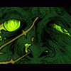
cancer Posted June 7, 2006 Share Posted June 7, 2006 [COLOR=Purple][SIZE=1]Within this thread I will post all of the fanart that I create from now on. I will also post some original sketches in here. I would appreciate any comments. I will try to draw one fanart a week at least. So I'll start this off with two pictures.[/SIZE][/COLOR] [IMG]http://i43.photobucket.com/albums/e389/xliquidousx/originalsketch.jpg[/IMG] [COLOR=Purple][SIZE=1]original sketch of a character based off of Lucifel of Angel Sanctuary.[/SIZE][/COLOR] [IMG]http://i43.photobucket.com/albums/e389/xliquidousx/AxelandRiku.jpg[/IMG] [COLOR=Purple][SIZE=1]fanart from Kingdom Hearts II. This is Axel and Riku. [/SIZE] [/COLOR] Link to comment Share on other sites More sharing options...
Dragon Warrior Posted June 7, 2006 Share Posted June 7, 2006 Heh, I don't know what Angel Santuary is, like I told you, but I really like that sketch. It's really well done. It almost seems flawless. I'm particularly fixed on the hair, how you individually did the hair strings and have the shine in as well. And the ear still shows through, which is a nice effect. I'd like to see that with more detail :) I'm not so intrigued by the Kingdom Hearts one. It's really good, though, but the people seem a tad odd looking to me. Maybe (Axel?) the white haired person's chin is too long, it seems. It looks like they have a massive jaw. The black-coated guy seems fine, though, and I particularly like how you did his flaming red-orange hair. So in the end, I like the black-coat person better than the white-haired one, but it's still pretty good. Nice colored penciling. Good work, sir :) Bring us more of these. Link to comment Share on other sites More sharing options...
cancer Posted June 8, 2006 Author Share Posted June 8, 2006 [SIZE=1][COLOR=Purple]Wow, only one comment so far? Can I get some more comments please? I spend hours on fanart and I'd like to know what people think. Thanks. Also, please go comment/rate my fanart at [URL=www.theotaku.com]www.theotaku.com [/URL]. It takes a couple of days, so every so often, it would help. Thanks a lot. Okay, here's a new piece I did today:[/COLOR][/SIZE] [IMG]http://i43.photobucket.com/albums/e389/xliquidousx/Sephiroth.jpg[/IMG] [COLOR=Purple][SIZE=1]Sephiroth, of course <3[/SIZE][/COLOR] P.S. I am currently taking requests for drawings. If you have a request, please PM me. Thanks. Link to comment Share on other sites More sharing options...
Dragon Warrior Posted June 8, 2006 Share Posted June 8, 2006 This will definitely be my favorite of the three now :P Having said that, I do have some thoughts. For one thing, why does he look so innocent and happy? Isn't Sephiroth the evil of all evils and meniacally insane and wants to kill all and stuff? Maybe I'm missing something. Nevertheless, the coloring job is really well done. I mean, the coat is superb. And the shine on the shoulder pads is excellent. Of course the fire's a nice touch. You've definitely got him spot on (aside from the face, to my liking). Well done. Maybe you should try more FF later :) Link to comment Share on other sites More sharing options...
Epsilon Posted June 8, 2006 Share Posted June 8, 2006 [COLOR=SlateGray][SIZE=1][b] Image 001.:[/b] [i]Original Sketch.[/i] I enjoy the characters expression and your use of color. The green snake / reptile in the background really helps to accent the character's eyes further. However, I must say that the concept reminds me more of the artist Amano. Rather then the art work of Angel Sanctuary or it's concept of the character Lucifel. The dynamics of the face and angle of hair are done very well. As Dragon Warrior has already stated, I'd like to see more detail on the piece. The simplicity of the clothing doesn't contrast very well with the detail and eye catching movements of the hair, reptile, and facial expression. The only other thing that bothers me is how pointed the upper tip of the characters ear is. Other then those small things, I like this image very much. [b] Image 002.:[/b] [i]Kingdom Hearts II.[/i] The concept seemed to catch my eye before the drawing it's self did. In this image you did very well on using the concept of the triangular design principal. Eyes fallowing the two characters, up to the comet in the sky and back down to the hole (crater) in the mid selections background. Also, the area where the sky meets the horizontal line. Gradually becoming lighter. Although I think you did very well on the concept... Your design elements and execution could have been better. What has bothered me most, is that your horizon line is... Flat. The areas around the holes or craters are as well. Generally there would be mounds of areas around the holes / craters that would rise. Even if only slightly. As I was looking at this I noticed six areas upon the ground that rise and have a darker outline. Those same kind of shadows and build up of the ground's material should appear around the holes / craters. As for the horizon line, I think that it's incoherent when paired with the rest of the image. Regardless of how long the land, water, etc. stretches for. There should be slight deposits or dips that are more noticeable. A smaller comment now. In the human skin you can find nearly every hue or color pigment you can imagine, when under the correct lighting or glow. Since the sky is purple, indigo, blue, etc. there would be a light shadowing of those colors. [b] Image 003.:[/b] [i]Sephiroth.[/i] The concept of Sephiorth and flames is always a nice concept to try once or twice. To see the variations of an artist's interpretation. I like the high lights used upon his clothing, armor, and sword. The colors of which you chosen go well together. Especially your blending of colors on the flames. The thing I notice most about this image is that it's very 1 dimensional. There are no row of flames. Nor do any of the flames move around or are in front of Sephiorth. The shading on the upper most of the picture seems messy and fairly rushed. [/SIZE][/COLOR] Link to comment Share on other sites More sharing options...
cancer Posted June 8, 2006 Author Share Posted June 8, 2006 [SIZE=1][COLOR=Purple]Thank you Epsilon and Dragon Warrior. Your critiques really helped me to learn some things. Now I can use this information to better my future fanart. I really appreciate the time you gave in critiquing these very well. ^_^[/COLOR][/SIZE] Link to comment Share on other sites More sharing options...
Recommended Posts
Create an account or sign in to comment
You need to be a member in order to leave a comment
Create an account
Sign up for a new account in our community. It's easy!
Register a new accountSign in
Already have an account? Sign in here.
Sign In Now