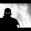
Zidargh Posted August 1, 2002 Posted August 1, 2002 Very simple. I just cooked it up. I think it's quite effective, just with one image and taking off between merging and font usage.
PiroMunkie Posted August 1, 2002 Posted August 1, 2002 [color=indigo]Quite interesting. The title says it all. Sweet and simple. The overall image seems to be a tad bit low in quality, but it's not too noticable. :)[/color]
Chaos Posted August 2, 2002 Posted August 2, 2002 A little too simplistic for my tastes, but by all means nice. Nothing to get excited over, nothing to cry about. :)
wrist cutter Posted August 2, 2002 Posted August 2, 2002 Eh, I hate to say, but I don't really like it. Splitting the image apart to fit the banner just doesn't work for me, but I guess that's just a personal peeve. I like what you did with the text, though. That turned out nicely.
Corey Posted August 2, 2002 Posted August 2, 2002 You should attempt to try to sharpen his face at least. Other than that it's really good.
No-Name Posted August 2, 2002 Posted August 2, 2002 I think that it suites your name and that's what makes it good.
Zidargh Posted August 2, 2002 Author Posted August 2, 2002 He he thanks. But FYI, I didnt split it up so it would fit the banner, I just tried, to make it more dramatic with tension, something that can be quite effective if thought over ya know? But thanks for the comments anyway guys.
Recommended Posts
Create an account or sign in to comment
You need to be a member in order to leave a comment
Create an account
Sign up for a new account in our community. It's easy!
Register a new accountSign in
Already have an account? Sign in here.
Sign In Now