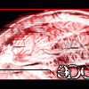
Subversive Posted June 25, 2003 Posted June 25, 2003 I hope you like this picture I made of you. I can't wait to see you, and don't worry I'll bring the money. (hehehe)
Guest Zeh Posted June 25, 2003 Posted June 25, 2003 Thats neat. The right side seems a bit bare, with the blurrry thing on the left, but the text helps with that. The colors actually look cool together, pretty neat.
Guest The Vietnamese Posted June 25, 2003 Posted June 25, 2003 i think the blurry thing on the left is supposed to be some sort of fire shot back from behind that vehicle. Like a rocket when it blasts off into space
The Vampire: Ed Posted June 25, 2003 Posted June 25, 2003 That's awesome looking. I like the picture you chose, and the letters look pretty neat. I have never really been a fan of F-Zero, but that's a cool looking banner.
GhostofSalvtore Posted June 25, 2003 Posted June 25, 2003 There my friends is a prime example of a good banner, very nice indeed, keep up the good work. And with my banner as well......(yes I know I gotta get the pic, but I'm lazy)
Turkey Posted June 26, 2003 Posted June 26, 2003 If you made it just a little bit lighter, and added something to the right side, it would be perfect. I really like the blurry effect.
Arkadyz Posted June 26, 2003 Posted June 26, 2003 [color=red][font=times new roman]Pretty nice looking banner...Only critque I would have is what Turkey said...Its abit too dark and alittle empty but still an excellent high quality banner :D [/font][/color]
Subversive Posted June 26, 2003 Author Posted June 26, 2003 I was trying to make it dark...so, I succeded ^^ I think it looks good now, and frankly I don't have anything to put on the right...
Guest Chris Posted June 26, 2003 Posted June 26, 2003 [color=green][size=1]i like it. the only thing i don't like is the doty line thing. but that's just me, so good job.[/size][/color]
Subversive Posted June 26, 2003 Author Posted June 26, 2003 Heres a different one...I think it looks a bit cleaner.
Guest Chris Posted June 26, 2003 Posted June 26, 2003 [color=green][size=1]what did you change about it?[/size][/color]
SaiyanPrincessX Posted June 26, 2003 Posted June 26, 2003 [QUOTE][i]Originally posted by Chris [/i] [B][color=green][size=1]what did you change about it?[/size][/color] [/B][/QUOTE] He changed the doted line. Its great. I like the crystal effect and darkness. However I don't like the blur in the corner. :/ The font is kind of iffy, but as for the line, I prefer the first one.
Subversive Posted June 26, 2003 Author Posted June 26, 2003 Do you not like the blur or the vehicle that has the blur on it?
Guest Chris Posted June 26, 2003 Posted June 26, 2003 [color=green][size=1]ah, yes. much better. good job.[/size][/color]
SaiyanPrincessX Posted June 26, 2003 Posted June 26, 2003 The blur itself. The vehicle looks fine. Maybe try a diffrent effect, to make it seem as if it were going fast.
Recommended Posts
Create an account or sign in to comment
You need to be a member in order to leave a comment
Create an account
Sign up for a new account in our community. It's easy!
Register a new accountSign in
Already have an account? Sign in here.
Sign In Now