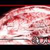
Guest Chris Posted June 26, 2003 Posted June 26, 2003 [color=green][size=1]i thought you posted that before? anyway, it's pretty good. i like the blackness. good job.[/size][/color]
SaiyanPrincessX Posted June 26, 2003 Posted June 26, 2003 I really don't like it. It looks kind of rushed and effortless. Thats just me though. The font is also hard to see. You can do much better.;)
KittyLynn Posted June 26, 2003 Posted June 26, 2003 [SIZE=1][COLOR=dodgerblue]Its kind of sloppy. And you can't see the font at all. You can do a lot better. ^^ I know it! -Kitty[/COLOR] [/SIZE]
Subversive Posted June 26, 2003 Author Posted June 26, 2003 Note the I was bored text...I was bored. Oh yeah, and what is with you people and fonts, sometimes I don't care if you can see it...I just put it in like a graphic or pic. Sometimes I put it in for you to read...this is a kinda both thing. I like how the bg shape looks, its like a bold and stuff, and on the white it looks neato. Guess its one of those love it or hate it things.
GhostofSalvtore Posted June 26, 2003 Posted June 26, 2003 Well that is a weirdness thingy, a very rushed weirdness thingy.
Recommended Posts
Create an account or sign in to comment
You need to be a member in order to leave a comment
Create an account
Sign up for a new account in our community. It's easy!
Register a new accountSign in
Already have an account? Sign in here.
Sign In Now