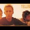
KKC Posted July 12, 2003 Posted July 12, 2003 That looks really good, The only thing I say needs work is the text, Its too plain and kinda small, but I think its good asides from that ^^ Rating: 8/10
boothten Posted July 12, 2003 Posted July 12, 2003 [color=darkblue][size=1]Very nice, I lke it. Plain, but nice. I love those kinds of banners. Again, very nice. Good job! ^^ I'll give it a 8.7/10 .:Lan:.[/color][/size]
ARTommy Posted July 12, 2003 Author Posted July 12, 2003 i'm not to sure this is better but i added a border and some new text
KKC Posted July 12, 2003 Posted July 12, 2003 Yeah, that text is much better. Not the best, but still really good. The border also adds to it. Now it give it a 8.9/10
Posthumous Posted July 12, 2003 Posted July 12, 2003 [color=brown][size=1]The second one looks much better than the first.Only thing, make it 5 pixels smaller.It's too big for OB. 8/10[/size][/color]
OtakuSennen Posted July 12, 2003 Posted July 12, 2003 Dude, that's great! The off-set text is ok, but I don't think it fits the scene that well.. I say 8.6/10.
ARTommy Posted July 13, 2003 Author Posted July 13, 2003 i just kinda made it smaller but i cant find any great text darn it
Guest Chris Posted July 13, 2003 Posted July 13, 2003 [color=#707875][b]nice. as stated, the text isn't the best, but i have resently discovered that text is the tool of the antichrist, so don't worry about it. over all, it looks good. nice job.[/b][/color]
DarK DeatH Posted July 13, 2003 Posted July 13, 2003 The text sucks in my opinion... The banner itself is OK, but the text just sucks... Try to fix that.
Recommended Posts
Create an account or sign in to comment
You need to be a member in order to leave a comment
Create an account
Sign up for a new account in our community. It's easy!
Register a new accountSign in
Already have an account? Sign in here.
Sign In Now