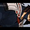
Assassin Posted September 24, 2003 Share Posted September 24, 2003 [size=1][color="666666"] Hey I used to be Aoshi Shinimori but to get to the point here is my new sig. Please check it out and rate it. Thank you very much and take it easy. [/color][/size] Link to comment Share on other sites More sharing options...
Boo Posted September 24, 2003 Share Posted September 24, 2003 Ah yes. A very nice banner. Reminds me kinda of Kaisuke's old work. Dont see any flaws in it... Or maybe place the text further in the corner... 78820 bytes or sumfin O.o... Link to comment Share on other sites More sharing options...
Assassin Posted September 24, 2003 Author Share Posted September 24, 2003 [size=1][color="666666"] Thank you Boo but what would you rate it out of 10? Also I did not want to place it to far into the bottom left corner because I tried and it did not look that good. [/size][/color] Link to comment Share on other sites More sharing options...
Mei Posted September 24, 2003 Share Posted September 24, 2003 [color=green]I like, very nice backround effects. I also think the way you cut out the front image, if you did that is, is very clean. The only thing that actually bothers me is the clash of the red and blue. If just doesn't seem to fit together. Otherwise, it's a lovely banner.^^ 8.5/10.[/color] Link to comment Share on other sites More sharing options...
Assassin Posted September 24, 2003 Author Share Posted September 24, 2003 [size=1][color="666666"] Thank you Mei, I suppose you mean the guy's jacket and hair. I know it does not look that great but I wanted to use that guy in the sig pretty much no matter what. And yes I cut out the guy. he had a orgional white background but many small places he had white and I had to zoom to cut them places out. Thank you for rating it and anyone else? [/size][/color] Link to comment Share on other sites More sharing options...
Guest Skyechild91 Posted September 24, 2003 Share Posted September 24, 2003 Hmm.. not bad, Josh-chan. Id rate it... 10/10. Truthfully. Nice goin, boi! Link to comment Share on other sites More sharing options...
Assassin Posted September 24, 2003 Author Share Posted September 24, 2003 [size=1][color="666666"] Why thank you Sailor Star. But would you tell me what you like about it because when I make other banners I might not use the same style I did with this one. Thank you all for rating it. [/size][/color] Link to comment Share on other sites More sharing options...
AzureWolf Posted September 24, 2003 Share Posted September 24, 2003 Wow, I hate the character picture more (c'mon, that's just not "cool" ;)), but the background is much better. Your previous ones were too sharp - or something O_o. Besides that, this banner is visually more pleasing than your previous ones simply because of the background improvement. Love all the BG designs, though. :) Link to comment Share on other sites More sharing options...
Assassin Posted September 24, 2003 Author Share Posted September 24, 2003 [size=1][color="666666"] Thank you AzureWolf you encouraged me and all. I agree with the character picture which I call "stock" I used Gaussian Blur at 1.5 when I copied the layer and made it hard light. So it looks sorta weird, Hey but I like it. Thank you for the compliment thought AzuraWolf. [/size][/color] Link to comment Share on other sites More sharing options...
Guest Skyechild91 Posted September 24, 2003 Share Posted September 24, 2003 1. The guy is hott. 2. I luv the background! Link to comment Share on other sites More sharing options...
Recommended Posts
Create an account or sign in to comment
You need to be a member in order to leave a comment
Create an account
Sign up for a new account in our community. It's easy!
Register a new accountSign in
Already have an account? Sign in here.
Sign In Now