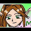
Mei Posted October 21, 2003 Share Posted October 21, 2003 [color=green]Well, I found a different wallpaper with Sora here on it, and I just [i]had[/i] to make my own. It's not much, I used the gradient tool as I have with all my backgrounds, and then the cutting tool around Sora. It took awhile, as well as some cloning of the same backround onto the actual one, but I finished it. The text may seem a bit odd with the rest of the wallpaper, but the logo for KH2 actually has a font close to that. It's a very simple peice of work, and though it's not that great, I spent time on it and did my best.[/color] Link to comment Share on other sites More sharing options...
Shinmaru Posted October 21, 2003 Share Posted October 21, 2003 I think it's pretty well done. The pic of Sora that you got is a bit fuzzy to me, though. It's not that distracting but it's noticeable. And, even though the font does look like the font for Kingdom Hearts, I still don't really feel that it fits with the rest of the wallpaper. However, I really like the background - the pattern looks pretty neat. And I also like the big number two; it looks very cool. Link to comment Share on other sites More sharing options...
Dagger Posted October 21, 2003 Share Posted October 21, 2003 I like the idea; it emphasizes Sora's new, darker look. Like Shinmaru, I love the big number two. Try fading the "Kingdom Hearts" text so that it doesn't stand out *quite* so much. I don't have a problem with the font itself, but the text is a little too strong. If you could find a sharper image of Sora, that would be fantastic. Otherwise, don't worry about it. ~Dagger~ Link to comment Share on other sites More sharing options...
Syk3 Posted October 22, 2003 Share Posted October 22, 2003 Ohhh, a wallpaper. ^_^ I don't remember seeing any of those from you before, but you did very well on this one. You deffinitly did a good job in cutting Sora out from the previous background for the most part, but there are still a few bits and peices that can be polished. Also, as Shin and Dagger mentioned, he could be of a slightly higher quality, but judging by the entire wallpaper, I don't think that's entirely your fault. Some degrading seems to have taken place by whatever file you saved it as. =/ The background, while looking nice, could use a *little* more substance, but the text you used really helps to even it out. ^_^ I think the fading is fine, but perhaps 'Mei' could be moved slightly over to the right. Overall, I like the wallpaper, love, but I'm very anxious to see how well you can improve for the future. :) That's what you've been doing with your banners, and look how good you are now! Link to comment Share on other sites More sharing options...
Recommended Posts
Create an account or sign in to comment
You need to be a member in order to leave a comment
Create an account
Sign up for a new account in our community. It's easy!
Register a new accountSign in
Already have an account? Sign in here.
Sign In Now