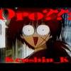
Kenshin_K Posted November 3, 2003 Posted November 3, 2003 This is the first banner I've tried to make. I'm proud of it and myself. It's not TOO bad for a first....is it?
Kieko Posted November 3, 2003 Posted November 3, 2003 No! In fact, it's pretty good! The only thing I can think of is the fact that I find it a little bit boring, you know, not a lot's going on in the banner. Also, try to border/frame it. But that's it, otherwise it's great ^_^
Dagger Posted November 3, 2003 Posted November 3, 2003 I like your font, but the text sort of overwhelms poor Kenshin--I can barely see him. I'd try using a bigger and brighter image, one that can hold its own alongside such a strong font. EDIT: Yes, do add a border. A decent border can make nearly any banner look much more professional. ~Dagger~
Kenshin_K Posted November 4, 2003 Author Posted November 4, 2003 Thanks! I'll try it. Any more opinions and ideas would be really nice!
Eclectic Posted November 4, 2003 Posted November 4, 2003 Dagger's right in everyway. I have a particularly bright pic of Kenshin if you'd like it. It has other people, namely Kauro, in it, but a little editting should take care of that!
Kanariya Posted November 4, 2003 Posted November 4, 2003 The banner is great, but I am agreeing with Keiko. It's boring a bit, try lightening it up some more. Also a border would work, and I also agree with Dagger, the text does overwhelm Kenshin. But otherwise, that's a nice banner.
Kieko Posted November 4, 2003 Posted November 4, 2003 Ummm, just so you know, you're not suppose to double post. you just edit your first post. Any way, I like your last banner, although I think you should choose pictures that are brighter/easier to see. I would also choose a different color font or a different font. But, I'm pretty new at this, so I don't really know, that's just how I see it.
Kenshin_K Posted November 4, 2003 Author Posted November 4, 2003 Oh, oops! Thanks. Well, anyway, the more opinions & ideas, the better!
Corey Posted November 4, 2003 Posted November 4, 2003 [QUOTE][i]Originally posted by Kieko [/i] [B]The only thing I can think of is the fact that I find it a little bit boring, you know, not a lot's going on in the banner.[/B][/QUOTE] That's extemely funny considering there's next to nothing going on in your banner. All the privious suggestions apply all to well. Especially the brightening one. The two banners are quite hard to see. For a first banner/s? Not bad at all.
stun gun Milly Posted November 4, 2003 Posted November 4, 2003 The Kenshin banner is nice,but the pic of Kenshin is dark and it's not as noticeable (sp?) as the text,but use a different pic of Kenshin that's brighter than the one you used and it'll look really nice!The text is goes really great with the banner and the quote,the text is really nice I really like the style you used.The background is really good,it goes really nicely with the text and the style.Also add a border,it'll make it look altogether. The Trigun banner is nice too,but it's really dark,use brighter pics and it'll look really great.The text is really nice,the style of the text goes really great with the banner and the pics.Also add a border to make it look altogether.You did really great,but use brighter pics and add a border and the banners will look really great!!I hope to see more!!
Kenshin_K Posted November 4, 2003 Author Posted November 4, 2003 Here, I used your ideas. It does look better, thank you!
Kieko Posted November 4, 2003 Posted November 4, 2003 That last one is much better! Although, I think Kauro's (sp?) in the wrong place and both Kenshin and her are poorly cropped. Also, you should get a brighter/easier to see picture of Kenshin. But it's really good ^_^!
Kenshin_K Posted November 4, 2003 Author Posted November 4, 2003 Sorry, they both came from the same pic. I was too lazy to search for new ones. I try harder if it's for someone else.
Chibi_Sango Posted November 7, 2003 Posted November 7, 2003 Hey K, it looks great, but I'd have to agree with Kieko. Keep trying!
Annie Posted November 8, 2003 Posted November 8, 2003 [color=teal][font=times new roman][b]Yes, the Trigun banner definately needs to be brightened. Maybe instead of the pics to be seperated, you should mesh them together. That way it doesn't look so chopped and plain. But definately brighter. Doing good, keep practicing. I wish I could make a banner. But I get one put together and then I can't figure out how to get it onto the boards.... But, anyways..Brighten them up, and be a tincy more creative*mesh the pics together* and you'll have amazing banners.[/color][/font][/b]
Kenshin_K Posted November 8, 2003 Author Posted November 8, 2003 Sorry, but I don't get what you mean by "mesh them together"...
Hittokiri Zero Posted November 8, 2003 Posted November 8, 2003 Mesh = Blend. Make them look like they seemingly blend together as one image. Basically make them fade into one another got it ^_^?
Kenshin_K Posted November 8, 2003 Author Posted November 8, 2003 Alright! I'll try....(this will take some figuring out...)
Recommended Posts
Create an account or sign in to comment
You need to be a member in order to leave a comment
Create an account
Sign up for a new account in our community. It's easy!
Register a new accountSign in
Already have an account? Sign in here.
Sign In Now