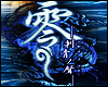
Dragon Fou Lu Posted December 25, 2003 Share Posted December 25, 2003 ok.....this another sonic banner i've made. the difference this time is 2 things.. 1) i used Knuckles and Tikal because they're both echidnas, so i thought it would work well. also the fact that they are both linked somehow with the Master Emerald also played a big part. 2) i would like a few comments on this banner please, the last 2 i've posted up everyone just looked at it and didn't tell me what they thought of it (so it gave me the feeling that my work isn't good enough). i don't think i'm asking too much for just a little support or critism :( anyway here's the banner. [b]Edit:[/b] it seems that this thread is going to end up like the others :( Link to comment Share on other sites More sharing options...
Sakura Posted December 26, 2003 Share Posted December 26, 2003 [COLOR=darkblue]I love it. It's plain but it has a sort of effect.Maybe you could add something in there that would take up the space a little, the gap between Knuckles and Tikal is quite big. I like the contrast of the 2 Echidnas and how they are related. I might ask you to make me another banner some time. The banner's cool and I love the color blue with them. I still think you should put something in the space between them....Chaos Emerald maybe....I dunno....just my suggestions. Good job anyways. Keep doing what you're doing. ~Ohkami[/COLOR] Link to comment Share on other sites More sharing options...
Kanariya Posted December 26, 2003 Share Posted December 26, 2003 [size=1][color=chocolate]I like this banner. It is simple, neat, and I love the background. The texture is pretty. You should put something in the middle to not make the banner so bare though, but for now, I like the banner.[/size][/color] Link to comment Share on other sites More sharing options...
Baron Samedi Posted December 26, 2003 Share Posted December 26, 2003 Tis not bad, but would prefer a sharper, brighter banner. I don't like the dull blue sheen. Also, I would advocate some text to go with it, or at least some more... attention in it. Not bad work, but it is rather plain. Aesthetics: 6/10 Technical: 4/10 Link to comment Share on other sites More sharing options...
Dragon Fou Lu Posted December 26, 2003 Author Share Posted December 26, 2003 well i was originally going to put in Metal Sonic and the master emerald for some reason but i decided to cut it out. and the reason i didn't put text on it is because i didn't really know what i wanted the banner to say :( however i have edited the banner a little (not much, i just put in a new pic) but hopefully it should fill in the gap in the middle :) thanks for the comments :) Link to comment Share on other sites More sharing options...
Pyrophobic Posted December 26, 2003 Share Posted December 26, 2003 Yeah, the first banner has a nice, clear impact. I'm not so sure about adding the emerald - it adds a cluttered weightiness to the foot of the banner somehow. It suits Knuckles' action line perfectly, but the way it contrasts with Tikal's spines' forward lean is a bit clashy - that's why it seems cluttered. Maybe you could think of a short sample of text to include, shrink the emerald and lay the text over it somewhere. I'd want to keep the space from the first banner and use it like you do in your green signature banner - I think that's very successful. Well done with what you've done so far - nice placid blue! ^_^ Link to comment Share on other sites More sharing options...
Kanariya Posted December 26, 2003 Share Posted December 26, 2003 [size=1][color=chocolate]I don't like the green emerald in the banner. It seems too 'real' for the cartoons and does not match the background.[/size][/color] Link to comment Share on other sites More sharing options...
Dragon Fou Lu Posted December 27, 2003 Author Share Posted December 27, 2003 well i couldn't really think of what else to put in besides the emerald, as it is linked to both of them. i was going to put in a chao but i only know that the chao are linked to Tikal, so i'm still unsure if they have a link to Knuckles. Link to comment Share on other sites More sharing options...
Stuart Posted December 27, 2003 Share Posted December 27, 2003 Hm that would look really pretty with some text on there. yeah why dont you try that, Just look for a good qoute and put it on maybe? nice work. Link to comment Share on other sites More sharing options...
Recommended Posts
Create an account or sign in to comment
You need to be a member in order to leave a comment
Create an account
Sign up for a new account in our community. It's easy!
Register a new accountSign in
Already have an account? Sign in here.
Sign In Now