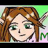
Mei Posted January 3, 2004 Share Posted January 3, 2004 [color=lightblue]New year, new art. Critiques and Comments is all I ask. Well, like most of my other late banners and avatars, I've used the faded edges for the border. I just seem to have fallen in love with the effect. It might be because OB is only using one skin right now, and these fit well with it. No wording or text on these, just a cute little picture, cloned in and layered. I'm just stuck with simplicity right now, and this picture was perfect. January has just always been a light blue in my mind. Not much else to say, this was an easy banner, and the avatar was even easier. Maybe next month will be more complicated, but this is it for now.^^ [img]http://otakuboards.com/avatar.php?userid=1617&dateline=1073165623[/img] [img]http://otakuboards.com/attachment.php?s=&postid=538352[/img][/color] Link to comment Share on other sites More sharing options...
Patronus Posted January 3, 2004 Share Posted January 3, 2004 [size=1][color=darkred]I love them, Mei - I really do. I only have one thing to say: Maybe you could put your name at the top, left corner of the banner? Overall, I love it. Rating: 8.9/10[/color][/size] Link to comment Share on other sites More sharing options...
haruno_sakura Posted January 3, 2004 Share Posted January 3, 2004 I love the simplicity of it all. There aren't any fancy designs or anything that detract attention from the lovely image. Though the image is a tiny bit blurry, it works well with the whole effect of the soft, faded edges. Absolutely darling. 9.0/10 ~haruno_sakura Link to comment Share on other sites More sharing options...
Shizoku Posted January 3, 2004 Share Posted January 3, 2004 I really love the faded edges it gives it a wonderful soft feel. I thought the image might be a little sharper but it's not really a problem. It looks good in your sig too. Link to comment Share on other sites More sharing options...
Snufkin Posted January 3, 2004 Share Posted January 3, 2004 You always make such wonderful banner and avatar combinations Mei ^_^ The nice soft colors of this combo are very eye pleasing and the faded edges of the banner just add to it. Simple and kawaii - always a nice combination ^_^ Link to comment Share on other sites More sharing options...
Sara Posted January 3, 2004 Share Posted January 3, 2004 [size=1]Quite lovely, Miss Mei. You're right, the edges do go nicely with the white background. I like it the way it is. Simple, pretty, and soft on the eyes. (Although your post itself is hard to read. :p)[/size] Link to comment Share on other sites More sharing options...
Dagger Posted January 4, 2004 Share Posted January 4, 2004 Ah, yet another beautiful banner from Mei. I really like this one; its overall softness is very pleasing to the eye, and the pastel-based color scheme serves to create a gentle, soothing atmosphere. To borrow Sara's words, "simple and pretty" sums it up perfectly. Your avatar is a wee bit grainy, but I get the feeling that most people won't examine it closely enough to notice that. Overall, lovely work. ^_^ ~Dagger~ Link to comment Share on other sites More sharing options...
Baron Samedi Posted January 4, 2004 Share Posted January 4, 2004 Unless you are critting it, the star looks wonderful and smooth. Overall, this set is quite... deliciously crisp. Kind of like... lettuce mixed with fairyfloss. Crisp but fades away. Nice work. I think you should just have an 'M' somewhere on the banner. That would be very stylish and cool and fit in nicely. Especially if you found a good font, and faded it in. Nice work Aesthetics: 8/10 Link to comment Share on other sites More sharing options...
Syk3 Posted January 5, 2004 Share Posted January 5, 2004 [color=teal]Yay! And you posted it on our six-month anniversuary, too. ^_~ What can I comment on that hasn't already been said? Simplicity is a virtue, my love. It's the basis of originality and greatest thing that can be found in all of your banners, and it never gets old. Not even when you use the same border, heh. As said [a million times], the softness on the eyes is probably the best part of this artwork. The only thing that I can find that needs improvement is the avatar, whereas the star is slightly pixelish. It may be from resizing or quality of the picture, but whatever the reason, it's nothing that can't be fixed with a little airbrushing. And as you know, my screen portrays images very lightly, so your post and sig are now hard to see without highlighting, but I don't mind.[/color] Link to comment Share on other sites More sharing options...
Recommended Posts
Create an account or sign in to comment
You need to be a member in order to leave a comment
Create an account
Sign up for a new account in our community. It's easy!
Register a new accountSign in
Already have an account? Sign in here.
Sign In Now