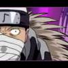
Dan Rugh Posted March 22, 2004 Share Posted March 22, 2004 So I was looking through the Shinsengumi Imon Peace Maker manga and saw this picture of Tetsu. I immediately wanted to do something with it but I wasn't sure what. Well, I put it in Photoshop and started out with putting a half-transparent, half-grey gradient overlay. Then I deleted all the gradient that was covering Tetsunosuke. After that I decided to just start coloring him, added some text at the bottom, and ended up with what you see now. I wanted the coloring to be very subtle. :) The text is actually from episode 23, although the picture is from early on in the series [spoiler]when Tetsu saves Saya from the mean men =P[/spoiler]. Well, here ya go: [IMG]http://www.otakuboards.com/attachment.php?attachmentid=18193[/IMG] How's it look? :) Link to comment Share on other sites More sharing options...
HatakeKakashi Posted March 22, 2004 Share Posted March 22, 2004 Niiiiiice. I really like when someone just makes one person stand out in the crowd...well not really talking about this.(stewpid me) Anyways I like the colors Dan they aren't all BOINGY BOING BOING in your face...and since I haven't seen the anime I wouldn't know the colors >.< Well anyways they are very...not...bright but more relaxy like. The manga is really good so far and I hope to finishing reading what I got d/led...tomorrow after school...if my sister isn't bugging the blazes outta me. ^_^ NIIIIIIIICE. You need to help me with artsy stuff sometime cuz I stink lol. And maybe like I'll get a stupid program to color YAY! Link to comment Share on other sites More sharing options...
Dagger Posted March 22, 2004 Share Posted March 22, 2004 Lovely work, Dan. ^_^ I agree with Hatake; the muted color scheme is a nice touch. You've done a great job with Tetsu's hair, too--it looks really sharp and clean, particularly the strands coming down across his face. The text is nicely placed, and the font you chose seems to fit in pretty well. I would try adding something to Tetsu's eyes... even if it's just a subdued hue of hazel, it might help balance out the other bits of color in the image. ~Dagger~ Link to comment Share on other sites More sharing options...
shaharazod Posted March 22, 2004 Share Posted March 22, 2004 hey thats an awsome the way u colored and made him stand out, great job!! :) Link to comment Share on other sites More sharing options...
r2vq Posted January 16, 2005 Share Posted January 16, 2005 Because of my total stupidity when it comes to Photoshop, I'm curious about your gradient. Did you change the layer mode to "Dissolve" or did you just use the 'Noise' filter with either an overlay or selection? As the others have said the muted colours are quite appealing. They give a serene appearance while allowing Tetsu to stand out. Personally, I would have made him too bright and the quoted text too large. I applaud your work, how long did it take? -ArV Link to comment Share on other sites More sharing options...
Recommended Posts
Create an account or sign in to comment
You need to be a member in order to leave a comment
Create an account
Sign up for a new account in our community. It's easy!
Register a new accountSign in
Already have an account? Sign in here.
Sign In Now