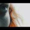
OtakuSennen Posted June 6, 2004 Share Posted June 6, 2004 [color=navy]Throughout the course of history, I have created banners and such out of sheer boredom. Today was a dull Saturday, and just like on every other, I ended up opening PhotoShop and toying around with the first image that comes to mind. Today's excursions proved to be very worth it. I browsed through Konami's official Metal Gear Solid 3 site, and found that they had a new wallpaper up. I found it to be the only two-dimensional Metal Gear picture that interested me- most of the time the faces don't really match what you see in the game. This time, however, things were perfect. I decided to use the image for a new banner and avatar. [center][img]http://www.otakuboards.com/attachment.php?attachmentid=19454[/img][/center] [center][img]http://www.otakuboards.com/attachment.php?attachmentid=19453[/img][/center] The banner was fairly simple to make. I just copied part of the image, resized it, and cut-and-pasted M, G, S and 3 from the logo. The avatar, however, took more time. I didn't want it to be simply a resized crop from the banner, because that would be too plain. I tried taking a bit of the background of the image and making it into an avatar, but it was all too plain. That's when it hit me- the game is basically all about the camouflage, so why not try and add Snake in there, in a more hidden way? I copied Snake's face over, darkened some areas that were too light, and there you have it. My MGS3 avatar. And to think it only took fifteen minutes to make. God, I love PhotoShop.[/color] Link to comment Share on other sites More sharing options...
Shinmaru Posted June 6, 2004 Share Posted June 6, 2004 I think the banner looks good, though the bright parts stand out a bit too much for my tastes. Snake and the leaves look sort of odd against it. The M also looks sort of strange, since part of it is also set against the light background. The avatar is pretty impressive, though. I love how you just look at it and Snake just pops out of the foliage; it's a cool optical effect, heh. It definitely fits in well with the theme of Metal Gear Solid 3, as well. You did a great job with that. Link to comment Share on other sites More sharing options...
BlueYoshi Posted June 6, 2004 Share Posted June 6, 2004 [color=teal]It's a nice piece. I can see how you could have changed the banner round to lose Snake's face completely by making the lighter areas much darker, but where's the fun in that? I'm glad that you decided to move away from making an identical set actually, by juicing up the avatar you've added a much more trivial look to it than the banner, kind of in a "spot the Snake" way, heh. No problem with the wording, the G and S seem to stand out a little but it's still possesses that discrete look, consider playing around with them a bit more to produce the same affect that the M has. *tries to spot the snake*[/color] :huh: Link to comment Share on other sites More sharing options...
Guest Mana Posted August 17, 2004 Share Posted August 17, 2004 I think that the banner and avatar are nice. I thinik though that you should add your name to the avatar, that'd make it more personal, ya know? I do like it though, It's got cool colors, and I'm a MGS fan. I need to get Photoshop and show u how it's done, lol. Very nice job. You're good. -MILZ :) Link to comment Share on other sites More sharing options...
Recommended Posts
Create an account or sign in to comment
You need to be a member in order to leave a comment
Create an account
Sign up for a new account in our community. It's easy!
Register a new accountSign in
Already have an account? Sign in here.
Sign In Now