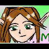
Mei Posted August 17, 2003 Posted August 17, 2003 [color=green]I'm still sticking with a simplistic theme, but I [i]did[/i] add some effects to the banner, and added more then one border round the avatar.^^ Tell me what you think, I'm curious to what everyone thinks of the border shape effect on the banner. Oh, I also used the gradient tool in layers on my name, hope you can see it.^^() [img]http://otakuboards.com/avatar.php?userid=1617&dateline=1061088665[/img] [img]http://otakuboards.com/attachment.php?s=&postid=465113[/img][/color]
HaUnTeD Posted August 17, 2003 Posted August 17, 2003 i like it!! good job!! i wish i could make banners... *sniffle*
Syk3 Posted August 17, 2003 Posted August 17, 2003 Ohhh, very intruiging. The first thing that you notice about this banner is the sort of double border that you mentioned, which now that I look at it is a [i]very[/i] nice touch. I like it a lot, and I'm thinking about applying it to my next banner. You were really able to pull that technique off well. When you look closely at the text, I could deffinitly see that gradient. While using multiple colors is a nice change from the continuous solid color that everyone uses, I would perhaps use something a little closer to the girl's hair. I know this will sound a little strange, but I think you did a good job of keeping those bottom and right edges of your name sort of going into the diffusion outline, even though I probably wouldn't have thought to do that if it was me. oO; You picked a fairly good quality picture, and came out with another great banner. ^_^ I'm very impressed with all of your work, and this whole theme is deffinitly one of my favorites. *huggles*
Spikey Posted August 17, 2003 Posted August 17, 2003 [color=darkblue][size=1]Your banners and avatars are always my favorites. Great job my. I must say I really like the avatar, and the banner. Great job and I give it a 10/10.[/size][/color]
Meteora Posted August 18, 2003 Posted August 18, 2003 [color=blood red][size=1][i]I like the Banner and Avi. Keep it up. I like the pic for the banner and Avi. The color is good and the effect is awsome on the banner. Keep up the good work. I rate it 10/10 as well.[/color][/size][/i]
Shinmaru Posted August 19, 2003 Posted August 19, 2003 I think they're both good. The pictures are nice and clear and are a lot easier to see than most of the stuff you see around here. I think the inside border of the banner looks good and the color gradients in the lettering look nice as well. *gives thumbs up*
klinanime1 Posted August 19, 2003 Posted August 19, 2003 The pics are really good quality, and I love the border effects on the banner. The avie is great, too.
Recommended Posts
Create an account or sign in to comment
You need to be a member in order to leave a comment
Create an account
Sign up for a new account in our community. It's easy!
Register a new accountSign in
Already have an account? Sign in here.
Sign In Now