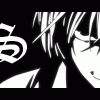
Syk3 Posted September 8, 2003 Share Posted September 8, 2003 Hey all, I'm back with another banner rather quickly, though I still havn't decided if I'm going to use it or not. More likely than not, the file is too big for OtakuBoards, so I basically just made this banner for fun. I think I did a decent job on it, though I can't help all of than graniness which happens automatically with animations for some reason, even on the highest level. I had a sudden urge to make the banner when I was watching the final battle between Kenshin and Shishio, heh. So what does everyone think? Should I cut stuff out of it so I can use it here, or should I keep my new one, or what? c/c [url]http://dg369.250free.com/Kenshin2.gif[/url] Heh, in fact, it's too big a file for the upload, period. o_O Scary... Link to comment Share on other sites More sharing options...
Shinmaru Posted September 8, 2003 Share Posted September 8, 2003 I have to say, Syk3, that banner looks totally badass. The transition from one scene to the next is practically flawless and Kenshin and Shishio inching their swords out of their holsters at the end - awesome. The only problem I have with it is that I thought that it looked a bit fuzzy. Everything else is great, though. Too bad you can't upload it here, huh? Link to comment Share on other sites More sharing options...
Angelus_Necare Posted September 8, 2003 Share Posted September 8, 2003 I love it! It may be a bit slow on this comp, but I can see what you're aiming for. I do have a question, what program did you use? That may be one factor as to the fuzz and grain of the animation. Link to comment Share on other sites More sharing options...
klinanime1 Posted September 8, 2003 Share Posted September 8, 2003 hmm... Everything's so... parallel.... Don't mind me, it's awesome, I'm just thinking that maybe you could have Kenshin or shishio jump out and like slash the banner in half..... But I know nothing about animation, so... It's terrific as is, though. Link to comment Share on other sites More sharing options...
DeViLOF23 Posted September 8, 2003 Share Posted September 8, 2003 [b] I really like the part where they both were moving their swords. Madd props~ Everything esle looks nicely done ^_^ The only thing that i didn't like was the font. Maybe u should of have done something more to it?? in anycase, it does look great as it is right now. ^_^ awesomeness~ [/b] Link to comment Share on other sites More sharing options...
Syk3 Posted September 9, 2003 Author Share Posted September 9, 2003 Sorry about all that pixely stuff everyone, it's unavoidable with Animation Shop 3. If anyone knows any other good animation programs that don't degrade it like that, I'd really appreciate it. ~_~' I agree that being parallel isn't something that you should always do, but I decided to do it on this particular banner because it sort of fits the theme of one man vs. another. It's supposed to create the illusion that they are nearly equal in strength, so it would be hard to tell exactly who would win. As for the font, I downloaded it particularly for the banner, haha. I realized that I really don't have much of a selection, so I went out looking for some Samurai font, where it would appear to be written in bamboo sticks or something, lol. The important thing is that I had a good idea of what I was looking for. I found this after a while, and it was better than the ones I already have, so I used it. I do agree at it could stand out a bit more, bleh. Thanks for the comments and critique so far. ^_^ Link to comment Share on other sites More sharing options...
terra Posted September 12, 2003 Share Posted September 12, 2003 Actually, I like your current banner better. I'm not sure why, but this banner just didn't do it for me that much ... On my computer, the thing at the end where they move their swords is kind of quick, and doesn't look ... quite right. I think it's partially because they're not doing it at exactly the same time? Or because the guy's on the left cloak blows in the wind and distracts my eye? Or because the blade on the left is faded out and looks rather strange to me? Heh, I don't know. Anyway, the animation and transitions are still really nice, as everybody else said. The "Who will win?" at the end is a good touch. And it's obvious that you spent a lot of time making the pictures work together correctly, and it was worth it :). Link to comment Share on other sites More sharing options...
Recommended Posts
Create an account or sign in to comment
You need to be a member in order to leave a comment
Create an account
Sign up for a new account in our community. It's easy!
Register a new accountSign in
Already have an account? Sign in here.
Sign In Now