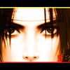
AzureWolf Posted September 13, 2003 Share Posted September 13, 2003 Well, believe it or not, I've changed my banner and avi into something that's NOT .hack-related. Unbelieveable, I know... [IMG]http://www.otakuboards.com/avatar.php?userid=5284&dateline=1063487637[/IMG] Someone's fanart, but it was normally in a white background. I think I did a decent job on the border and background. :D [IMG]http://home.earthlink.net/~azurwolf/images/Azure-Naruto-Banner.jpg[/IMG] Banner's a bit of a spoiler, but it shouldn't be a problem if you can't identify everyone. For the background, I fiddled around with a lot of the effects. I'm a bit annoyed that the "#1 Rookie" text isn't just a little bit more to the left, but that's just me. The baner is the main thing I want comments on. [IMG]http://www.myotaku.com/upload/53.jpg[/IMG] Picture taken from some Naruto scene. It's for the "My Picture" thing at myOtaku. [IMG]http://home.earthlink.net/~azurwolf/images/Naruto-Chibi-Logo.gif[/IMG] Another fanart thing turned into a mini-banner for myOtaku advertising. The only thing I did was shrink it, add the "AzureWolf's myOtaku" on the last frame, and put a border. Thanks for all comments. :wave: Link to comment Share on other sites More sharing options...
terra Posted September 13, 2003 Share Posted September 13, 2003 NOOOO ... Why, why, why did I press reset form ... Now I must rewrite my comments ... :( :( :( Okay. So I've seen quite a few of your banners in various sigs, and I would say to try not to include that rainbow border on [i]all[/i] of them. It's nice and all, and does give things that "AzureWolf touch" or whatever you might want to call it, but it gets a little tiresome when you use it every time. That being said, I like the character placement on this banner (and most of your other ones) a lot. I also really like the effects in the background, especially on the right-most side. The "#1 Rookie" and "AzureWolf" texts look kind of random though, especially since they seem to cut in between the continuing quote in the corners. They just don't seem to fit in very well and sort of mess up the ... er ... "flow" of the banner. I like the avatar a lot, though. The background and border go very well with the picture. For the myOtaku advertisement, I'd say to make your "AzureWolf's myOtaku" text stand out a bit more. You could make it bolder, or in a less script-y font that would be easier to read against the busy background. :D Nice job overall! Link to comment Share on other sites More sharing options...
Semjaza Posted September 13, 2003 Share Posted September 13, 2003 [QUOTE][i]Originally posted by terra [/i] [B]NOOOO ... Why, why, why did I press reset form ... Now I must rewrite my comments ... :( :( :( [/B][/QUOTE] How I loathe that button. What is the purpose of it? Can people not just press Ctrl+A and delete it all? Gah. I like your avatar. I think the background behind the character looks pretty cool. It probably wouldn't look nice if the image was huge, but it works since it's rather small. The placement of the characters in the banner is nice... I'm not really feeling the grid you put over it though. It seems like you just put it there because it needed "something more", but you didn't know what it was. If you know what I mean. The text placement in the center is a bit odd too. I've never understood why people put their own name in their banners though. The MyOtaku banner is pretty cool, but the text is very, very difficult to make out... at least for me. Overall good stuff though. Link to comment Share on other sites More sharing options...
Whiteblaze Posted September 14, 2003 Share Posted September 14, 2003 I think all three of them look very nice and I really like the reddish glow in the avatar. For the banner, I like the colors in there and the pics on opposite sides. I think the '#1 Rookie' text looks okay and specifically I really like the left and right sides a lot. I really like the little mini banner, but for me, I can see the text just fine, esp. since it's blue. Link to comment Share on other sites More sharing options...
OtakuSennen Posted September 14, 2003 Share Posted September 14, 2003 *gasp* A banner done by AzureWolf that's NOT .hack related?! Impossible. :p [b]Avatar--[/b] Yep, the picture in it is really nice. So's the background.. Did you get the permission of the fan artist's to use the pic..? [b]8.4/10[/b] [b]Banner--[/b] Hehe, I like this one a lot. The selection of pictures in it are well done, and the quote is nice too. I, too, think the center text could be selected better.. But I don't have the art program you have, AzureWolf, so I don't know if that WOULD in fact be the best text.. Good quote, too. [b]9.3/10[/b] [b]MyOtaku picture--[/b] Hm.. Nice picture, however I think that a background change would make it a little better. Not much else to say about this one. [b]8.4/10[/b] [b]MyOtaku video[/b] Hm.. I like it, the drawings are really nice.. However things kinda move fast, for example, the sound effects seem to flash on the screen and there's barely any time to read them. Of course, maybe you were aiming for that; I don't know (Ooh! A semicolon! I've always wanted to use one of those outside of smilies!).. [b]8.6/10[/b] Love the whole Naruto theme, Azure. Nice work. Link to comment Share on other sites More sharing options...
AzureWolf Posted September 17, 2003 Author Share Posted September 17, 2003 [quote]Okay. So I've seen quite a few of your banners in various sigs, and I would say to try not to include that rainbow border on all of them. It's nice and all, and does give things that "AzureWolf touch" or whatever you might want to call it, but it gets a little tiresome when you use it every time.[/quote] Hehe... :sweat: Well, I tried to make the gradient thing on my banners always different. If you look closer at the borders, you'll notice that I never use the same color set for the borders. But, if you have to look closer to notice the difference, then I have been overusing the effect. Thanks, I try to never do the same thing on two banners, but now I know that I'm being too subtle. :D [quote]That being said, I like the character placement on this banner (and most of your other ones) a lot. I also really like the effects in the background, especially on the right-most side. The "#1 Rookie" and "AzureWolf" texts look kind of random though, especially since they seem to cut in between the continuing quote in the corners. They just don't seem to fit in very well and sort of mess up the ... er ... "flow" of the banner.[/quote] Really? The character placement is good? That's nice to know. It does take me quite a while to figure what belongs where, so I'm glad it pays off. As for the text, I figured it was proper to put the name in the middle. I noticed that it "interfered" with the quote, but I thought it might have just been me. Thought maybe the coloring would keep things uninterrupted. :D Gotta fix that... Oh, and just so you know, the "#1 Rookie" thing is something they say in Naruto, and could be a phrase that you just automatically associate with the series. I thought it would be clever if I just made "#1 Rookie Ninja AzureWolf." :o [quote]I like your avatar. I think the background behind the character looks pretty cool. It probably wouldn't look nice if the image was huge, but it works since it's rather small.[/quote] You've got a good eye, unlike me. I did try it on (guess what?) my banner's background, but as you predicted, it just doesn't work. [quote]The placement of the characters in the banner is nice... I'm not really feeling the grid you put over it though. It seems like you just put it there because it needed "something more", but you didn't know what it was. If you know what I mean. The text placement in the center is a bit odd too. I've never understood why people put their own name in their banners though.[/quote] Haha, I can't believe it. I didn't know people really liked my character placement. Again, I'm glad the work there is appreciated. As for the grid, yeah, it feels empty without it. I know what you mean: the grid doesn't "match" the rest of the banner. As for putting my name, I saw everyone else doing it when I started making banners, so I thought there was a reason behind it. Personally, I figure that's a way to show that you didn't just take someone else's banner, and this banner was made specifically for you. Also, it allows for a greater association as mentioned with the "#1 Rookie" phrase. [quote]The MyOtaku banner is pretty cool, but the text is very, very difficult to make out... at least for me.[/quote] Yeah, I'm not proficient in animated stuff. It was a pain just adding the border and text, but I'll see what I can do with that. ImageReady is a pain... [quote]I think all three of them look very nice and I really like the reddish glow in the avatar. For the banner, I like the colors in there and the pics on opposite sides. I think the '#1 Rookie' text looks okay and specifically I really like the left and right sides a lot.[/quote] Well, just to clarify things, for the avatar, I just extracted the picture from the white background (which, for some reason, was harder than usual) and added a "livelier" background and a border. The red effect was by the artist. The right and left parts of the banner? Haha, is the middle boring? ;) [quote]I really like the little mini banner, but for me, I can see the text just fine, esp. since it's blue.[/quote] LOL! [quote]Did you get the permission of the fan artist's to use the pic..?[/quote] O_o Well, no, and for two reasons. First, I figured it's the same as using official art: I don't ask permission to use it for "personal, non-commercial" use, so I figured it was ok. Second, I don't know who the fanartist is (I would have given a link :)), because the original file was handed down from two or three people before it reached me, so all I know is that it is fanart. [quote]Hehe, I like this one a lot. The selection of pictures in it are well done, and the quote is nice too. I, too, think the center text could be selected better.. But I don't have the art program you have, AzureWolf, so I don't know if that WOULD in fact be the best text.. Good quote, too.[/quote] Yeah, it took me a while to work the quote into something that simple. I couldn't find the right word, but then I thought of something not english and found "Gaiden." I'm just worried that some people might not know that it means "a continuation," and usually a chronologically-specific continuation. Anyway, so you think the center text doesn't stand out properly, but you like the phrase? Haha, I'm not sure what you are saying because you say it's a good quote, but you say I could have selected it better. :-/ [quote]Hm.. Nice picture, however I think that a background change would make it a little better. Not much else to say about this one.[/quote] Well, the background was originally white, and I think the background looks neat, so :p [quote]Hm.. I like it, the drawings are really nice.. However things kinda move fast, for example, the sound effects seem to flash on the screen and there's barely any time to read them. Of course, maybe you were aiming for that; I don't know (Ooh! A semicolon! I've always wanted to use one of those outside of smilies!)..[/quote] O_o I don't know... Um... should I pretend to know what you are talking about? Haha, I think slowing it down would hurt the overall quality, and it does loop infinitely, so it shouldn't be hard to catch the whole thing. And, like I said, I'm bad at animation, or else I would have made a completely original animation instead of a preset one and just adding a few things. Currently, I'm trying to figure out Virtual Dub so I can cut out a cool scene from the Naruto anime and turn it into a GIF. That would rock. :) Ok, thanks for everything. I've taken all comments to heart and the results are below. More input is greatly appreciated! I didn't just replace the banner in my FTP because I want people to be able to compare the two. [IMG]http://www.otakuboards.com/attachment.php?s=&postid=485456[/IMG] See? Without the grid thing, it looks like just a bunch of colors thrown together. :-/ I don't know: it just appears like a "lazy" background, where you just put a gradient and are done. Link to comment Share on other sites More sharing options...
Stuart Posted September 17, 2003 Share Posted September 17, 2003 [color=darkred][size=1]Yeah the avatar is awesome, (even though I dont know who or what its from) and the banner also. I notice your boarder again hehe. I must say that you are a AWESOME banner maker.. If you only made them more often.. You would be pretty popular, lol. Sweet Job man, Keep up the good work[/size][/color] Link to comment Share on other sites More sharing options...
OtakuSennen Posted September 19, 2003 Share Posted September 19, 2003 [quote] [i]AzureWolf originally wrote:[/i] [b]Yeah, it took me a while to work the quote into something that simple. I couldn't find the right word, but then I thought of something not english and found "Gaiden." I'm just worried that some people might not know that it means "a continuation," and usually a chronologically-specific continuation. Anyway, so you think the center text doesn't stand out properly, but you like the phrase? Haha, I'm not sure what you are saying because you say it's a good quote, but you say I could have selected it better. :-/ [/b] [/quote] Heh, sorry for making it so complicated.. What I [i]meant[/i] to say but did not convey properly as I intended to was that I loved the quote (Yep, Gaiden. I love that word for some reason..) however the actal font for the text could be selected better. I like how you rearranged the text boxes in your more recent version, Azure. It seems to flow better, in my opinion, but that's just me. *looks at Naruto's headband* You put a mirror-ish effect on Naruto, didn't you? In this one it seems he's looking to the right, but the leaf on his headband is backwards. If I'm correct, that picture had him originally facing to the left with the tip of the leaf on his headband pointing to our left as well, right? :p I haven't a problem with that, I just wanted to point it out. (If I am right, "Oh I'm good.") Link to comment Share on other sites More sharing options...
Whiteblaze Posted September 20, 2003 Share Posted September 20, 2003 [QUOTE][i]Originally posted by AzureWolf [/i] [B]Well, just to clarify things, for the avatar, I just extracted the picture from the white background (which, for some reason, was harder than usual) and added a "livelier" background and a border. The red effect was by the artist. The right and left parts of the banner? Haha, is the middle boring? ;) [/B][/QUOTE] No, that's not what I said/was trying to say. I like [I]all[/I] of it, I [I]specifically[/I] like the sides because of the way the pics look; I don't at all think the middle is boring. Oh, I'd forgotten to say! I really like your myOtaku picture! Esp. with that purple aura thing! It contrasts nicely with that black hair! :bellylol: Also, I think the grid looks great with it. Link to comment Share on other sites More sharing options...
Recommended Posts
Create an account or sign in to comment
You need to be a member in order to leave a comment
Create an account
Sign up for a new account in our community. It's easy!
Register a new accountSign in
Already have an account? Sign in here.
Sign In Now