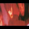
wrist cutter Posted November 19, 2003 Share Posted November 19, 2003 Somehow I think having the name "James" in the title of this will draw more people in... besides, it's not inaccurate. So like Transtic and James before me, here's a little gallery of some of my works... not to make it seem like I'm some great artist with a long history or anything... but here's some banners I made. With titles. [b]hide forever[/b] [img]http://necrophilia.nu/haruka/chris/nonchris/hideforever.gif[/img] - One of my better received works... I thought it was decent, so I was a little surprised at the really positive reaction. [b]hakkyou sakadachi ONANISUTO[/b] [img]http://necrophilia.nu/haruka/chris/nonchris/kageroubanner2.jpg[/img] - This is the first banner I used here. Made me look badass, that's for sure. I spent a lot more time on this than my usual banner, so I think it's one of my best. [b]fragment of memory[/b] [img]http://necrophilia.nu/haruka/chris/nonchris/kiokunohahen.jpg[/img] - A banner I made for a site awhile back, no longer active. Really captures the mood of the album DUNE, I think. [b]komorebi[/b] [img]http://necrophilia.nu/haruka/chris/nonchris/komorebi.jpg[/img] - "komorebi" means "sun shining through the trees". I liked the word so I made a banner for it. Thicker border than usual. [b]for dear[/b] [img]http://necrophilia.nu/haruka/chris/nonchris/kuroyumefordear.jpg[/img] - I didn't do a lot of editing to this picture, but I really like the end result anyway. Something I can't quite place my finger on. [b]kyokutou I LOVE YOU[/b] [img]http://necrophilia.nu/haruka/chris/nonchris/kyokutou.jpg[/img] - Inspired by a BUCK-TICK song. A little too bright to keep in my signature, but a pretty cool banner nonetheless and most people seemed to like it. [b]FREESIA[/b] [img]http://necrophilia.nu/haruka/chris/nonchris/laputa.jpg[/img] - Not sure if the brown works well with the blue... in fact, I'm just not sure how much I like this banner at all. I think this is the second one I used for this site. [b]saigo no yoru[/b] [img]http://necrophilia.nu/haruka/chris/nonchris/lastevening.jpg[/img] - I think this is my best work. My only qualm would be the text is a little hard to read, but otherwise, I just love the way this inverted one turned out. [b]New Temptation[/b] [img]http://necrophilia.nu/haruka/chris/nonchris/newtemptation.jpg[/img] - Not sure what I was shooting for in this one, but it turned out pretty cool. Finally a banner without just flat text. [b]POPular UPrising[/b] [img]http://necrophilia.nu/haruka/chris/nonchris/POPularUPrising.jpg[/img] - Just text on a background. I really like the background, I wish I could remember how I did it as I have a good idea for using it now... [b]Re:plica[/b] [img]http://necrophilia.nu/haruka/chris/nonchris/replica.gif[/img] - My only animated banner. Not sure if the fact it's animated enhances it at all though. It just looks cool, not much else really going on. [b]shinkai[/b] [img]http://necrophilia.nu/haruka/chris/nonchris/shinkai.jpg[/img] - I really like the text on the right side, I thought that was somewhat unique. Not extremely balanced, but I really like this one anyway. [b]THE LAST LIVE[/b] [img]http://necrophilia.nu/haruka/chris/nonchris/thelastlive.jpg[/img] - I went for a very simple, straightforward approach with this one. I really just wanted to capture the moment of THE LAST LIVE. I think the names at the bottom should have been cut out... leaving the faded text at the top my only addition to the picture. And that concludes most of the banners I've made while here at Otakuboards. If you comment I might give you a lollipop. Link to comment Share on other sites More sharing options...
James Posted November 19, 2003 Share Posted November 19, 2003 [color=#707875][b]hide forever[/b] I like this one, primarily because of the colour and text. I wouldn't say that it's a favourite of mine, out of your works, but it's quite dark and gothic looking. So, I like it. [b]hakkyou sakadachi ONANISUTO[/b] This one's very cool. It has a kind of graffiti look, to me. You haven't over-edited it, but at the same time, you've made it complex enough to be visually interesting. I particularly like the text in the background and the filter covering the figures. [b]fragment of memory[/b] For some reason, this banner reminds me of Ring a little. I mean, with the way the text looks...the way it appears on film. Or maybe I'm just Ring crazy? Who knows. Either way, again, it's a nice banner. A little less interesting than some others you've made, but I like the simplicity on this one. [b]komorebi[/b] Very cool banner, particularly the border. I always like it when people do unique things with their borders. So you get a big thumbs up from me on that account. I like the text, but the bevels aren't entirely attractive to me...partly because I've seen so many bevels used on various works, that maybe I'm tired of them. I think you used them effectively though -- you didn't seem to use them just for the sake of doing it. [b]for dear[/b] I think you have a good stock image here, but I don't really like the text covering it. I would personally like to see the text done differently...or perhaps the stock image itself could be edited, without the use of text. It's nice, but not a favourite of mine personally. [b]kyokutou I LOVE YOU[/b] I really like this banner. It's so vibrant and bold...what's not to love? ~_^ The text is well-edited and the background is painted with great care; it comes off looking very textured and bold. [b]FREESIA[/b] I like the text you've used on this one and the subtle editing on that. The photo works pretty well and I think everything looks pretty balanced. Good combination of colours, too. [b]saigo no yoru[/b] I like the feathers/leaves in the background; they came out well with the inverted look. Otherwise, I'm not a huge fan of inverted graphics. I think more needs to be done beyond inverting the colours, for it to really attract my attention. Nevertheless, it's a nice design. It stands out. [b]New Temptation[/b] This banner is rather cool; great use of typography here. I like the fact that it's [i]just[/i] text -- there's so much you can do with text. Text can be a powerful visual tool, as much as imagery. The layering and effects are great and I like the colour too. Very cool. [b]POPular UPrising[/b] I like the background also. But I'm not a huge fan of the text. Maybe it's the font, or maybe it's the kind of white shadow behind it...but it just looks a bit muddy to me. [b]Re:plica[/b] This would probably have to be my favourite. Apart from the fact that it kinda hurts my eyes to watch it (lol), I really like the style you've used. The stock imagery is fantastic and the background fits it perfectly. Good use of typography, too. [b]shinkai[/b] This is also a pretty funky image; the text on the right [i]does[/i] look great. The background works well and the border is pretty inventive. It comes off looking sharp, rather than clumsy. I like. ^_^ [b]THE LAST LIVE[/b] I think you've captured the scene pretty well in this banner, although I dislike the text on the bottom. It's hard to read...and it almost looks like it's interfering with the banner, rather than complimenting it. But a change in text could quickly rectify that. Anyway, as I am sure I've told you before...I tend to like your banners. You don't follow that "look at me, I'm using pixels and putting my name in the corner and being all simple and stylish because I'm awesome" crowd. It's a trend...and for the most part, an unimaginative one. Anyone can do it. I don't think it demonstrates any visual flair. Of course, there are exceptions to that rule. But too many people follow the rule...it's like with lense flares and things of that nature. Everyone jumps on the bandwagon, which is one reason why I make very few "technical banners". When I look at your signature, I can be guaranteed that I'll see something unique and visually interesting. And, for me, it's something I appreciate. [/color] Link to comment Share on other sites More sharing options...
Transtic Nerve Posted November 19, 2003 Share Posted November 19, 2003 I must say, I like alot of your more earlier works better... I can't really say why cause I honestly can't pinpoint the exact reason. My favourite one of the list is probably the Kagerou one... yeah... Link to comment Share on other sites More sharing options...
wrist cutter Posted November 20, 2003 Author Share Posted November 20, 2003 [QUOTE][i]Originally posted by Transtic Nerve [/i] [B]I must say, I like alot of your more earlier works better... I can't really say why cause I honestly can't pinpoint the exact reason. My favourite one of the list is probably the Kagerou one... yeah... [/B][/QUOTE] Yeah. I've been getting gradually lazier throughout the years. THANKS FOR ALL THE MANY COMMENTS ALL OF YOU. Link to comment Share on other sites More sharing options...
Transtic Nerve Posted November 20, 2003 Share Posted November 20, 2003 [QUOTE][i]Originally posted by wrist cutter [/i] [B]THANKS FOR ALL THE MANY COMMENTS ALL OF YOU. [/B][/QUOTE] But only 1 guy.... ohhhhh..... I see..... Link to comment Share on other sites More sharing options...
Recommended Posts
Create an account or sign in to comment
You need to be a member in order to leave a comment
Create an account
Sign up for a new account in our community. It's easy!
Register a new accountSign in
Already have an account? Sign in here.
Sign In Now