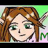
Mei Posted December 12, 2003 Share Posted December 12, 2003 [color=crimson]Well, the Holidays are approaching, so I thought I might as well make [i]something[/i] to help get into the spirit. I realize I've been away for a while, so my artwork hasn't exactly gotten any better, but I did try my best on this one. It's really a very simple banner, with a CG image, layered text, and a nice fluffy border. The avatar is basically the same, minus the text. It took a while to find a picture I liked and could use, but I'm happy with this one, and I hope the banner and avatar turn out fine when I upload them. Comments, critique, etc.[/color] [img]http://otakuboards.com/avatar.php?userid=1617&dateline=1071270642[/img] [img]http://otakuboards.com/attachment.php?s=&postid=528720[/img] Link to comment Share on other sites More sharing options...
Dagger Posted December 13, 2003 Share Posted December 13, 2003 Absolutely beautiful. Why hasn't anyone commented on this? Your banner is colorful, attractive and eye-catching. Sure, it's simple--but simplicity can be a virtue. I really love the soft, faded border, and the fact that your font both suits the image perfectly and complements its color scheme. Even if you're still learning how to do this (as your comments seem to indicate), the banner looks very clean and professional; upon first seeing it, I was sure that it had been created by a very experienced banner-maker. All of my comments also apply to the matching avatar. ~Dagger~ Link to comment Share on other sites More sharing options...
Syk3 Posted December 13, 2003 Share Posted December 13, 2003 [color=teal]Muahaha, another original and extremely eye pleasing banner from Mei. I'd say that the other banner you made was good too, but I can't argue with these results. ~_^ I really like your choice of colors in this design, as well as the scheme you've added to your post. The purple and red combination allows you to create your own artistic touch, rather than using the generic red and green, though that would have looked nice as well. The image, the border, and the text all flow nicely together, and overall, it "feels" like a Mei banner..whatever that means, lol. You'd think that part of the text, being placed above where the same colors are used in the banner, would not come out as clear, but by the way you designed it, it is easily legible. And as always, I love the character you chose; such innocence coupled by high quality. As for things that you can improve on..meh, nothing comes to mind offhand, but it would be interesting to see you use multiple pictures and a few choice effects, while retaining the simplistic feel. Great banner, hun. Oh, and the avatar -- very kawaii. ^_^[/color] Link to comment Share on other sites More sharing options...
Lady Asphyxia Posted December 13, 2003 Share Posted December 13, 2003 [size=1]I told you I'd post, and I am. So ha! to all those out there who think they can stop me from posting, even when I can barely see because my eyes are so bleary [stupid storm!]. Anyway, Mei, I thought it was a great job. If I still believed in having banners [I don't -- I'm far too lazy to bother, heh.] I'd get you to make me one. The banner is clean and effective. I love the border, and the picture is well chosen. The colour scheme is original, and the text is clear and legible. You'd think that, with the text fitting so perfectly with everything else, you wouldn't be able to see it, but you can, and easily. The avatar is just as good. The pic is once again well chosen, the border is done very well. All around, it's a brilliant job. Well done, Sis. Two very enthusiastic thumbs up from my corner! ^.~[/size] Link to comment Share on other sites More sharing options...
Roxie Faye Posted December 13, 2003 Share Posted December 13, 2003 [color=#9933ff][font=comic sans Ms]How is it that I like the Avatar better than I like the banner? O_o Not to say that the banner isn't good, but I just find the avvie image cuter. ^^;; The fluttery edges remind me of snow, and the girl on the banner reminds me of Sakura from CCS, but it's not (Who is it, Mei?). She also reminds me of someone who might save Christmas if Santa couldn't. O_o That's cool, though. I was unaware that you were [i]only[/i] a beginner, Mei. Yeah right. This is better than anything I make. I do really like the simplicity of it; it just gets the point across plain and clear, which is a really lovely aspect of both banner and avatar. I also like how the avatar isn't still the girl, but it's still related, and it "adds" to the banner -- they complement each other. =) The only things I can see for improvement would be some sort of all-over effect, to add to the christmas tone, but nothing too "busy", as to throw off-kilter the great simplicity. But yah, really uber-great-spiffy-cool graphic work. Keep it up! ^__^ ~Roxie, I'm only the graphic commenter, and yes I'm still stealing this from Ness.[/font][/color] Link to comment Share on other sites More sharing options...
Shinmaru Posted December 19, 2003 Share Posted December 19, 2003 Arr, I can't believe I passed over this thread. x_x Anyway, both the banner and avatar are very eye-catching, the banner in particular. I like how the banner blends in with the white background - a nice touch, in my opinion. The banner gives off a very nice vibe, too; it just screams "Have a nice Christmas!" The avatar is very pleasant, as well. I love the snowman you used - very cool stuff (uh...pun not intended lol). And the fact that the snowman is on its side adds something a bit unique to the avatar. Cool stuff. Again, very nice work, Mei. You always make great banner/avatar combos, heh. Link to comment Share on other sites More sharing options...
Recommended Posts
Create an account or sign in to comment
You need to be a member in order to leave a comment
Create an account
Sign up for a new account in our community. It's easy!
Register a new accountSign in
Already have an account? Sign in here.
Sign In Now