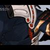
Assassin Posted September 1, 2003 Share Posted September 1, 2003 [SIZE=1][color=crimson]I uh made this sig for K.K.C for the fun of it. Its Crim from .hack//SIGN so check it out.[/color][/SIZE] Link to comment Share on other sites More sharing options...
boothten Posted September 1, 2003 Share Posted September 1, 2003 [color=darkblue][size=1]Wow, those are very good, Aoshi! I've been looking for those kinds of b/g everywhere... That is very good, Aoshi. That image of Crim is very good, it's hard to find those. Nice job, I hope to see more! ^___^ [b]Rating:9.8/10[/b] -Lan[/color][/size] Link to comment Share on other sites More sharing options...
Assassin Posted September 1, 2003 Author Share Posted September 1, 2003 [size=1][color=crimson] Yay thanks for replying dude. I appreciate your comment. What is the .2 percent that you do not like about the sig. I may be able to fix the mistake in other sigs I might make. [/size][/color] Link to comment Share on other sites More sharing options...
stun gun Milly Posted September 2, 2003 Share Posted September 2, 2003 I really like this one,I really like the color and the design of the background because both of them go really great with the pic of Crim.Also the quote and the text color go really great with the banner.Everything is really great and there is nothing wrong with it,you did a great job on it,and I hope to see more!! Link to comment Share on other sites More sharing options...
ARTommy Posted September 2, 2003 Share Posted September 2, 2003 i like it alot though it seems to bemissing some type of boarder just to seperate it from the rest of the page but other wise its great PEACE Link to comment Share on other sites More sharing options...
Assassin Posted September 2, 2003 Author Share Posted September 2, 2003 [color=crimson][size=1]Yeah tommy I forgot to put the border on it. I see what you mean though. Thanks for pointing that out.[/size][/color] Link to comment Share on other sites More sharing options...
Hittokiri Zero Posted September 3, 2003 Share Posted September 3, 2003 Your steering in the right direction with this but the text placement needs to be imrpoved and change the "K.K.C" font =\. Also I can't tell whether you used color dodge or burn but stray far away from those two blending modes the excesive blackness doesn't look good and neither do some of the really white/bright spots =o. The stock image also looks a little weird but that can probably due just fine maybe if the sig was wider instead of longer the stock image would look better, just my 2.5 cents :P. Link to comment Share on other sites More sharing options...
Assassin Posted September 3, 2003 Author Share Posted September 3, 2003 [size=1][color=crimson]Thanks Zero that helped alot. I didnt use color dodge I used overlay mode. It took me a while but in about all the sigs I made they have white in them. Anyway I see what you mean like the font that says K.K.C needed to be different. But I tried something alittle different than the 04 3b font. [/color] [/size] Link to comment Share on other sites More sharing options...
Whiteblaze Posted September 3, 2003 Share Posted September 3, 2003 It does sort of need a border but, it still looks just as awesome! That's a really nice pic of Crim and that background looks so nice! [QUOTE][i]Originally posted by Hittokiri Zero [/i] [B]Your steering in the right direction with this but the text placement needs to be imrpoved and change the "K.K.C" font =\. [I]Also I can't tell whether you used color dodge or burn but stray far away from those two blending modes the excesive blackness doesn't look good and neither do some of the really white/bright spots =o.[/I] The stock image also looks a little weird but that can probably due just fine maybe if the sig was wider instead of longer the stock image would look better, just my 2.5 cents :P. [/B][/QUOTE] That's funny, I think what you're saying is the exact opposite of what you're saying. I mean, what you think doesn't look good, I think looks awesome! It's exactly the kind of thing I like! Link to comment Share on other sites More sharing options...
Lord Prozen Posted September 3, 2003 Share Posted September 3, 2003 [color=royalblue]wow thats a pretty good banner! but you really need to try differnt backrounds. all the banners you've made have the same backround and just some guy on the left whos bright. try somthing new.[/color] Link to comment Share on other sites More sharing options...
Assassin Posted September 3, 2003 Author Share Posted September 3, 2003 [size=1] K thanks Prozen. I know I need to make different backgrounds but I really like those type of backgrounds and all. [/size] Link to comment Share on other sites More sharing options...
Hittokiri Zero Posted September 3, 2003 Share Posted September 3, 2003 [quote]That's funny, I think what you're saying is the exact opposite of what you're saying. I mean, what you think doesn't look good, I think looks awesome! It's exactly the kind of thing I like![/quote] It's aquired taste as the banners you make become more and more complex you look back on your old work or others work that looks similar to your old work and then you truly see what's "wrong" with them, I'm not saying you can't like the parts of his banner that I don't but about 99% of the people who have made graphics as long as me will side with me and not you :P. Link to comment Share on other sites More sharing options...
KKC Posted September 9, 2003 Share Posted September 9, 2003 Oh! Wow! Awesome! Sry i couldn't reply sooner. Me is really really busy lately. ^__^ The BG is sooooo awesome! I like the banner I have now though, so I'll keep this one as a back up! Thanx a bunch! ^________^ *happy dance* Rating: 8.8/10 Link to comment Share on other sites More sharing options...
Recommended Posts
Create an account or sign in to comment
You need to be a member in order to leave a comment
Create an account
Sign up for a new account in our community. It's easy!
Register a new accountSign in
Already have an account? Sign in here.
Sign In Now