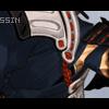
Assassin Posted September 2, 2003 Posted September 2, 2003 [color=crimson][size=1]Well I made this banner cause I uh watched trigun and fell in love with it x.x Its so cool. Ne way it took me awhile to think up how to put the font on it and all. [/size][/color]
Guest Anime_Forever Posted September 2, 2003 Posted September 2, 2003 very nice! an unorigonal bacground but nice.
Assassin Posted September 2, 2003 Author Posted September 2, 2003 [size=1] I know...I dunno how to make any other backgrounds. Thanks for the encouragment though Knives. lol[/size]
stun gun Milly Posted September 2, 2003 Posted September 2, 2003 I still love the background design alot!!I love the pic of Vash and it goes very nice in the banner and everything,and the color background goes very nicely!!I really like it and you did a wonderful job!!I hope to see more!!
Eclectic Posted September 2, 2003 Posted September 2, 2003 I love your banner, especially the pixeled background. It goes very well with Vash's serious persona.
Hittokiri Zero Posted September 3, 2003 Posted September 3, 2003 Hmmm like with your other banner the sig size itself makes the stock image look kind of funny and cut off =\ also work on your typos don't keep the text so spread apart try moving them closer together and maybe add a few vector lines/ a design around them. I also have the same problem with the BG as before the black and white stand out to much and aren't blending with the red. =\. For your next sig really just try a different image size you need more width to your banners =]!
Assassin Posted September 3, 2003 Author Posted September 3, 2003 [size=1][color=crimson]Zero, I see what you mean about the width. But in some cases it takes to much memory. And I see why you mean about typos I have alot of typos x.x! I didnt even spell my name right! I am going to have to fix that. [/color] [/size]
Whiteblaze Posted September 3, 2003 Posted September 3, 2003 Aoshi, I like your Vash banner just the way it is, really. To me, the brightness and pretty much everything Hittokiri Zero said that was bad, I think looks just simply cool. I like the pic because it looks so . . . colorful and I like the way you put your text in.
Lord Prozen Posted September 3, 2003 Posted September 3, 2003 [color=royalblue]hmmm....i think its to bright. i dont really like bright banners myself but still a pretty good banner. i like the backrounds you use for your banners too, thats pretty cool. nice banner! keep up the good work![/color]
Spikey Posted September 3, 2003 Posted September 3, 2003 Actually I think the banner is very nice. The background is what amazed me, it just amazed me because you have all that talent to make such a great background. The Vash image is very clean, and I love the text, it fits it perfectly. I think you might want to make the text a little bit bigger though. Other than that great job. I give it a 9/10.
Assassin Posted September 3, 2003 Author Posted September 3, 2003 [size=1] Thanks Spikey. The font I used was 04 3b and only works on size 8. Thats the only font that looked good on it. In other words...I couldnt find any other font... Well thanks for all your comments people. [/size]
Hittokiri Zero Posted September 3, 2003 Posted September 3, 2003 Well what I mean by typo was just your text layers :P... Hmmm if you go look at this sig of mine ---> [url]http://otakuboards.com/showthread.php?s=&threadid=30265[/url] and notice the design and what not around the text that's personally just my way of creating a "typo" but it's stuff like that, that appeals to me. *The typo on my sig would be considered the entire text layers aswell as the little design around the text* yeah it's kind of confusing because a "typo" is also when you mispell something but that's just some basic gfx terminology for ya =o.
klinanime1 Posted September 4, 2003 Posted September 4, 2003 Nice, clean cut pics and a good bg that fts it and doesn't damage the aura. Well done, well done.
Recommended Posts
Create an account or sign in to comment
You need to be a member in order to leave a comment
Create an account
Sign up for a new account in our community. It's easy!
Register a new accountSign in
Already have an account? Sign in here.
Sign In Now