stun gun Milly Posted September 24, 2003 Author Share Posted September 24, 2003 Thank you!!Also here's a avatar I did on request through PM.It's funny because look at his teeth and it looks like he has a gap or something,but I really like the texture and style I gave it and the pic.Overall I really like this avatar!!So post opinions and ideas!! Link to comment Share on other sites More sharing options...
Xyandar Posted September 25, 2003 Share Posted September 25, 2003 I love it! its an amazing avatar! I'm hoping to see your future creations also. Good job and continue doing whaat you do:) And thanks:) Link to comment Share on other sites More sharing options...
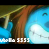
stun gun Milly Posted September 26, 2003 Author Share Posted September 26, 2003 ^^,here's an avatar I did through a PM request,I like the pic,but it would be neat if it had a texture though,but I couldn't find one that would suit it ^^.Also I'll make different versions later on ^^.Also this is a different version of the original character ^^.So state opinons and ideas!! Link to comment Share on other sites More sharing options...
Alter~Ego Posted September 26, 2003 Share Posted September 26, 2003 it is SSSSOOOOO awesome!!!!!!!!!!!! thanx;) Link to comment Share on other sites More sharing options...
stun gun Milly Posted September 29, 2003 Author Share Posted September 29, 2003 Thank you!!I really love this banner I might even use it ^^.I really like it because I love the show and they are just soo cute!!I really like the background and the pics are really cute I think they look a bit rough,but I finally got the text to show!!I really like this banner alot,I may even use it ^^.So post ideas or opinions!! Link to comment Share on other sites More sharing options...
Alter~Ego Posted September 30, 2003 Share Posted September 30, 2003 I rate it... 3/10. Only because i don't get the point of hamtaro. What is its purpose? kinda like pokemon. i don't like pokemon cuz i'ts ghetto gipeddo. (meaning unknown) Link to comment Share on other sites More sharing options...
Xaru Silverfire Posted September 30, 2003 Share Posted September 30, 2003 [QUOTE][i]Originally posted by Alter~Ego [/i] [B]I rate it... 3/10. Only because i don't get the point of hamtaro. What is its purpose? kinda like pokemon. i don't like pokemon cuz i'ts ghetto gipeddo. (meaning unknown) [/B][/QUOTE] [color=blue][font=times][b]Wow.... That post was entirely queer (Meaning weird). You rate it a 3? A [i]3[/i]? How can you do that?! It keeps a smooth texture... It isn't boring/unexiting. And the font goes with the rest of the banner. ----------------------- Hamtaro! ^.^; No, I don't really watch it much, but I like hampsters. -_-; Stung Gun Milly, I give it a.... ::Drumroll:: 9/10 Like I said above, I like mostly everything about it. ^.^ ~Xaru Editness: Stupid smileyness.[/color][/font][/b] Link to comment Share on other sites More sharing options...
stun gun Milly Posted October 5, 2003 Author Share Posted October 5, 2003 ^^,please don't start something here ^^.Here's a new banner from a show called Lain,I really like the darkness it gives off,and the design of it.The pic was already with those little lines,but I still like it,also I like the purple she has it adds something to it.The text I didn't make,but I kind of fixed it and stuff and it's not suppose to have the little period on top of the i for some reason,but it looks good and the text makes the banner look really neat,and I'm glad the text shows this time.Overall I really like this banner I made,also there's another one,but with a different pic.State ideas and opinions. Link to comment Share on other sites More sharing options...
Haze Posted October 5, 2003 Share Posted October 5, 2003 the only problem i got wit most (not all) of your banners is the text. not the actual font but teh color. you seem to be fond of doin text is almost the same color as teh background!! making it quite unreadable. change that and all of your banner will be AWESOME!! i really like the sailor saturn, spike and faye (very nice effect!), and your lain banner. very very nice quality. i think my fav is the spike and faye one though. i have been unable to use that effect in my banners cuz my program makes them look stupid when i do that. so what program do you use?? i use Microsoft Picture It! 99 and sumtimes Microsoft Picture It! Photo Premium 2002. as you can see they are photo editing programs, which makes it a little difficult to do cool stuff. i want really really really bad paintshop pro. but its like $60 so i gotta save up! . . . .MERF!!! right. . . back to the banners. i forgeted. keep up the coolness, eh? ~haze Link to comment Share on other sites More sharing options...
stun gun Milly Posted October 16, 2003 Author Share Posted October 16, 2003 I'm sorry about the text ^^,I'm afraid it would look weird with a color that's not really matching,but I should try using different colors ^^!!Also I did this banner as a request,it has Spike,I like the little lines I added,it makes it look like it has some type of style,also the colors I think are kind of nice and the way they kind of mix together,but I think of could of done more,but I didn't really know what more I could of added.So state opinions and ideas!! Link to comment Share on other sites More sharing options...
Recommended Posts
Create an account or sign in to comment
You need to be a member in order to leave a comment
Create an account
Sign up for a new account in our community. It's easy!
Register a new accountSign in
Already have an account? Sign in here.
Sign In Now