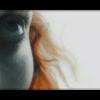
OtakuSennen Posted October 25, 2003 Share Posted October 25, 2003 [color=midnightblue]Well, here is the first banner I have ever really made all by myself. Actually, I'm pretty fond of this one. The brush I used on the background gave it a nice touch, I think. Kazuko was the first to witness this one (through AIM), and he thinks that I should have left the area around my name un-clouded. I'm fine with it either way, but I'd like to hear what the people think. I made this to go with my new Rei Ayanami avatar I just created. I think they compliment each other rather well. Rei is good. Everybody likes Rei. My current banner is really totally awesome, but if you all say you like this one I may change it. Comments and criticism, please. Thank you.[/color] Link to comment Share on other sites More sharing options...
instantramen14 Posted October 25, 2003 Share Posted October 25, 2003 [color=purple] The words are kinda hard to read. Thats all. Everything else is great. [/color] Link to comment Share on other sites More sharing options...
Tog Posted October 25, 2003 Share Posted October 25, 2003 Sugoi! I like the... what's it called? Arrangement. Yeah. It's good. Keep it up, 'kay? Link to comment Share on other sites More sharing options...
OtakuSennen Posted October 25, 2003 Author Share Posted October 25, 2003 [QUOTE][i]Originally posted by instantramen14 [/i] [B][color=purple] The words are kinda hard to read. Thats all. Everything else is great. [/color] [/B][/QUOTE] [color=midnightblue]Do you mean in the banner? If that's the case, I'll change that right now.. I got rid of most of the white there, but decided to keep the mostly transparent name. Then I had the craziest idea. "How about I take a leaf from Syk's book and do a solid text right in front of it?" And I did just that. Keep it coming, everyone. EDIT: I added a black border. I think it looks sort of unfinished without one.[/color] Link to comment Share on other sites More sharing options...
AzureWolf Posted October 25, 2003 Share Posted October 25, 2003 The compression on Rei's face is too noticeable. Since the banner's size (memory) is so small, I think you should just leave out any compression to get rid of that blemish. Besides that (and adding a black outline to the text to make it stand out more), everything is fiddle-danish-andy. What program you be usin'? Link to comment Share on other sites More sharing options...
OtakuSennen Posted October 26, 2003 Author Share Posted October 26, 2003 [QUOTE][i]Originally posted by AzureWolf [/i] [B]The compression on Rei's face is too noticeable. Since the banner's size (memory) is so small, I think you should just leave out any compression to get rid of that blemish. Besides that (and adding a black outline to the text to make it stand out more), everything is fiddle-danish-andy. What program you be usin'? [/B][/QUOTE] [color=midnightblue]Heh, I'm not quite sure how to de-compress anything yet. I just got the program yesterday. So many buttons.. This thing has, like, 1,000 times the features of my former medium, i.e. MS Paint. I kind of want to keep the text a little concealed. I think of Rei as the main focus of the banner, and everything behind rushing by, somewhat (Thus came along the blurs in the background). The name is just temporarily stopping. ^_^' It's kind of hard to explain outside of my head. Sorry if it doesn't make sense. It's Paint Shop Pro 8, by the way. Awesome program, though rather complicated. I think I'm getting the hang of it, though.[/color] Link to comment Share on other sites More sharing options...
Syk3 Posted October 26, 2003 Share Posted October 26, 2003 [QUOTE][i]Originally posted by OtakuSennen [/i] [B][color=midnightblue]"How about I take a leaf from Syk's book and do a solid text right in front of it?"[/color] [/B][/QUOTE] Heh heh...leaf... I deffinitly like the new one better, mainly because of the border which actually gives it some contraints of sorts, heh. Making the faded text behind the other text was also a nice touch. :) I like where you were going with this. It sort of portrays the sadness and emptyness in Rei's heart, and I think you did very well on the background. It makes it seem like it's raining, which also helps to add to the sadness theme, and I probably wouldn't be able to make a background like that, heh; I'm not good at abstract work like that. The dark blue behind your name also is good for bringing out the white; in the other version, it seemed like it didn't stand out enough. Now onto the imrpovements that can be made. First of all, you probably could have used a higher quality picture of Rei. The text could be a little better as well, whereas the faded one in the back should be bolder and larger, and overall, there are better fonts out there. Also, you may want to make Rei's face a little more distinct as the foreground image, and by that I mean not fade the background into the side of her face as much. Overall, great banner, Sen. One of the best I've seen from you...if I have. :) Better than the one I made for you for sure. Link to comment Share on other sites More sharing options...
OtakuSennen Posted October 26, 2003 Author Share Posted October 26, 2003 [QUOTE][i]Originally posted by Syk3 [/i] [B]Heh heh...leaf... Now onto the imrpovements that can be made. First of all, you probably could have used a higher quality picture of Rei. The text could be a little better as well, whereas the faded one in the back should be bolder and larger, and overall, there are better fonts out there. Also, you may want to make Rei's face a little more distinct as the foreground image, and by that I mean not fade the background into the side of her face as much. Overall, great banner, Sen. One of the best I've seen from you...if I have. :) Better than the one I made for you for sure. [/B][/QUOTE] [color=midnightblue]Well, I went through all 25 pages of Rei images on a Google search (Went around all of the perverted stuff) and those were the best I could find. I do agree though, the avatar's source isn't the best quality picture ever. *sniff* But I like the text the way it is.. -- Well, I changed the avatar a little bit. I used the "burn" effect on the brush, making it sort of look like a chalk or charcoal drawing. Enjoy.[/color] Link to comment Share on other sites More sharing options...
Kyo no Ryu Posted October 26, 2003 Share Posted October 26, 2003 OOOOOO me likey. THe banners were alright but are kinda dull but the avatar rocks. Keep makin um! Link to comment Share on other sites More sharing options...
AzureWolf Posted October 26, 2003 Share Posted October 26, 2003 Ok, I was fiddling around with your banner (sue me :p) and I found that you can blur the picture to restore some quality. The picture blurs quite well, so you might want to give it a shot and see what you think. Link to comment Share on other sites More sharing options...
OtakuSennen Posted October 26, 2003 Author Share Posted October 26, 2003 [color=midnightblue]Eh, I tried it, Azure, and I think I'll keep it how I have it. I want to think of this one as my first banner that I did entirely by myself, without assistance from others.. Besides, this sort of appeals to me how it is, for reasons I do not know.. Well, I think I'm going to make banners in themes-- My first one being Rei Ayanami, Asuka Langley Sohryu, and Shinji Ikari of Evangelion respectively. Each theme will have a certain layout and similar backgrounds and such. Here's the Asuka set. I like the Asuka banner more than my Rei banner, yet I like the Rei avatar more than the Asuka avatar. I think I'll add some sort of effect to the avatar tomorrow. As for the moment, I am tired and shall be going to bed. EDIT: Heh, seems you can't attatch more than one picture to a message, so I'll wait for someone to come along and post..[/color] Link to comment Share on other sites More sharing options...
Kyo no Ryu Posted October 26, 2003 Share Posted October 26, 2003 Hey OtakuSennen, just to let you know your banner looks much better when you invert the colors. Trust me. Try it. Link to comment Share on other sites More sharing options...
Kazuko Posted October 26, 2003 Share Posted October 26, 2003 (edited) ... Edited October 11, 2017 by Kazuko Link to comment Share on other sites More sharing options...
OtakuSennen Posted October 26, 2003 Author Share Posted October 26, 2003 [QUOTE][i]Originally posted by Kazuko [/i] [B]Nice Sen.I love this effect you used for the background and the fade into Asuka. As for constructive criticism: 1.For some reason the huge 2-3 pixel border bugs me,make the one in the center white,or just cut it down to a one pixel border 2.The name.Put a space in between Otaku and Sennen;it looks better that way.Also,change the font or space out the word 'Sennen',a lot of the letters are sticking together. That's pretty much all I have to say.Nice banner Sen-kun ^_^ [/B][/QUOTE] [color=midnightblue]Yeah, this burn feature and this long brush are amazing. I have grown quite attatched to them. Probably because it's the simiplest feature I've figured out how to do well so far. o.o' 1. It's a two-pixel border.. I think I'll just change the color of the inner one some. 2. No problem, though I do kind of like how the letters are jammed together. Well here's the Asuka series avatar. Syk convinced me to leave it rather plain and simple. I don't like this avatar as much as the Rei one. I think I'll make a second Rei banner, a better one, so that I can keep this dark blue scheme going. I don't think I'd be fond of an orange/red font in all my posts. Blue is much more.. Me.[/color] Link to comment Share on other sites More sharing options...
Kyo no Ryu Posted October 26, 2003 Share Posted October 26, 2003 Oh yeah asuka, I like the banner but he avatar is BORING. Ill se how tha one looks with inverted colors... yep! it turns a really cool blue!!! Link to comment Share on other sites More sharing options...
OtakuSennen Posted October 26, 2003 Author Share Posted October 26, 2003 [color=midnightblue]Well, here is the Shinji Ikari banner I made, completing the Eva children theme. I don't like how this one came out. The picture isn't of the highest quality ever, and I couldn't find a text that I thought went well with the banner. But I want to get this set over with (Maybe I'll remake the Rei and Shinji sets some time in the future) and move on to something else. I'm thinking of making a set based on some of my favorite video games and/or games that I am looking foward to.. You'll just have to wait for me to post them to see what they are. Oh, and I couldn't find a good picture for a Shinji avatar. If anybody wants to see one, you can find one and PM me, but it is not at all my top priority at the moment.[/color] [quote] [i]Kyo no Ryu originally wrote:[/i] [b]Oh yeah asuka, I like the banner but he avatar is BORING. Ill se how tha one looks with inverted colors... yep! it turns a really cool blue!!![/b] [/quote] [color=midnightblue]Yeah, I tried it, but I didn't get what I wanted from my banners when I used the effect. Thanks for helping, though, Kyo. Or should I call you Ryu?[/color] Link to comment Share on other sites More sharing options...
Kyo no Ryu Posted October 26, 2003 Share Posted October 26, 2003 Its Kyo, the name means Kyo the dragon I belive. And the dull Shinji banner with inverted colors turns a very neat variety of colors. Do you use photoshop? Link to comment Share on other sites More sharing options...
AzureWolf Posted October 26, 2003 Share Posted October 26, 2003 I don't know why you used green for Shinji. I mean, you were on a roll with blue for Rei and red for Asuka, but where did green come from? O_o Certainly, I think purple would be a better choice, and, if not that, at least a brighter green to emphasize the pattern more. And yeah, the picture isn't the best of the best, but I know you were trying to look for a "profile" angle. However, why don't you try to also make a pattern out of that and make Shinji look in the other direction that Asuka is looking? Just suggestions, don't have to listen to em. :p Link to comment Share on other sites More sharing options...
OtakuSennen Posted October 26, 2003 Author Share Posted October 26, 2003 [QUOTE][i]Originally posted by AzureWolf [/i] [B]I don't know why you used green for Shinji. I mean, you were on a roll with blue for Rei and red for Asuka, but where did green come from? O_o Certainly, I think purple would be a better choice, and, if not that, at least a brighter green to emphasize the pattern more. And yeah, the picture isn't the best of the best, but I know you were trying to look for a "profile" angle. However, why don't you try to also make a pattern out of that and make Shinji look in the other direction that Asuka is looking? Just suggestions, don't have to listen to em. :p [/B][/QUOTE] [color=midnightblue]I sort of wanted to have three main "element" colors for these three banners. Blue for sky or water, red for fire, green for earth. In a way, they reflect the characters personalities. I think. With the effects I use, you kind of see wind blowing by Rei, fire behind Asuka, and a partially shaded meadow under Shinji. So you could say the darker color is the shadow of a tree branch, the lighter color being the un-shaded grass. I searched through twenty-five pages of Asuka, Shinji and Rei pictures. These were the best I could find out of all of those. I would have much rather had a high-quality pic of the First Child as seen on the cover of the first Eva graphic novel, but I could not find one, and my scanner did not make a very good one either. I might have scanned in the first DVD cover, but that isn't the greatest picture of Shinji ever, I think. (Sadomoto's drawings are better than the actual television series' animation, of course.) I'd like to use one of these three for my banner/avatar combo, though I am not sure which. So I would appreciate it if people said which they thought is the best, as I work on my new theme. Thanks a ton.[/color] Link to comment Share on other sites More sharing options...
KKC Posted October 26, 2003 Share Posted October 26, 2003 Yay! Sennen can make banners! *does Happy dance* I agree with Azure about your newest ones BG. The green just doesn't fit... But the other ones are very awesome! The color choices are great! And I think that avitar is pretty awesome. I just think the borders are too thick, But thats just something that always bothers me. I would like to see more Sennen ^^ Shhhhhh! Be quite! Im posting my own banner so I can use it in my sig! Plus, I want to get on Sennen's nerves.... hehe.... Link to comment Share on other sites More sharing options...
Shinmaru Posted October 27, 2003 Share Posted October 27, 2003 Some really nice work, Sennen. Since I have the inside scoop, I got to see a few of these banners (okay, only one -__-) before Sennen posted them here, hehe. Anyway, really nice work you have here. My favorite is definitely the Asuka banner - the flaming red looks very, very cool. If it didn't say OtakuSennen on it, I'd think about stealing it for myself (though, I'm still waiting for you to post up my new biatch banner ~_^). I didn't really think that the green worked with the Shinji banner. It just looks a bit odd to me. The banners are a bit plain, too, but I'm still not sure if you've gotten used to the program yet, so I can't really hold that against you. But it's still good work, especially since you're just starting with the program. I look forward to better work from you in the future ^_^ Link to comment Share on other sites More sharing options...
eleanor Posted October 27, 2003 Share Posted October 27, 2003 [size=1] All three of your banners seem to follow the same format, Sennen, with the picture at the extreme left side and your name in the bottom right-hand corner and CGed middle. Try messin' around with other stuff. ^_~ Anyways, I like the Asuka banner the best. I really like what you did with the red stuff in the middle. I really have no idea how people do that, lol. The avatar goes along with it nicely as well, so good job. ^_^ Anyways, the Shinji banner is a bit iffy, but it's good at the same time. Er...yeah. I personally never liked Rei that much but yer banner is still great. XD Hope to see more![/size] Link to comment Share on other sites More sharing options...
OtakuSennen Posted October 27, 2003 Author Share Posted October 27, 2003 [QUOTE][i]Originally posted by Shinmaru [/i] [B]Some really nice work, Sennen. Since I have the inside scoop, I got to see a few of these banners (okay, only one -__-) before Sennen posted them here, hehe. Anyway, really nice work you have here. My favorite is definitely the Asuka banner - the flaming red looks very, very cool. If it didn't say OtakuSennen on it, I'd think about stealing it for myself (though, I'm still waiting for you to post up my new biatch banner ~_^). I didn't really think that the green worked with the Shinji banner. It just looks a bit odd to me. The banners are a bit plain, too, but I'm still not sure if you've gotten used to the program yet, so I can't really hold that against you. But it's still good work, especially since you're just starting with the program. I look forward to better work from you in the future ^_^ [/B][/QUOTE] [color=midnightblue]Heh, the Asuka one is definitely the best one. That's a fact. The Rei one was too experimental, and the Shinji one was too quickly done. I wanted the third one to be different from the other two, not just color and picture-wise, but I didn't find anything that I liked.. I'm still experimenting with opacity. I haven't really used any non-solid pictures yet.[/color] [quote] [i]Maladjusted originally wrote:[/i] [b]All three of your banners seem to follow the same format, Sennen, with the picture at the extreme left side and your name in the bottom right-hand corner and CGed middle. Try messin' around with other stuff. ^_~ Anyways, I like the Asuka banner the best. I really like what you did with the red stuff in the middle. I really have no idea how people do that, lol. The avatar goes along with it nicely as well, so good job. ^_^ Anyways, the Shinji banner is a bit iffy, but it's good at the same time. Er...yeah. I personally never liked Rei that much but yer banner is still great. XD Hope to see more![/b] [/quote] [color=midnightblue]Well yeah, I intended for them to be similar. Part of the recurring theme. My next ones are gonna be different. I think.. *mutters to himself* [spoiler]Rei is essentially Kaworu in the end, so I don't know what you're whining about.[/spoiler] Heheh. Just fooling with ya, dear friend. Well here is Shinmaru's new revised banner, intentionally rather dull and put together in five minutes.[/color] Link to comment Share on other sites More sharing options...
Shinmaru Posted October 27, 2003 Share Posted October 27, 2003 My banner rules and everyone knows it =P Yep, nice and simple - just how I like it. And it looks like a regular OB banner, too, since it's nice and small now. And I like the shiny effect, too - though, my banner could stand to be cleaned with some Windex lol. Link to comment Share on other sites More sharing options...
OtakuSennen Posted October 27, 2003 Author Share Posted October 27, 2003 [color=midnightblue]You're very welcome, Shinmaru. It wasn't a trouble at all. I decided to use the gift of Animation Shop Pro 3 that came with Paint Shop Pro 8 today, because I was bored, and here is what resulted. I am quite fond of this work. It was intended to be rather fast and somewhat plain. Putting in a colored background was not what I wanted. Finding a good color for all the frames would have been difficult. If I did different colors for each frame then anybody who sees it may have a seizure. I also wanted the frames around the pictures to be rather scratchy and not neat. It somewhat fits the tone of FLCL, I think. Now I have a dillema. I have different banners and different avatars I have made which I like for different reasons. The Rei avatar is very pretty, yet the Asuka avatar is the best I've done yet. And now I have this, which I am rather fond of as well. So there's no real way I can have a dark blue avatar with an orange and red banner with blue text without anything clashing. Why am I worried about this? I really don't know..[/color] Link to comment Share on other sites More sharing options...
Recommended Posts
Create an account or sign in to comment
You need to be a member in order to leave a comment
Create an account
Sign up for a new account in our community. It's easy!
Register a new accountSign in
Already have an account? Sign in here.
Sign In Now