Fyxe Posted July 4, 2006 Share Posted July 4, 2006 [size=1][color=slategray]Oh, you guys have no idea how excited I am. I finally got Photoshop back! ^.^ Well, since I'm rather rusty on making banners and other graphic art, I decided to play around with it again, get familiar with the controls again. You know. So, as I was messing around with it, I created this with a smexy picture of Ritsuka from the manga Loveless. I'm actually pretty proud of it, for not really making anything for about a year. It was simple, but I think it turned out pretty well. I mainly just did film grain on the image, did some things with lining in the background. That sort of stuff. [IMG]http://img.photobucket.com/albums/v177/ShadowFox71/Lovelesstestbanner.jpg[/IMG] So. Opinions? Feedback? I'd appreciate comments a lot. I'll continue to mess around until I get a good feel with Photoshop again. So, expect some more soon.[/color][/size] Link to comment Share on other sites More sharing options...
Guest alshaimaa Posted July 4, 2006 Share Posted July 4, 2006 [COLOR=RoyalBlue]Hi, i loved this banner alot and i think it's great. I liked alot the mixing between red and purble ;) Good done [/COLOR] :wave: Link to comment Share on other sites More sharing options...
Fyxe Posted July 4, 2006 Author Share Posted July 4, 2006 [QUOTE=alshaimaa][COLOR=RoyalBlue]Hi, i loved this banner alot and i think it's great. I liked alot the mixing between red and purble ;) Good done [/COLOR] :wave:[/QUOTE] [size=1][color=slategray]I think you are commenting on the banner I have in my signature. As much as I adore it, I cannot take credit for it. THAT banner was so nicely created for me by Keyblade Wielder. Anyway, as a side note on my previously posted banner, I already see a mistake in it. Funny enough, I was telling myself to fix it, but ended up doing something else and forgot. The problem is: I layered the border wrong, so one of the faded words goes right through it. XD Doesn't look attractive.[/color][/size] Link to comment Share on other sites More sharing options...
Retribution Posted July 4, 2006 Share Posted July 4, 2006 [QUOTE=alshaimaa][COLOR=RoyalBlue]Hi, i loved this banner alot and i think it's great. I liked alot the mixing between red and purble ;) Good done [/COLOR] :wave:[/QUOTE] [size=1]You're on the right track, alshaimaa, and I'm glad you're trying to add in positive comments about specifics. However, I'm sure that's not all that Blase did well and I'm also certain she didn't make it perfect either. What can be improved? In addition... that was her signature as she herself just pointed out.[/size] Link to comment Share on other sites More sharing options...
Riku Posted July 4, 2006 Share Posted July 4, 2006 [COLOR=DeepSkyBlue][SIZE=1][FONT=Tahoma]Wow, Blase... I can see that you've used Photoshop before because I love the way you extruded some parts in the banner... it's very nice and I would also love to know how you did it. XD Anyways, something to say... I really love the way you focused on the picture of Ritsuka's eye and kind of worked around it. The graining kind of loses the focus of the whole picture, though... but it also feels as if it adds to it, too. Kind of like a good and bad thing? Lol I don't know. I'm not good at pointing out what's wrong with it. :/ Although I do have a good tip: next time, try to add a little more brightness to the picture and add something more to catch someone's eye. I mean, Ritsuka is just plain sexy, yo... show him off by making him more sexy!! XD But really Blase... I'm very anxious to see more of your work. Maybe one day you could make a banner for me? That would be so awesome. =D Anywho, I'm your fan right now and I want to see some more!! *Is your fan and friend* XD And btw, I didn't say this.. but One: that banner is really lovely. And two: Thanks for crediting me on your banner. I made it just for you. ~.O ~<3[/FONT][/SIZE][/COLOR] Link to comment Share on other sites More sharing options...
MomochiZabuza Posted July 6, 2006 Share Posted July 6, 2006 [COLOR=DarkOrange][SIZE=1][FONT=Verdana]Ah I see what you mean about the faded word/border mishap. But other than that I really like the banner. As much as I don't like the color lavender on anyone or anything, I really like the faded and smeared effect and the repetition of the word "loveless" in random places in different shades. The one thing that kind of bugs me is the three white lines that go through the banner, though I'm fine with the black ones, but I would have to see the banner without the lines and with the lines to really decide which one looked better in my opinion.[/FONT][/SIZE][/COLOR] Link to comment Share on other sites More sharing options...
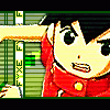
Fyxe Posted July 17, 2006 Author Share Posted July 17, 2006 [size=1][color=slategray]Oh my, haven't updated for a little while. I'm lazy. >> Thanks for the feedback, guys. And, Keyblade Wielder, I'd love to make you a banner sometime. :) I have some new stuff finally. I made two of these tonight, actually. First off, I'll start with my Naruto yaoi and yuri banners. XD [B]#1[/B] [IMG]http://img.photobucket.com/albums/v177/ShadowFox71/NarutoSasukebanner.jpg[/IMG] I found this adorable picture of Naruto and Sasuke while I was doing some searching and I couldn't resist. I mainly went for the old photograph-like look. Just messing around. I didn't put any text, because I didn't want to ruin the simplicity... and plus, I think it would have looked out of place. [b]#2[/b] [IMG]http://img.photobucket.com/albums/v177/ShadowFox71/BoundtoYou.jpg[/IMG] Another adorable picture I found... but, this time, Ino and Sakura. (Yeah, I know... I have a problem... I don't root for too many straight couples on Naruto. XD) Motion blur, contrasting, line work... all that fun stuff. Yay. [b]#3[/b] [IMG]http://img.photobucket.com/albums/v177/ShadowFox71/LastPetalGone.jpg[/IMG] Okay, a break from Naruto. I think the picture I took the main image from was really pretty... and I already have it as my background on my MySpace page. So... it was banner making time. I know that the font isn't exactly... smooth. I tried almost everything and it wouldn't go right. :/ So. There you have it. Comments very encouraged. *hugs Photoshop* Gawd, I'm so happy. XD[/color][/size] Link to comment Share on other sites More sharing options...
2010DigitalBoy Posted July 17, 2006 Share Posted July 17, 2006 [COLOR=DarkSlateBlue]Loveless[/COLOR] - I've never seen the show, but I've heard of it. I love the banner because the line effect looks cool and the colors are great. I also like the little Loveless' floating around. [COLOR=DarkSlateBlue]NarutoxSasuke[/COLOR] - I couldn't tell what was going on here for a while till I looked really close and saw it. Not bad, but nothing fancy. [COLOR=DarkSlateBlue]Bound To You[/COLOR] - Yeah, I like non-straight relationships also. Usually more fun to watch :animesmil I like the pic used, very cool artstyle, and the shrouding effect over the back part looks great. I like how the I-noxsakura pic goes over the border. [COLOR=DarkSlateBlue]Last Petal Gone [/COLOR] - The girl's face looks kinda weird over the rest of it, but I love the colors and the rose in the background. And aside from the awkward positioning, the pic is really cool. Link to comment Share on other sites More sharing options...
Riku Posted July 17, 2006 Share Posted July 17, 2006 [COLOR=Navy][SIZE=1][FONT=Tahoma]Yay!! I was waiting for you to finally post some new works you produced, Blase! I'm a big fan, you know. XD Anyways, continuing on... *ahem*... [B]NaruSasu[/B]: Ahh... my fangirlishness inside me runs wild when I see this banner. I love what you've done with the whole picture and making it look like an old photograph was an awesome idea. It was also a good thing not to add any text in there because it would lose focus on the actual picture... which I luff. XD I love everything abou it except the little two lined border on the inside. I feel it just loses the focus on NaruSasu and makes me look at the lines. Next time maybe you shouldn't put those there; it'll look better without those, I think. =D [B]Bound to You[/B]: And again, I love this one a lot... mainly because of the blur you did with the picture, the pink and black border and the stroked black lines... homg I loved those so much. I just love the quote and how you zoomed into the hands and also sticking with a whole pink-like feel. Only thing is where you see Ino and Sakura's face, they're above the border and that kind of loses the professional feel, if you get what I'm saying. When you put the border around everything, it looks a lot better. Trust me... I know. :/ [B]Last Petal Gone[/B]: Well... I like this one, but it isn't my favorite out of the three here. The picture of the woman kind of looks... bland among the reds and blacks. Maybe do some color balance and hue and saturation on her face. The red border with the flowers inside is nice, which I like. And also to what you said, the text isn't all that smooth. Try downloading some more cursive fonts or maybe try so pixel fonts. As I've learned from Ezekiel, if you want to put a lot in your banner, pixel fonts are the best.. and they're cute too. XD If you would like a site as to where you want to download them, [URL=dafont.com]here's[/URL] a good place to go to. Dafont is the best for getting great fonts... like the Kingdom Hearts font! OMG I need to download that! XD Anyways.... your work is so awesome by what I've seen. I can't wait to see some more!! n.n[/FONT][/SIZE][/COLOR] Link to comment Share on other sites More sharing options...
Recommended Posts
Create an account or sign in to comment
You need to be a member in order to leave a comment
Create an account
Sign up for a new account in our community. It's easy!
Register a new accountSign in
Already have an account? Sign in here.
Sign In Now