ARTommy Posted September 22, 2003 Share Posted September 22, 2003 my friend did this banner and i thought it wasnt to great so i went and pplayed around with it and this is what i got.commments advice [color=teal]BMP files are the worst thing to save as, because on the off chance that it does work, you have to go through a lot of work just to open it up and see it. I saved it to a JPG for you. -Syk3[/color] Link to comment Share on other sites More sharing options...
Zen Posted September 22, 2003 Share Posted September 22, 2003 Pretty cool. I like the blue coloring. Really mellow and cool. I like it. Add seom text of what ever and you got yourself a banner worth stealin'. 9/10 :D Link to comment Share on other sites More sharing options...
Xyandar Posted September 22, 2003 Share Posted September 22, 2003 here is my goku banner so far. waddya think?????? Link to comment Share on other sites More sharing options...
ARTommy Posted September 22, 2003 Author Share Posted September 22, 2003 heres a couple more of the same banner different layout tell me what ones u like [color=teal]EDIT:[/color] heh forgot to post em sry [color=teal]Please do not double post. If you forget to post an attachment, simply delete your previous post and post again with the upload. -Syk3[/color] Link to comment Share on other sites More sharing options...
Xyandar Posted September 23, 2003 Share Posted September 23, 2003 heres my finished banner tell me what you think okay?? Link to comment Share on other sites More sharing options...
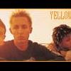
ARTommy Posted September 23, 2003 Author Share Posted September 23, 2003 uhh... dude you should make your own thread not post ur banners on someone elses just a reminder heres one more banner. i was inspired by Syk3 banner so i kinda made on my self Link to comment Share on other sites More sharing options...
Booboo Posted September 23, 2003 Share Posted September 23, 2003 I like your last one. It's plain and simple... I don't like complex banners thats much. I give it a 9.5/10 ^.^ Link to comment Share on other sites More sharing options...
OtakuSennen Posted September 23, 2003 Share Posted September 23, 2003 Hm.... Here goes a review. [b]First one--[/b] Ooooh, I smell a bitmap. ^_^ It's good that you converted it to JPeg or Gif or whatever you did. Normally bitmaps aren't allowed on OB. But that's impressive that you made a bitmap of such high quality on Paint. You DID use paint, right? But that's a nice color scheme, and the Goku came out well in the blue scheme. But you may wanna put a very light blue in the white areas. It seems sorta blank there, in a bad way. [b]8.8/10[/b] [b]And Xyander's..[/b] This one is interesting. Why are there two Super Saiyans that become one non-SS Goku, though..? It's good that you put the framerate up higher, but I still think you could put a little more time into that detail. [b]7.9/10[/b] [b]Tommy's second one:[/b] This one's just kinda plain. I guess it's OK, but I think you may wanna put your name in it or something. [b]8.2/10[/b] Link to comment Share on other sites More sharing options...
ARTommy Posted September 23, 2003 Author Share Posted September 23, 2003 thanks for the info guys:) . I've really been likeing my kenshin banner so i made some more like it. tell me what you think. and yes i do use paint. Link to comment Share on other sites More sharing options...
Syk3 Posted September 24, 2003 Share Posted September 24, 2003 [QUOTE][i]Originally posted by Xyandar [/i] [B]heres my finished banner tell me what you think okay?? [/B][/QUOTE] Please make a seperate thread for your banners. You are filling up someone else's topic with banners that will likely not even be noticed now. I'm not too big a fan of the first banner. It's good for what it is, but you simply cut out one picture, and made some designs in the background, but I do have to give you props for using the colors from the picture to make the color fading. On the second set of banners, I'd have to choose the first one. I like the seperation by the black border the best out of all of them, and I recommend finishing it up on the right as well as underneath the color fading bar. Despite the fact that they may be plain, I do find the last few banners good "eye candy." Other than the one of Jim from Outlaw Star, the pictures are all of good quality, and the borders are fairly proeffessional, though obviously to base someone around their borders is absurd. In any case, you captured the scenes well, and I was actually thinking of doing a banner similar to the one I have now but with some Samurai X in them, like you did with the one that's currently in your sig, heh. Just try a little harder and put a little more work into the banners, and with some practice, you'll become a lot better. ^_^ Link to comment Share on other sites More sharing options...
ARTommy Posted September 30, 2003 Author Share Posted September 30, 2003 its been i while since i put some up here. lesse.....hm these two look good Link to comment Share on other sites More sharing options...
klinanime1 Posted September 30, 2003 Share Posted September 30, 2003 Hm, well I've never really been much of a fan of wide banners, but the pics look really nice, quality wise. The borders are... neh... but at least you have one. It would be nice if there were words, and the first one's cut isn't too neat. As always, to each his own, and nice job. Link to comment Share on other sites More sharing options...
ARTommy Posted October 1, 2003 Author Share Posted October 1, 2003 heres two more. a spike and a vash one the spike is kind of bad quality Link to comment Share on other sites More sharing options...
Baron Samedi Posted October 1, 2003 Share Posted October 1, 2003 Your first one is cool. I like the idea, but a sharper image quality could do. Xyandar- Correct me if I am wrong, but this is ARTommy's thread for posting in, not yours. Second batch- Like I said, it is good excepting image quality. Your third one is sweet. really well done, 1000% improvement. The next two are both cool. The top one's image is not so good, but I like the simplicity and the cool borders. Nice sharp. I don't like that with the shadows. I prefer actual characters. The top one is ok, if you added a small text piece- like your name. The bottom one doesn't look very good at all. I can't even tell what it is!! lol. Some nice banners in there, keep it up. Link to comment Share on other sites More sharing options...
ARTommy Posted October 1, 2003 Author Share Posted October 1, 2003 heres this banner that i need to know what to do with. i'm not sure if i want to put a heart in the middle or not. please help Link to comment Share on other sites More sharing options...
Recommended Posts
Create an account or sign in to comment
You need to be a member in order to leave a comment
Create an account
Sign up for a new account in our community. It's easy!
Register a new accountSign in
Already have an account? Sign in here.
Sign In Now