Haze
-
Posts
406 -
Joined
-
Last visited
Content Type
Profiles
Forums
Calendar
Everything posted by Haze
-
thank you!!! i have been saying for years that shakespeare is not "bad" or "hard to understand" but people look at me like i am insane. i think they think it is so hard to read is because he uses language that is all but gone in the present day. its sad. he also uses alot of description. . . not what some people do today (that "the sky is big and blue" crap some authors use. shakespeare goes into extreme detail about it.) i honestly love shakespeare. he is amazing. . . and i wish i knew how to write like him. i think his best play has to be Hamlet. that play was awesome! i found Macbeth to be horribley boring. i didnt like it to much. but yes, it is better when acted out. . . but then you loose the ability to interpret the text for yourself. like those little phrases that can have several meanings. . . some very clean. . . others quite "vulgar" to put it nicely. i like reading it alot, but i also like to see how particular directores take what he says. is you ever get the chance go rent kennith branagh's version of hamlet. whoo! its great. not only does he star in it but he directs it as well. it is very well done. well i suppose i have ranted on for too long. ~haze
-
i do not have a problem with other people's banners its just. . . well lemme see. okie so in certain people's (its not like this person or that, its just random people, but not everyone. ) sig.s tehy thank this person or that for soem banner that is supposed to be somewhere in their sig. welp. i cant see them. but as i said its not in everyone's. . . like i can see syk's, james', queen asuka's, and various others. . . its just some people, but most of them. is it me and my stupid computer or is it something those people have done? a couple people that it is like that are Ryoko T.D.C. and GuradianStorm. if i am not mistaken i think other people can see them, but im not sure. please help, cuz its driving me crazy. . . they have a thank you yet no banner. ~haze
-
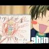
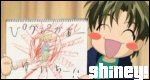
holy bajezus!!!!!!!!!!!!!!!! thats awesome!!he is so cute!! yay. thank you for drawin that! ^__^ the water drops add quite a bit. very nice detail. the hair, as per usual, looks awesome. i wish i could draw like you. . . .>.< but sadly i can barely draw stick peoples. the surf board is cool. . . i would have never thought of a surfer guy. . . awesome awesome job!!!! i cant wait till your next one. ~haze
-
their synthisizzed sound is kind of part of their package. . . that and the blues side to 'em. "harder to breathe" is the only song on their cd that sounds like that, or it is in my opinion. most of the rest of them have that "*sigh* its sunday afternoon. lets be lazy outside in the bright springtime sun and just relax." kind of feel to it. i really like them. . . i suppose its that attitude that is so great. if anybody has the cd. . . my favorite songs are "sunday morning" "secret" "through with you" and "tangled". not only do they address relationship problems. . . but they add in Adam Levine's gorgeous voice filled with such emotion that it makes me shiver just thinking of it. i've never heard a voice quite like his. and i get to see them in concert next week!!! yay. im so happy.
-
yeah so i had one thread but it kinda died. . . so i started this one. this first banner is from a series of books called "the Wheel of Time". it is very good and you should consider reading it. but the quote is said by a man by the name of Lews Therin Telamon Kinslayer. he is called the Dragon because he "broke" the world. read the book or pm me to find out what that means. i prefer for you to read the books. but that brought about lots of death and choas and such so the quote makes sense. the pheonix is my addition. i guess its cuz phoenix's are reborn. . . just like Lews Therin was. but yeah. read the books. they are really really good. all of 'em are by Robert Jordan. check em out. C&c&C ~haze
-
wow. that is really pretty. i like it lots. what is that "Son Goku" thing you keep makin banners of? i dont get out much so i dont kno. but i like it alot. i like all ur stuff. its very cool. i aslo like that last son goku banner (i think it from that) the one that has green on it and that guy. i liked that one very much. i think this last one is prolly your best yet, though. ~haze
-
YESH!!!!!!!! that is what im talkin bout!!!!!!! did you just cut that out of something? *looks at u all suspicious like* just kidding!! ^__^ i like it tho!! its a very nice. 10/10
-
hey thats neat. i cant guess what the image is from tho. . . >_< im not good at that stuff. but i like it. 10/10 for sure!! its really nice looking. . . very neat (not like cool but neat as in ordered). its not like alot of folks that is all over. . . its kind of controled, yet not. i like it.
-
oh my. . . that last one sounds scary. . . think of it a bit pervertedly. . . oh yeah. . . and you got a typo. but as i stated before (way early on) your banners and avis look great. there are just a few problems i have. 1. the text: you switch up the fonts a little bit. . . go crazy with 'em. also try to make them not so blurry. 2. your pictures are very pixelly most of the time. 3. your style. this one is a bit harder to explain. it like all your banner are the same. picture on left, text on right. switch it up. try doin like a picture or two all over the banner tehn put the text on top of the photo. or i suppose you could even switch the order and put the text on the left and the photo on the right. but mix it up a bit. now for some questions: 1. what program are you using? that may be the key to solving your problems from above. 2. where do you get your pics from? if you do what i do and just search on google. . . piece of advice. actually open the pciture. do not just use the thumbnail. the actaul pic is of better quality. 3. what kind of shows/games or whatever else do you get pictures from? im talkin like . . . who is that (other than rouge)? keep it up tho. you have some serious potential man. and im quite scared that you already have 40 posts under your belt and you've been here for not long. your thing says october but that is 40 posts in 8 days. its taken me 2 or 3 months to get clase to a hundred. but then i didnt have my own thread back then. plus i never talked. . . now im like all over. which i advise you to do as well. i look around and take notes from people whose banners get the best response. another word of advise look at dan rough's, hack helba (or whatever that name is), and most importantly KAOLA SU's banners. su is amazing. she is like a banner goddess. im serious too. but keep it up man. you'll go far.
-
name: kim age: 15 gender: female hair: brown but the under side is blondish eyes: green and yellow. . . they have like random yellow places wardrobe: umm. . . jeans and t*shirts. im not into that lets dress up to show off kind of stuff personality: welp. im shy round new folks. VERY OUTSPOKEN, kind of mean if i dont like you, im the go to girl- i kno more than all of my friends (seriousley. all but ben and trey are idiots), and i listen to everbody's problems. im nice too! hairstyle: well its either tied back in a low pnoytail or in a high one. i hate my hair. its all ugly so i dont wear it down. music: almost anything. i go for hardcore, straightedge, punk rock, rock , pop rock(sometimes), indie, electro-clash, a lil bit of metal, country, anime, trip/techno, classical, emo, orchestral, but no rap. i dont like it fav. bands: hot hot heat, every time i die, afi, the mars volta, modest mouse, moving units (yeah!!), stretch arm strong, daughters, alan jackson, toby keith, beethoven, mozart, chopin, my states symphony, reggie and the full effect, get up kids, saves the day, of means and ends, all ammerican rejects,coldplay, finch, thursday, taking back sunday, the used. . . all right i suppose i will stop. hobbies: i play alto sax, reading (anything i can get my hands on), talking on OB!, thinking (which not every one spends enough time doing), and studying (*gasp* yes. . . . i like to study, but only for one class. i am in this program called law academy and my high school. last year i took philosophy and ethics. this year its "examining historical documents and how those documents led to the creation of our government today? wow. That?s a long title. . . and yes that is really its name. We call it historical documents just cuz all that is a biatch to write out on evey single paper we hand in.)
-
hey zero!! man dont take anything im bout to say to be mean. . . k? okie. the main problem i have with your banners and avi is how you have stretched out the pictures. on all of 'em specially the second one you cant really get the full effect because of the fact that the pics are so spread. try and get some better pics and then dont stretch them so. also you might wanna use different color fonts on those first two. . . in places they are a bit hard to read. also try to use diffrent, less plain fonts. i like to see text that pretty much pops out at you. . . its really gotta draw attention to itself you kno? i presonaly like those fonts that are kinda cursive-ish. very pretty and flowing. but im likin what i see!! you have some serious potential once you get exactly how to make em down. keep it up! ~haze
-
that is very cool. whas it from? i like the boxes and such. what program did you use? i give it a 10/10!! its very cool.
-
those are great!!! bulma looks really hot in those clothes!! lol. im not really diggin that first chick. . . her body just doesnt "go" with her head and face. you know what im tryin to say? but those last two are amazing. i really like that third one. she looks cool. so does the last one tho. and maladjusted is right. . . those eyes are addicting. . . could you maybe draw a guy some time? i wanna see how hot you make guys look. ^__^ keep up the awesomenes! ~haze
-
mmmmmmm. . . you just made the BEST THREAD EVER!!! i love asian candy! so much so that i kno more about it than one of my asian friends. he says i am an asian in desguise! yay. pocky sticks are great. except teh strawberry kind. ewww. umm. . . Star Kiss Candy!! soooo good. find some and eat it. it is like a hard candy that tastes like nothing i can describe. . . it is awesome tho. LICHI!!!!! or however you wanna spell. not the dried stuff. im talkin the jello-ish stuff (which is lichi flavored jello) with a piece of lichi fruit in the middle. so good!
-
yay. i actually like this one. it of kauru kaimiya(or however that is spelled). its very purty. . . or at least i think so. well C &C ~haze
-
i like the concept for all of your banners. . . its just that . . . well to put it simply. . . your fonts suck. they are all the same and kinda boring. they are just there. you kno? they dont scream out "hey look at me! i have something important to say!!" they just sit there. some of your pictures are a litlle fuzzy but nice work.
-
huh. never heard of berserk. maybe i will check it out. but back to the banner. it looks quite good. where did you get that picture? artisticly it is very well drawn. i like it. 10/10
-
hmmm .. . this one isnt as good. the text should be a different color, you cant read it. also the picture is a bit. . . .well, off. i dont know how to discribe it. its like his face is squished or something. . . maybe somebody else could tell you exactly what it is but i just cant put my finger on it other than bein squished. srry. i give it a 7/10
-
that is kinda cool!i really like the background. what did you use to create it?
-
im an idiot. but i could have sworn it was u that made my avi. . . so stupid. i think i may have found out why i dont like ur sepiroth banner. its crowded and kinda scary. that middle picture *shudder*. . . but it is really really crowded. . .so much so that you cannot see the backgorund all that well. but the lord prozen one is still awesome!!!!!
-
Merf!!! so fast. .. .so dizzy *sways*. . . so headache-ey. try slowin them down A LOT!!!! they are really nice just too fast. i kno i have no room to speak with my avi bein what it is.. . .all siezure-like. but slow em down and it will look killer (hahahaha. . . me and my nerdy self. you get the pun? no? well in all your motion things someone is dying. . . so i used "killer" you get know?? im such a nerd!!!)
-
me like! who is this Ken Akamatsu??? i am so hopelessly deprived. . . *hangs head* but it is quite nice. and really funny! ^__^ what manga did you theive from? it has a very lush-shojo style. im likin it. keep up the coolness, eh? ~haze
-
that is kinda nice! quite good for a newer-newbie! me sees great things in yous future!!! yay!! i would really like to see more. . . keep up the coolness, eh? ~haze
-
the only problem i got wit most (not all) of your banners is the text. not the actual font but teh color. you seem to be fond of doin text is almost the same color as teh background!! making it quite unreadable. change that and all of your banner will be AWESOME!! i really like the sailor saturn, spike and faye (very nice effect!), and your lain banner. very very nice quality. i think my fav is the spike and faye one though. i have been unable to use that effect in my banners cuz my program makes them look stupid when i do that. so what program do you use?? i use Microsoft Picture It! 99 and sumtimes Microsoft Picture It! Photo Premium 2002. as you can see they are photo editing programs, which makes it a little difficult to do cool stuff. i want really really really bad paintshop pro. but its like $60 so i gotta save up! . . . .MERF!!! right. . . back to the banners. i forgeted. keep up the coolness, eh? ~haze
-
okie. . . you click the "reply" button. . . not the plaze that you can type at the very bottom. but it is right above that. it will say "new" in one little box and "reply" in the other. click reply. then once youve typed ur message click on the box that is a lil bit after teh text box that says attach file. then you click browse and find out where your picie is you wanna post and BA_BAM! its posted as an attatchment. i think that is right. you should be able to find it. pm me is you cant. tho i dont know if i can be any help ^__^ ~haze