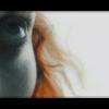
OtakuSennen Posted April 18, 2004 Share Posted April 18, 2004 [color=navy]It's been a while since I've really put any planning or time into a banner, and I was bored today, so I re-did one of my recent failed projects that was never seen on OtakuBoards. [center][img]http://www.angelfire.com/pro2/otakusennen/apprehensive-banner-web.jpg[/img][/center] I really don't have a title for this one. The file's name is "Apprehensive Banner", but I don't think that describes the expression on the girl's face well enough. For two or three months I've been trying to make some sort of follow-up to my old [url="http://www.otakuboards.com/showthread.php?t=37297"]"Fire And Ice"[/url] banner, but never quite got what I wanted out of any attempt. Today I decided to make another attempt, using both Paint Shop Pro and PhotoShop. It really didn't take me long to do, because I already had a basic layout made already because of a previous attempt. I just had to find the image of the girl again, which didn't take long, then spend maybe fifteen minutes putting everything together. The end result came out very well, I think. I spent a few minutes simply trying to find the right hue for the background, and what you see here seemed to compliment the rather bright tones of the girl. Plus, I finally gave up on feathered borders. Perhaps they should not exist in the first place. The avatar is just a crop of the banner, so there's nothing too special there.[/color] Link to comment Share on other sites More sharing options...
Shinmaru Posted April 18, 2004 Share Posted April 18, 2004 I think that the banner looks good. Nice and simple, heh. It helps that the picture of the girl is extremely sharp, as well. The only problem that I see is that the bluriness in the background is somewhat hard on the eyes, but it's not too bad. Overall, I think that you did a good job ^_^ I still like your Sniper Wolf banner, though, simply because Sniper Wolf is kick *** in just about every way >.> Link to comment Share on other sites More sharing options...
Mimmsicle Posted April 18, 2004 Share Posted April 18, 2004 [quote name='Shinmaru']The only problem that I see is that the bluriness in the background is somewhat hard on the eyes, but it's not too bad. [/quote] [font=Verdana][size=1][color=darkred]I acutally disagree >_>; The bluriness makes it more relaxing to look at, for me. Hehe. But anywhoo, the image is cut perfectly and is crisp. The darker background works splendidly with the lighter image. I'm glad you didn't include any text, but if you do at some point I wish you all the best ^_^;[/color][/size][/font] [font=Verdana][size=1][color=#8b0000][/color][/size][/font] [font=Verdana][size=1][color=#8b0000]Overall a job well done *thumbs up*[/color][/size][/font] Link to comment Share on other sites More sharing options...
James Posted April 18, 2004 Share Posted April 18, 2004 [color=#707875]Nice banner, Sen. I think that you chose a great image to work with and the composition works out very nicely. The only thing is, the background reminds me of a microscopic view of cells or worms or something...at least, that's the impression I get when I view it. So, that kinda mixes the meaning up for me. But aesthetically, I think it's quite nice.[/color] Link to comment Share on other sites More sharing options...
Syk3 Posted April 18, 2004 Share Posted April 18, 2004 Mm, you did very nice on this banner, Sen. ^_^ You chose a clean and crisp picture for the foreground, and the background is a cool abstract piece. It's all very soothing on the eyes. The only thing is, like I mentioned to you earlier, the glow around the end of her hair strand, which is kind of cut out. Also, I'm not sure if it was intended, but the inner border pixel is has less opacity which just looks a little off to me. :o Link to comment Share on other sites More sharing options...
Baron Samedi Posted April 19, 2004 Share Posted April 19, 2004 [size=1][color=darkred]Amazing stuff Sennen. I really love this one! I'd have to agree with Syk's comment about the glow on the end of those strands...it kind of goes a little bit funky there and ruins the general soothing and streamlining effect that an outer glow should have. I'd have to say the background is amazing, and having a slightly thicker border looks really excellent on this piece. The conttrast of the girl and the background is perfectly toned. If I was able to name this piece I'd call it "Wist-futility", a fusion of wistful and futility. Anyway, I'm really liking this one Sennen- possibly your best banner ever. Be proud.[/size][/color] Link to comment Share on other sites More sharing options...
Recommended Posts
Create an account or sign in to comment
You need to be a member in order to leave a comment
Create an account
Sign up for a new account in our community. It's easy!
Register a new accountSign in
Already have an account? Sign in here.
Sign In Now