Ikillion Posted May 29, 2006 Share Posted May 29, 2006 [COLOR=DarkSlateGray][SIZE=1][FONT=Comic Sans MS][center]Welcome ladies and Gentelmen to Round 2[/CENTER] Participants: Ezekiel, Katana Date Due: June 1st, 2006 Requirements:[strike] -500x500px -Limited palette [/strike] [COLOR=Black]-[NEW!] [/COLOR] 125 px (width) by 500px (length) [COLOR=Black]-[NEW!][/COLOR] Font set: Century Gothic and Arial Narrow. [COLOR=Black]-[NEW!][/COLOR] Ban on transparent pixels [COLOR=Black]-[NEW!][/COLOR] Limited palette: white, black, 50% gray(#888888) only. Colors in between are not allowed. (Please don't kill me for these. I just follow the rules >.>; ) Reminders: -The [COLOR=Black][B][U]final day [/U] [/B] [/COLOR] to modify/change/edit/or do whatever you would like to your picture is three days from today. -After the deadline, voters will be given [COLOR=Black][B][U]five days[/U][/B][/COLOR] to vote. Other than the two participants, all Members are able to give their votes on the works of art. -Remember you [COLOR=Black][B][U]must[/U] [/B][/COLOR] post at least [COLOR=Black][B][U]three[/U][/B] [/COLOR] sentences about the entry they are voting for,and at least [COLOR=Black][B][U]one[/U][/B][/COLOR] sentence of constructive criticism about the other. If a member fails to meet this criteria they will be sent a PM from a Tournament Presider and will be able to change their vote for the rest of the voting time. If they still do not meet the criteria after being sent a Pm their vote won't be counted. -Finally, good luck and may the best artist win.[/FONT][/SIZE][/COLOR] Link to comment Share on other sites More sharing options...
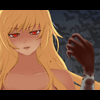
Katana Posted May 31, 2006 Share Posted May 31, 2006 [color=royalblue][size=1][b]Preface:[/b] Ezekiel has me pwned. [b]Ramble:[/b] This is probably the hardest thing to work with. At first, I thought it was just greyscale, but then I scrutinzed the post and realized - no buddy, it's just three colors. With little to work with, I just kinda whipped out some (not-so) old pictures to mess around with. To my surprise, after having some filter-experimentation-fun, I received a decent result. [b]Pleading Details:[/b] Before I even post my piece, I need to explain some nit-picky details. The piece came from a 1280x960 pixel picture, which I worked with for full detail. I saved it as a .psd, yeah? But I realized that after I resized everything and saved it in the .jpg format, some colors appear turn into a very very slight grey. ...And I can see those raising eyebrows. And I really need to prove my point. Ooookay, it's time for links! >>[url=http://img335.imageshack.us/img335/6676/hbrush7yu.jpg]Original[/url] - This is the brute-force of the original, all 1280x960 pixels of it, leaving 56k users wallowing in pain. As you can see, it's WHITE. >>[url=http://img185.imageshack.us/img185/1589/rush7sg.jpg]Resized[/url] - And now, the unfortunate force of resizing has come into play, and some pixels are appearing grey. [b][center]>>Entry<<[/b] [img]http://img445.imageshack.us/img445/536/hbround24kn.jpg[/img] Falling Apart, Piece By Piece [spoiler]A reference to finals, maybe? (Edit: Yeah, a reference to finals.)[/spoiler][/center] [b]Selection:[/b] Nose, lips, and parts of my way-too-messy hair. The first two parts came out the best out of all the things I messed with, so I figured I should make them the focus. [b]Second Ramble:[/b] I'm excited. And estatic. And my stomach hurts. x3 After r2vq suggested I go with a .gif instead of a .jpg, I discovered something vastly important - [b]I am too dumb for .gifs.[/b] >.< This is why I must be supervised at all times. Also, the .gif just washed out my text. [b]Conclusion:[/b] ...I need pudding. ><[/size][/color] Link to comment Share on other sites More sharing options...
Ezekiel Posted May 31, 2006 Share Posted May 31, 2006 [SIZE=1]Ugh, Katana, don't count yourself out just yet. I hated this round. -_- While I had fun making this piece, I'd have been much happier if I didn't have to post it for voting purposes. *gurgle* [CENTER][IMG]http://img.photobucket.com/albums/v219/AzureImi/shikaround23.png[/IMG] [/CENTER] While Shikamaru was fun to look at while I did this, I'm not quite sure he's done the job. Oh well, such is life. EDIT: Took out all the grey shadows on Shika's right side. Hope this is okay now, Delta.[/SIZE] Link to comment Share on other sites More sharing options...
Ikillion Posted June 1, 2006 Author Share Posted June 1, 2006 [COLOR=DarkSlateGray][SIZE=1][FONT=Comic Sans MS] Woah, Wow, Amazing stuffs you have actually been able to produce with almsot a little touch on the side of confusion, While I still try to find out why I am still awake while its 2 in the morning my time I will take this time to say... [CENTER]Voting is now open! [insert cheer here][/CENTER] Now follow the rules and such as afore mentioned on the top of the thread or else, happy voting.:whoops: [/FONT] [/SIZE] [/COLOR] Link to comment Share on other sites More sharing options...
sakurasuka Posted June 1, 2006 Share Posted June 1, 2006 [size=1][b]Katana[/b]-I know how you feel, this round was quite near torture for me, too [; I think you did quite well given the handicap. The squiggly lines don't appeal to me much, but that's personal choice. I think you did great with the font handcap, though! *Thumbs up* [b]Ezekiel[/b]- Shikamaru! Yays! This piece also used well the colors allowed by the handicap. I think limited space is used rather well. The font is nice, not thre greatest, but I understand why with only two font choices. The design at the top is a bit distracting, maybe it would have looked better just dots alont the top? Or omitted altogether? I'm not sure. It just looks a bit awkard as-is. That being said, I must vote for [b]Ezekiel[/b], because her piece looks a bit cleaner, and I think she took full advantage of the few things the handicap allowed.[/size] Link to comment Share on other sites More sharing options...
DeGHead Posted June 1, 2006 Share Posted June 1, 2006 [B]Ezekiel:[/B] You're piece is great, I love the picture, though it almost doesn't seem to work with the text. The background is great cause it's simple yet not boring, and busy but not annoyingly so. I think you could have done better with the text, but taking into account the handicaps, you did very well. [B]Katana:[/B] I liked your piece, but it was waay too much. It took me several minutes to figure out what it was. Though I do like how the font fits in, it's simple, with all this craziness around it. I just think given less excruciating handicaps you could have done much better. Oh yeah, I vote for [B]Ezekiel[/B] Link to comment Share on other sites More sharing options...
Riku Posted June 1, 2006 Share Posted June 1, 2006 [COLOR=DarkSlateBlue][SIZE=1][FONT=Tahoma]Before I place my vote, I would just like to say that you both did an amazing job with the gruesome handicaps provided. Both of your pieces look absolutely wonderful and I hope that which ever one of you moves on that you do an excellent job in the final round. ;D Now, to stop with my ramblings and onto my vote!! XD [B]Katana[/B]- I must say... I absolutely adore what you did to that photo. Filters, you say? This is amazing... really nice. Although, the wavy lines (as Sakurasuka said, I believe) don't really appeal to me all that much... it kinda took me awhile to actually realize what your picture was all about. Really awesome saying, though. =D [B]Ezekiel[/B]- As you once said... Shika~Shika Shikamaru!! Or something... XD Anywho... I love this piece so much it scares me. Just the way the picture is placed, the brushes you used that adds to the mystery in it all and your quote just explains what Shikamaru is totally about. You took full advantage of the handicaps in this round and made a awesome piece!! Anywho, for my vote... [B]Ezekiel[/B]. w00tness to you both, I say!! =D[/FONT][/SIZE][/COLOR] Link to comment Share on other sites More sharing options...
jigglyness Posted June 1, 2006 Share Posted June 1, 2006 [b]Ezekiel[/b] gmv this round also. Ezekiel - I really like how the quote/text matches shikamaru perfectly. Although I think Shikamaru's should area is a little too white. It makes it seem like there's a white chunk behind it. Where it starts to get really black, I think the random line things are a little awkward. Katana - Your piece is very creative with the nose mouth and hair but the lines are really bothersome to me. it's a very good idea but the lines are very un-liney so it seems really awkward to me especially where it's supposed to be hair. BUT the typography doesn't really seem like a handicap for your piece since it looks like it was purposely that font type even without the handicap. Good job both of you. I wish you guys good luck. :) Link to comment Share on other sites More sharing options...
Katana Posted June 1, 2006 Share Posted June 1, 2006 [color=royalblue][size=1]It's not really like me to pubically whine, but I feel a need to explain something. I've noticed that many people have been citiing me for the "squiggly lines". But what are those? They're not intentional - [i]it's my bloody hair.[/i] The piece is a real and true photograph of myself, just Photoshopped. If I was to take away that hair, than the piece would defintly lose something. Not only that, but then I would be bald. >.> >>[url=http://img308.imageshack.us/img308/3563/katshair8tw.jpg]Picture clicky![/url]<< Saying that the squiggly lines are bad and pretty much meaning that they shouldn't be there is sort of like saying "get better genes". I just wanted to make that clear before people get off with the idea that I really enjoy squiggly lines. XD[/size][/color] Link to comment Share on other sites More sharing options...
Boo Posted June 1, 2006 Share Posted June 1, 2006 [size=1]Not to be a party pooper or anything, but... [quote name='Handicaps']Limited palette: white, black, 50% gray(#888888) only. Colors in between are not allowed[/quote] Lot's of different shades of gray in both pictures though. Katana's has them because of the JPEG quality of her image (which I must say was not smart either <.<;; ). The original can be found [url=http://img335.imageshack.us/img335/6676/hbrush7yu.jpg]here[/url] or in her original post. Gurt's (Ezekiel's) piece has quite many shades of gray though. [URL=http://img396.imageshack.us/img396/8579/ehhhgrays7iw.png]Example.[/url] Now please, before I vote, can anyone tell me if that is allowed? [b]Edit:[/b] Before you think I'm whiney: I just don't think it's really quite fair if someone can use more shades of colours than an other. And well yeah, you may think I'm whiney now.[/size] Link to comment Share on other sites More sharing options...
Ezekiel Posted June 1, 2006 Share Posted June 1, 2006 [SIZE=1]Delta PMed me about the shades of grey I had in my piece because when I first sumitted it half of Shikamaru was in grey. I deleted all that I could and now it's purely white. As far as I can tell. I realise that some shades will be grey and this is, I feel and I imagine Katana does too, pretty unavoidable when using stock that we had to edit form its original colours (Her moreso than myself). I did a vector piece first but there's only so many vectors a message board can take. I don't honestly think that I cheated by using mutliple shades of grey because, honestly, are they a huge part of the picture? When I look at my own and Katana's pictures the first thing I see is 'black and white'. Not black, white and...omg! A shade of grey that isn't #888888?!?! We didn't intenionally put them there to be awkward or get an advantage, you know. You get my meaning? If it was a big part of the picture, like I had before, then I would agree with you Boo. But seeing as it isn't I think you're being a wee bit too nit-picky. I still <3 you though. ^_~[/SIZE] Link to comment Share on other sites More sharing options...
Boo Posted June 1, 2006 Share Posted June 1, 2006 [size=1]Well, seeing as your text is at the top and your image at the bottom, the thing that catches my eye most is the ammount of grey in the middle ¬_¬' But really, the not-being-able-to-use-many-greys [i]is[/i] the main handicap in this round. I think it's a pain too, but luckily anti-aliasing is allowed. So if you could've just cleaned it up a bit and make the rest of the greys look like anti-aliasing, there wouldn't really be a problem. Now the grey is really part of the image in my eyes. Sorry <_<;;[/size] Link to comment Share on other sites More sharing options...
sakurasuka Posted June 1, 2006 Share Posted June 1, 2006 [QUOTE=Katana][color=royalblue][size=1] Saying that the squiggly lines are bad and pretty much meaning that they shouldn't be there is sort of like saying "get better genes". I just wanted to make that clear before people get off with the idea that I really enjoy squiggly lines. XD[/size][/color][/QUOTE] [size=1]Heh. The whole thing is a tad squiggly, not just the hair. That is what I was reffering to. I was just implying that maybe a better method could have been used to make it #000000, #FFFFFF, and #888888. That filter just isn't my favorite. It gives birth to bright white squiggly lines. And Boo, you're right, there are many, many colors of gray in both pieces. But both are un-intentional. Katana provided the original, and we can tell that it's obviously supposed to be just two colors. The problem was in the re-sizing. I think maybe Katana could have re-sized the image before applying the filter. That would have fixed the problem. *Shrugs* Zeke's has more gray... But most of it is in the image's shirt. Meh. I dunno. All of ours [Save r2vq] have a few different pixel colors due to anti-aliasing, but it really is Delta's call.[/size] Link to comment Share on other sites More sharing options...
Boo Posted June 2, 2006 Share Posted June 2, 2006 [size=1]Ah well, whatever. My vote goes out to [b]Katana[/b]. Gurt has enough votes anyway. I like squiggly lines. I will not repeat that I found it rather silly that you've downsized it, while it being filtered [i]and[/i] jpeg. Okay, I just did. The piece reminds me of the type of drawing that requires black paper, ink and some of those oldschool pens. I did that at primary school alot. The piece brings back sweet memories... *sees butterflies fly past him while running through flowerfields* Okay, they weren't [i]that[/i] sweet. ¬¬ Gurt's piece was nice too. Well, I already mentioned that I'm not too happy with the greys in it, so that seems unnecessary to comment on. The text is way in the top while the stock is way down. His head is kind of low too, which makes him look even lower in the picture. I like the splattered background though. If you left the scratches in the middle out my vote might've gone to you. [/size] Link to comment Share on other sites More sharing options...
Aaryanna Posted June 2, 2006 Share Posted June 2, 2006 [COLOR=SeaGreen][B]Katana:[/B] What I like best about your piece is how the messy lines especially along the top fit the idea of falling apart piece by piece. It?s like the form in the picture is coming apart from the top down. What I don?t care for is that the font seems to be a little closer to the right border than it is to the left. Perhaps moving in over to the left a touch would help? [B]Ezekiel:[/B] What I like best about your piece is how nicely it?s organized. From the placement of the picture to the background it?s nicely laid out. I also like the texture in the background as it keeps the piece from being to bland. What I don?t care for is the placement of the font at the top. Perhaps moving it down a touch would help? It just seems to be slightly blended in with the top. Though that?s probably my screen. Anyway, nice job both of you. ^_^ I see a lot of creativity considering the limitations that were placed on this round. In the end I vote for [B]Katana[/B] as I like the feel of things unraveling in their piece. [/COLOR] Link to comment Share on other sites More sharing options...
Pumpkin Posted June 2, 2006 Share Posted June 2, 2006 [FONT=Franklin Gothic Medium][COLOR=#333333][SIZE=2]This is a tough one... [b]Katana[/b] : I suppose I must have been blind or didn't look closely enough because it took me quite awhile to actually see that it was a portrait piece until I read your little skit. After that, I appreciated it even more for its creativity. But what I really loved most was your saying and how your picture seemed to represent it most. I don't know much about graphic coloring but all I do know is that with the limitations you were given, you sure managed to pull of a unique look. However, the only thing that I would change would be maybe making it stick out more since the image is really hidden and not everyone can tell that it's a portrait piece. [b]Ezekiel[/b]: I loved your piece not only because it was clean cut, but it was simple and still made your eyes drawn to the image. The slogan "Shadows are lovely company" is also cute and supportive of the theme, I much enjoyed the background as it fades into a white. Very creative look. However, the only thing that I found wrong about this piece, was it was sort of cliche' and didn't break any boundaries. It seemed a bit too simple. So my vote will have to go to...[b]Katana[/b]..simply for uniqueness and creativity. [/FONT][/SIZE][/COLOR] Link to comment Share on other sites More sharing options...
Horendithas Posted June 2, 2006 Share Posted June 2, 2006 [COLOR=Sienna][B]Katana:[/B] The thing I like the most about yours is the obvious contrast of black with just a little bit of white. The lines are a nice mix of clean and messy and overall it just flows nicely. I also like how none of the lines other than the text are simple. What I don?t care for is the placement of the text as it?s a little to close to the right. [B]Ezekiel:[/B] First of all what I like best is the nice texture in the background. The choice and placement of the picture goes nicely as well. The choice of words fit the piece. And overall I think it all fits together. The thing I don?t care for is the white background around part of the character as it just seems distracting. For this round my vote goes to[B] Ezekiel[/B].[/COLOR] Link to comment Share on other sites More sharing options...
eleanor Posted June 2, 2006 Share Posted June 2, 2006 [color=dimgray] First of all, great jobs to both of you. [b]Katana[/b]: When I first looked at your piece, I had no idea what it was. I may sound like an idiot right now, but it took me some time to actually realize that it was your face. (I had to read the your notes to finally get it.) [i]After[/i] I realized that it was your face, I'd have to say that it's pretty neat. I have no idea how you did this, so kudos! Awesome job with outlining and such. Or however you did this. lol However, I take as sort of a bad sign when I can't tell what a graphic is. The end result must always speak for itself, and I also take is as a bad sign that I was forced to read the notes. In addition, I don't see how "falling apart piece by piece" correlates with the graphic. Maybe more of a 'fading away', but falling? I don't get it. Lastly, I do not like the aesthetic look of the scribbly-ness. [b]Ezekiel[/b]: Nice. I think you did a great job under the handicaps, and I think the font matches well. Everything looks pretty neat and clean, and I think the balance is ok. It may be a little off to many people, but I didn't get irritated by it or anything. (Plus... it's Shika-boom-boom! :D) My only critique is that it's very conventional and safe, but on the other hand, I value conventionality to an extent. My vote goes to [b]Ezekiel[/b].[/color] Link to comment Share on other sites More sharing options...
Aiyanna Posted June 4, 2006 Share Posted June 4, 2006 [COLOR=Indigo]Hmmm...:: ponders the two:: The OB people seem to like simple straight lines. That depresses me. Katana: I love this piece. I knew what it was from the start-maybe I'm just intuitive that way? (or maybe I saw the original? :P) But really, I didn't think it was that hard to figure out. Personally, I love the "squiggly" lines. They fit well, it makes one want to keep looking, just to see if they end, or start going straight. And honestly, the text fits perfectly with the image, in my eyes. "Falling apart, piece by piece" is exactly what the image is doing. THUS THE SQUIGGLIES! Muahaha, I understand it. I think the way that it's white on black, and not the other way explains the falling apart part of it...it's very dramatic, and has an awesome effect. Ezzy: Do you mind if I call you that? Oh well. ^^; I gotta say, I really like the cross-hatching thing going on in the background. It's reminiscent to me of claw marks, or scrapes or something. ::shrugs:: I also like the actual image of the person....he looks menacing! The white around the character is a bit...overpowering to the image, drawing the eyes to where it leads rather then the image as a whole. I really like the piece, but I must say it just doesn't catch my attention. It seems too simplistic. My vote: [B]Katana![/B] [/COLOR] Link to comment Share on other sites More sharing options...
SunfallE Posted June 5, 2006 Share Posted June 5, 2006 [COLOR=RoyalBlue][B]Katana: [/B]your submission has a nice contrast to it and a good messy feel as well. I like how you went with a black background and the lines being in white instead of the other way around. I think it makes it stand out more than say having white with black lines would have. What I don?t really care for is the words. They don?t seem to fit and the placing seems to be off. The words falling apart just seem like they would look a little better if they were centered. [B]Ezekiel:[/B] your submission comes across, as being well structured with the words shadows are lovely company at the top and the dark background. It leads nicely down to the character who though touching the shadow?s so to speak is still in the light by virtue of the white background surrounding him. Hence the shadows are company. Or so it seems. What I don?t care for is the top border. I?m not sure if those marks are supposed to be stars? I can?t really tell. It?s nice; I just find it a little distracting. My vote goes to [B]Katana[/B]. [/COLOR] Link to comment Share on other sites More sharing options...
Ikillion Posted June 6, 2006 Author Share Posted June 6, 2006 [COLOR=DarkSlateGray][SIZE=1][FONT=Comic Sans MS]Well now may I say that was one really close race. After counting, re-counting, and counting I think around two times more the results are inn. [CENTER]Katana-5 Ezekiel-6[/CENTER] Even though I adore both pieces, Ezekiel moves on to the next round which should be a Threeway? (excuse the pun) Then after that is Teh final round. Congratulations to both of you though, they really were wonderful.[/FONT][/SIZE][/COLOR] Link to comment Share on other sites More sharing options...
Recommended Posts
Create an account or sign in to comment
You need to be a member in order to leave a comment
Create an account
Sign up for a new account in our community. It's easy!
Register a new accountSign in
Already have an account? Sign in here.
Sign In Now