Sun Posted October 27, 2003 Share Posted October 27, 2003 Hilarious! .:bow's down to the master:. ! My banner skills will never match the creative style that you have. Every single banner that you posted on this thread is magnificent. I thank you so much for starting me off with making banners, and i hope to see more banners from you. ~Dragon~ Link to comment Share on other sites More sharing options...
Dagger Posted October 27, 2003 Share Posted October 27, 2003 Wow. Your Homestar Runner banner is absolutely amazing. The timing is just right, and it's incredibly funny. The blue lines look perfect, by the by. ^__^ I also like the Tsukasa banner. The scan lines are a really cool-looking effect, and it's good that you didn't let the numbers in the background overpower the image of Tsukasa. Nice color scheme, too--the dark blues and grays lend it a somber, thoughtful sort of mood, much like that of the actual show. ~Dagger~ Link to comment Share on other sites More sharing options...
terra Posted October 27, 2003 Share Posted October 27, 2003 Hahaha, that reminds me, my college had a pumpkin carving contest and then put the pumpkins up in the dining hall. One was Homestar, which I thought was hilarious. I love the Teen Girl Squad banner, it is, indeed, perfect. The blue lines are seamless, and the timing is good. (Man, Dagger took my comments.) Link to comment Share on other sites More sharing options...
Dan Rugh Posted October 28, 2003 Author Share Posted October 28, 2003 Sha Gojyo - THE coolest character in Saiyuki. That is why he is the star of my banner. In the back are Goku, Hakkai, and Sanzo. [img]http://www.otakuboards.com/attachment.php?s=&postid=508054[/img] Link to comment Share on other sites More sharing options...
Kyo no Ryu Posted October 28, 2003 Share Posted October 28, 2003 YEAH! That is one aweome banner. I agree, he is the coolest. I like it. Keep going. Make more Saiyuki! Link to comment Share on other sites More sharing options...
Dan Rugh Posted October 29, 2003 Author Share Posted October 29, 2003 I love this picture of Sanzo Genjo of Saiyuki... so I animated it into a banner. Let it load through once before watching it... it gets a lot smoother. :) [img]http://kangarugh.250free.com/sanzo_gunblast.gif[/img] One question before I go: Why doesn't anyone ever post in my thread? It's the same people every time besides the occasional newbie. Link to comment Share on other sites More sharing options...
Pex Posted October 31, 2003 Share Posted October 31, 2003 That banner you made for Saiyuki is really great. The animation is smoothe and animated slow enough for people to see the everything in the banner, because sometimes people who make animated banners usaually don't give the viewer enough time to read everything. Personally I like every banner you do, especially this one, my new favorite anime, when I have to watch it on the Anime Network, Saiyuki. ^_^ Link to comment Share on other sites More sharing options...
Arcadia Posted October 31, 2003 Share Posted October 31, 2003 [size=1][color=firebrick]Oh Dan, don't you like your loyal fans? I do like the new banner, though I think I just like the picture by itself more than with all the animation added to it. It's a pretty intense sort of picture, so to me it feels like all the added stuff just kind of takes away from it. That, and I kind of wish there was some sort of border to it, just to distinguish it from the rest of the white on the page. But that's just me. ^_^[/color][/size] Link to comment Share on other sites More sharing options...
Dagger Posted November 1, 2003 Share Posted November 1, 2003 Wow, that image is absolutely gorgeous. Like Arcadia said, it's quite intense. The bright colors add a lot to its impact. The animation is extremely smooth. It's actually rather mesmerizing to watch. The banner as a whole would look a bit cleaner if it had a border, but I'd venture to guess that adding one would be [i]extremely[/i] time-consuming. ~Dagger~ Link to comment Share on other sites More sharing options...
Dan Rugh Posted November 1, 2003 Author Share Posted November 1, 2003 Saosin avatar for Miss Kaola Su. [img]http://www.otakuboards.com/attachment.php?s=&postid=510050[/img] Kaola, tell me if you like it cuz I can make a new one. Link to comment Share on other sites More sharing options...
Sun Posted November 9, 2003 Share Posted November 9, 2003 I love that avatar, but the latest Sanzo one is amazing.There is nothing wrong with it what so ever.Maybe you can give me some other pointers. I can't wait till your next banner comes out. One more thing I don't get, your one of our best banner makers and your thread has no comments we need to do something about this. Come on people! Post! Link to comment Share on other sites More sharing options...
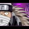
Dan Rugh Posted November 9, 2003 Author Share Posted November 9, 2003 Well, I must give many thanks to Evolved_Dragon for replying so quickly at my request since no one ever does. ¬_¬ Well, I made one and a half banners today... both in greyscale. The one is the picture at the entrance page of some Naruto website. I liked it so much that I stole it, changed the size, and edited a bit. The other is all by me. :) [img]http://kangarugh.250free.com/kakashi_sharingan.jpg[/img] [img]http://kangarugh.250free.com/naruto_trio.jpg[/img] The thing to marvel at is that the little arrow was created by yours truly. It is the star of the show, obviously. ;) Link to comment Share on other sites More sharing options...
Mimmsicle Posted November 9, 2003 Share Posted November 9, 2003 [color=chocolate]wow... after looking through [i]ALL[/i] the pages I find myself speachless. it's amazing how you've managed to make all these different banners and avatars and still maintain a high level of ... what's the word... they all look different, there's no repeating in style. I'm gobsmacked. Truly. I might have to call upon your services when I get something that might challenge you in the slightest :P - Mimmi[/color] Link to comment Share on other sites More sharing options...
Hittokiri Zero Posted November 9, 2003 Share Posted November 9, 2003 [quoteWhy doesn't anyone ever post in my thread? It's the same people every time besides the occasional newbie.[/quote] Alot of people including myself don't like these constant threads where graphics are constantly posting. Instead of rolling out in quantity aim for quality. Let's see the animated Saiyuki banner is interesting but it doesn't have a smooth animation in the sense that once it ends it kind of "jumps" then starts over. The blood looks somewhat liquidy which is nice but because of that it just somehow doesn't look right when it scrolls down if the ripples moved... now that'd be something. As for the Naruto banners the one with the arrow is quite simple but looks [i]somewhat[/i] nice. My biggest complaint is that between the text there is just too much white space. As for the other Naruto banner, the way the eye hangs over the border looks good... but I really don't know how to say this other than that it looks "odd" in demeanor/for a signature. :therock: Link to comment Share on other sites More sharing options...
Tsukina Posted November 9, 2003 Share Posted November 9, 2003 I like the new banners. I think the second one is better. (especially with the little arrow) I'm not sure what, but there's something about the first that I don't like. It may be that I'm a very mathematical/logical person and the eye at the bottom just doesn't seem to fit. Link to comment Share on other sites More sharing options...
Dan Rugh Posted November 9, 2003 Author Share Posted November 9, 2003 [quote][size=1][i]Originally posted by.... eh, who cares?![/i] A[b]_[/b]lot of people[b],[/b] including myself[b],[/b] don't like these [b](edit)[/b] threads where graphics are constantly [b][being posted][/b]. Instead of rolling out in quantity[b],[/b] aim for quality.[/size][/quote] If you didn't notice... I started this thread at the end of June. So, your "quality over quantity" garbage doesn't affect me. Edit: Oh. I took the liberty of editing the quote I took from you. What a mess. Link to comment Share on other sites More sharing options...
Hittokiri Zero Posted November 9, 2003 Share Posted November 9, 2003 Wow I haven't posted that bad gramatically since the good old n00b days... Then again it could be that instead of spending all my time in doors I enjoy working out outside even in the cold -_-.... urusei... anyway my quality over quantity "garbage" does still apply to you; just take it as it is (don't get angry -_-). From the looks of it your signatures have not taken very long to make you just make them for the sake of making them, now there is nothing wrong with that. But it is my personal opinion and advice to you that you would be better off trying to make a few good sigs instead of many less than medicore ones. example: Your naruto sigs could be created in less than 4 minutes. If you spent a little bit more time on them and strived more for quality you could easily have come up with something better (I hope). Link to comment Share on other sites More sharing options...
Dan Rugh Posted November 9, 2003 Author Share Posted November 9, 2003 The first one only did take a few minutes because, essentially, all I did was change the size of it to be banner size. The second one did not take me 4 minutes, by the way. Each of the characters, which were around 600x600, had to be cropped from their backgrounds. I take a lot of time in tweaking my banners until I am completely satisfied with them overall. "From the looks of it" you can't tell how long they take because you didn't make them. You have no idea what all was done in a banner just "from the looks of it". I do what looks good to me so I could care less if you like them. Link to comment Share on other sites More sharing options...
Hittokiri Zero Posted November 9, 2003 Share Posted November 9, 2003 [quote]The first one only did take a few minutes because, essentially, all I did was change the size of it to be banner size. The second one did not take me 4 minutes, by the way. Each of the characters, which were around 600x600, had to be cropped from their backgrounds. I take a lot of time in tweaking my banners until I am completely satisfied with them overall. "From the looks of it" you can't tell how long they take because you didn't make them. You have no idea what all was done in a banner just "from the looks of it".[/quote] Cropping out a character from a bigger image nevertheless onto a [b]WHITE[/b] background is the easiest type of photo editing to do -_-. Here's a few reasons white tends to hide up the mistakes you may make, and when a image is shrunk even more pixels get lost because of the size distortion. Now please don't argue I posted a opinion take it as you will, I'm not in the mood to continue this. [quote] I do what looks good to me so I could care less if you like them.[/quote] haha quite ironic why make a thread to post your banners in if you don't care what others think -_-. Link to comment Share on other sites More sharing options...
Dan Rugh Posted November 9, 2003 Author Share Posted November 9, 2003 I must get the last word in so... I make banners because it's enjoyable. If people like them, then so be it. If they don't like what I'm doing, then fine. But your "high and mighty/I know everything about Photoshop" attitude got me angry. Link to comment Share on other sites More sharing options...
Dagger Posted November 10, 2003 Share Posted November 10, 2003 Well, Dan, I for one am a big fan of your banners, and your latest are (as always) simply superb. Though both simple, the two Naruto banners are very aesthetically pleasing. They're well-balanced, and the use of grayscale lends them a nice, clean (for lack of a better word) look, which color might not have been able to achieve quite so effectively. That little arrow is indeed the star of the show. ^_~ Once again, fantastic work. ~Dagger~ Link to comment Share on other sites More sharing options...
Haze Posted November 11, 2003 Share Posted November 11, 2003 i agree with dan but i suppose it is none of my business! ok. i really like the one with his eye below the line. i think it just adds something. very purtty ^__^ and that arrow in the second!!!! WOW!!!!!! its so BEAUTIFUL!!! its the shining-star. *winks* i also like the rest of that banner. its lovely. clean pictures. and i rather like the white background, its something new. oh! i hope you dont mind, but i just went through your ENTIRE thread and saved almost all of your stuff to my hard drive. heehee! ^^ i want to look at them lots. i plan on using you as a guideline so that i can better my banner/wallpaper making skills. they are quite low at this point. heh. i hope you dont mind. i wont use them other than to oggle at. k? ~haze Link to comment Share on other sites More sharing options...
Dan Rugh Posted November 17, 2003 Author Share Posted November 17, 2003 Made a banner today. Took me a while to decide what I wanted to do with it. It's actually got more to it than it looks like. There are two separate pieces of the picture there, one inside the white lines and another outside of the lines. After I separated the picture, I faded the pieces differently so it would have that neat effect. [img]http://www.otakuboards.com/attachment.php?s=&postid=517840[/img] Link to comment Share on other sites More sharing options...
Kyo no Ryu Posted November 17, 2003 Share Posted November 17, 2003 Will you ever cease to amaze me? That is beutiful. The blue aura, the 2 shades of blue, the text, the placement of the white lines, all so perfect. 10/10 as usual. Link to comment Share on other sites More sharing options...
Tix Posted November 17, 2003 Share Posted November 17, 2003 Wow! Once again (what...the 4678974th) the Naruto banner is really great. How you blended the two image = neat banner. We want more...:wigout: 11/10:laugh: Link to comment Share on other sites More sharing options...
Recommended Posts
Create an account or sign in to comment
You need to be a member in order to leave a comment
Create an account
Sign up for a new account in our community. It's easy!
Register a new accountSign in
Already have an account? Sign in here.
Sign In Now